The challenge of getting screen transitions right
Use the right transition to convey hierarchy and structure to your app.
Moving from one screen to another is the perfect occasion to provide a sense of structure and dimension to the user, to better understand the information architecture of our product. It’s not just a cosmetic matter; sure, a smooth transition is, of course, more pleasing to the eye than a sudden jump. But the way the screens move in or out of the viewport is fundamental to subconsciously explain how our app is structured; it’s a way to add a third dimension to an otherwise flat space.
Transitions can be of many kinds and of course, there is always room to invent a new one. They usually are NOT interchangeable, it’s not really a matter of preference, each transition conveys a message and describes a position in our product’s map; a slide-in suggests a different relationship between screens than a fade-in or a pop.
Here we’ll explore the most common and basic (and functional ones) and when these should be used.
Push
Push transitions are used between screens that are hierarchically at the same level and share the same plane. It’s like they are all on the same sheet and a camera moves from one to the next. The push can be from left and right or top and bottom.
Common uses
- Moving between tabs
- Quickly access to a main functionality (e.g. access to camera)
- Content slideshow
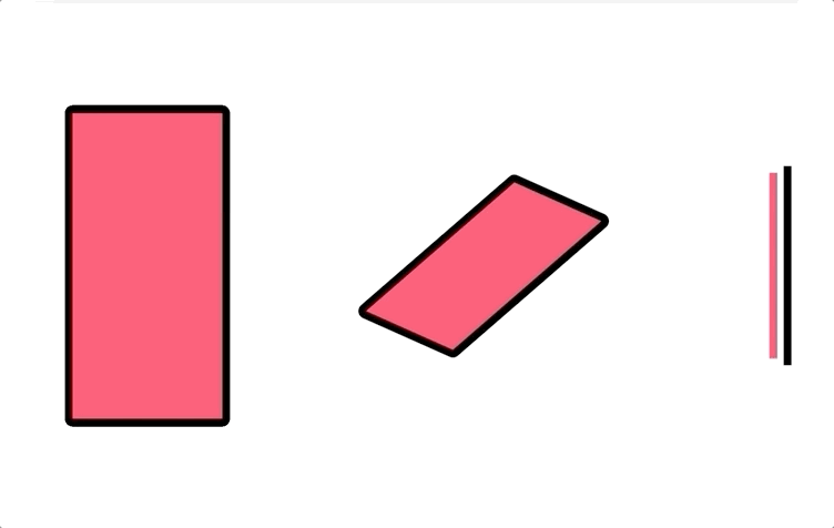
Slide-in/out

This might look similar to the push transition, but it’s not. The new screen slides in but doesn’t push the old one out. The idea is that the incoming screen is positioned on a layer above the previous one.
This works also the other way around, with a slide-out. The current screen slides out and reveals the screen resting underneath.
The new screen is getting the attention of the user for her/him to perform an action, but there isn’t a real change of location. The new screen is usually temporary, the user wants to go back to the previous one once the task has been completed.
Common uses
- Modals
- Dialogs
- Menus
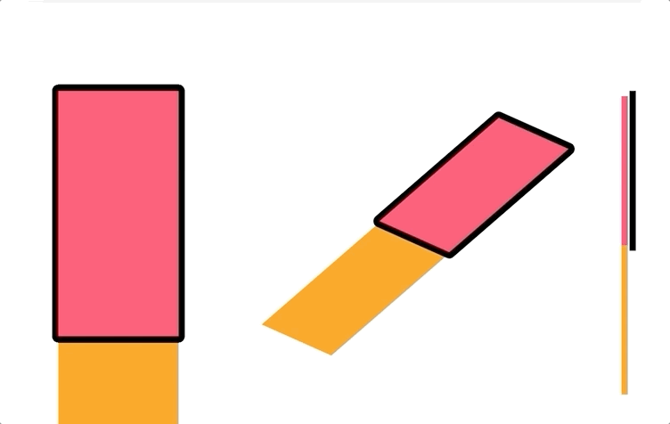
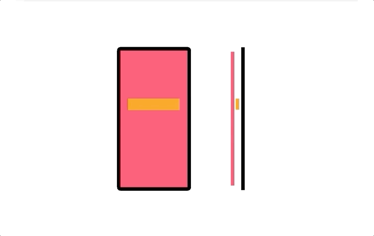
Pop
The destination screen scale-up and fade-in to cover the initial screen. There is a movement on the Z-axis, a screen that was behind moves forward and vice-versa. In this case, the 2 screens don’t share the same plane, they live in 2 different locations and exchange places, the one in the front goes to the background and vice-versa. They might be equally important, or the first one could be the container for the second.
Common uses
- Launching an app
- Swapping between 2 main functionalities or modes
Fade-in

The destination screen fades-in in front of the original screen. This transition can have multiple purposes: it can be used to simply have a smoother jump to a location that is hierarchically higher or lower, or even at the same level, but not related (for content or functionality) to the origin in a way that a slide-in would make sense; it can be used to display a screen that is a consequence of an action performed on the original screen. In other words, a screen that is originating from the main screen on which the trigger action has been performed.
Common uses
- Moving between screens from a bottom navigation
- Modals (e.g. confirmation to delete an item, logout,…)
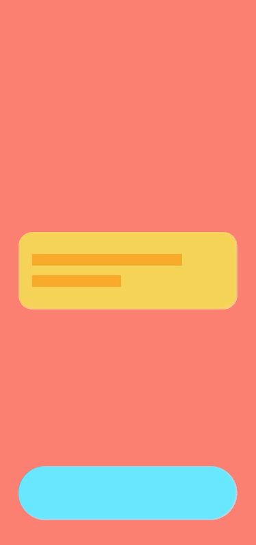
Expand
This transition is usually used to move to the detail page of an item that is already displayed in a collapsed/preview version on the original screen. The origin is usually a node in a branch of the information architecture, the destination is a leaf page, normally we move 1 level down.
Common uses
- Going to the detail view of an item from a list
- Expand a card
Persistent elements
This is a particular iteration on the push. In some cases, when we have a flow made of several steps, like a registration process, for example, it can be beneficial to guide the user from one screen to the other with elements that persistently stay within the viewport and move from one step to the following. Such elements can change their position and size or even morph in shape, but they don’t follow their originating screen out of the viewport. They are animated in contrast with the transition and drive the attention of the user to the new screen, helping to maintain the context. It’s a “visual link” that guides through the process.
It doesn’t have to be the same component going through each step of the flow, it can work as a relay race:
- from step 1 to step 2 element A is persistent
- step 2 brings in element B
- from step 2 to 3 element B is persistent
- step 3 brings in element C
- from step 3 to 4 element C is persistent
- and so on.
Common uses
- Registration flows
- Check-out flows
Transitions not only help to create a more polished and pleasant product, but communicate the information architecture, give context and help to navigate.
But not all transitions are good in all situations; to a certain extent, they are able to mimic a physical environment, or at least suggest the idea of one, and the more coherent this environment is, the easier it is for users to move around without getting lost.
⬜️⬜️⬜️⬜️⬜️⬜️⬜ 👧🏻👧🏼🧒🏻👦🏼👧🏾👦🏿👧🏽👧🏻👧🏼🧒🏻👦🏼👧🏾👦🏿👧🏽👧🏻👧🏼 ⬜️⬜️⬜️⬜️⬜⬜️⬜
My new book “Designing Digital Products for Kids”! Out December the 4th!
Learn the secrets to design successful digital products for children.
You’ll find answers to all your questions regarding the industry, and its peculiarities in 📐 UX design, 🎨 UI design, 🔍 user testing, 📈 business strategies, and much more.
⬜️⬜️⬜️⬜️⬜️⬜️⬜ 👧🏻👧🏼🧒🏻👦🏼👧🏾👦🏿👧🏽👧🏻👧🏼🧒🏻👦🏼👧🏾👦🏿👧🏽👧🏻👧🏼 ⬜️⬜️⬜️⬜️⬜️⬜️⬜


