Member-only story
UI Trends 2020–2021
Glassmorphism in user interfaces
Another year, another UI trend is becoming increasingly popular among designers. Do you know it yet?

Last year I unintentionally started the craze around Neumorphism, but as I predicted then, it didn’t really take over the design scene. In that very first article, I also mentioned all the potential accessibility problems this style faces, which hopefully helped all the other articles raising accessibility issues that year :-)
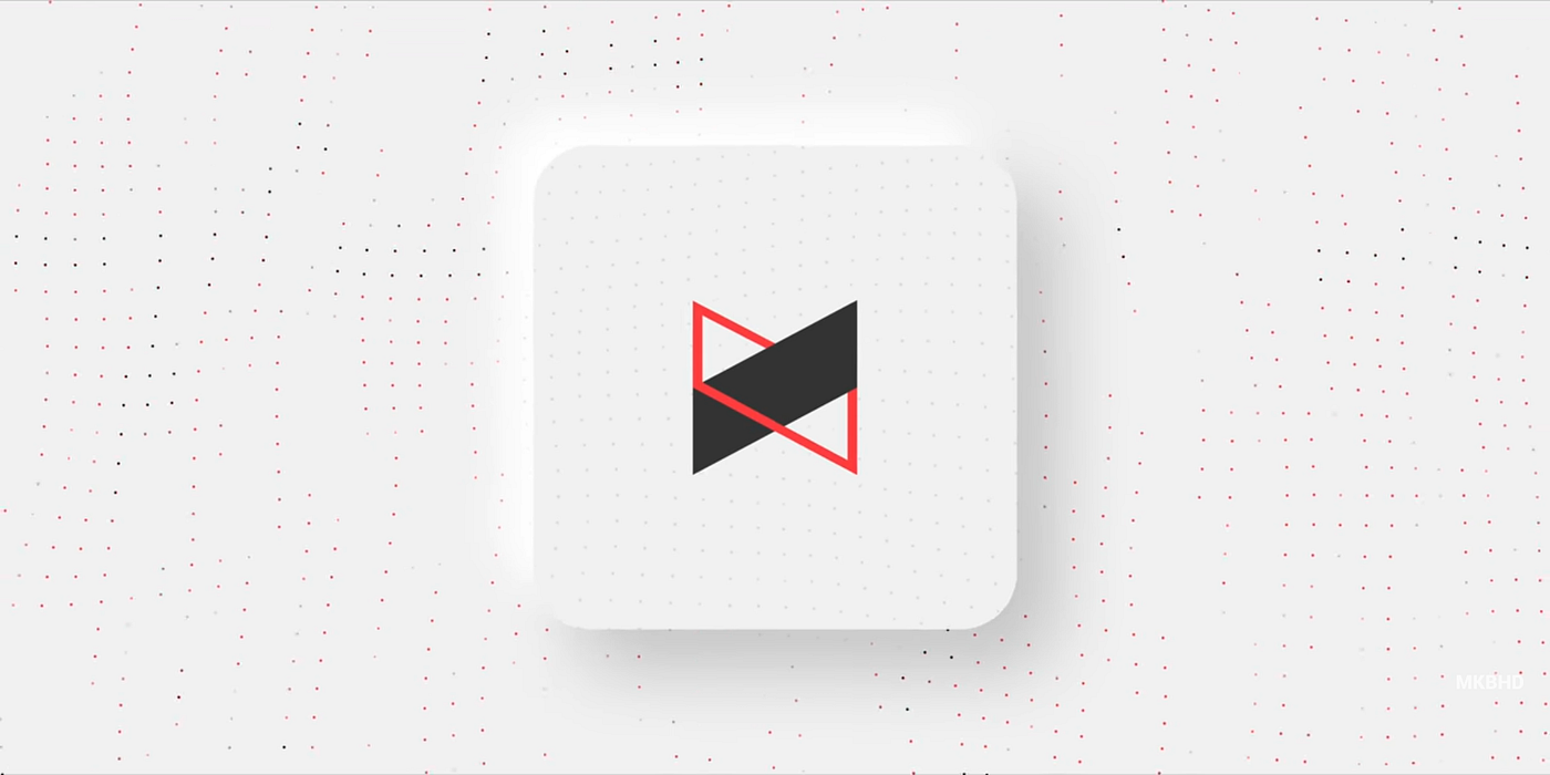
Sure — there were some apps and products done in this style, but most notable, widespread uses were in some Samsung ads and in the MKBHD intro video. So not any full products, but rather smaller elements which proves my thesis that this style can work if used scarcely and if the objects on these backgrounds still hold their structure and readability without the decoration.
Hello, Glassmorphism
There is a new style on the block right now and it’s growing in popularity. While Neumorphism was imitating an extruded, plastic surface (but still looking like one layer), this new trend goes a bit more vertical. It’s most defining characteristics are:
- Transparency (frosted-glass effect using a Background Blur)
- Multi-layered approach with objects floating in space
- Vivid colors to highlight the blurred transparency
- A subtle, light border on the translucent objects.
That verticality and the fact you can see through it, means users can establish hierarchy and depth of the interface. They simply see which layer is on top of which, just like pieces of virtual glass.
Because of that glassy look, I believe the best way to call it is GLASSMORPHISM.