Google Calendar app feature integration — a case study
Discovering a way to improve student interaction with Google Calendar notifications through research, synthesis and ideation.

As UX Designer for General Assembly, I was tasked with integrating a new feature into an existing mobile application to help students with an aspect of time management. GA students use Google Calendar to track their lectures, meetings and studio times on a daily basis. It is a fast-paced schedule that can result in time management issues, a solution to which is explored in this case study.
Discover
User Research
I talked with students on how they manage their schedules and to find out if any challenges come up in using time management apps. During these interviews, I learned that students use the Google Calendar app throughout the day but have concerns over not being held accountable for acknowledging or dismissing the notifications on their phones.
Research Synthesis
An Affinity Map was used to sort ideas, pinpoint challenges, and discover trends based on the interviews.
Interviewees claimed they miss calendar notifications because they disappear without tapping or dismissing the banner notification on their lock screen or notification center.

The following “I” statements stood out among these insights:
“I miss calendar notifications.”
“I need notifications that capture my attention and hold me accountable.”
Now that possibilities had been explored through research synthesis, the findings could take shape in a user-centered solution to improve student interaction with Google Calendar notifications.
Define
Insights & User Persona
Qualitative data from interviews was assimilated to create a user persona. Representing the target user is Alex, a late-twenties Software Engineering student at General Assembly. Her goal is to stay on track during the Winter 2020 immersive program and she relies on notifications from her Google Calendar app.

“Google Calendar is my end all, be all.”
— Alex
Alex’s need for accountability is hindered by her worry that she will get caught up in studio hours and miss the start time of the next scheduled event. Her challenge led to an insight and problem statement to move forward with in ideation.
Ideation
Proposing a Solution
General Assembly students use calendar-based apps for their time management. Alex has a fast-paced schedule and relies on notifications to help her stay on track. How might we integrate a feature with notifications that hold her accountable?
Low-Fidelity Wireframes
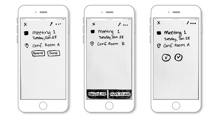
To explore interaction with the notifications, paper wireframes were sketched with call-to-action buttons not currently featured on Google Calendar’s event details screen. Intended to show an additional reminder, the sketches also featured an in-screen pop-up for users to scroll through and set a time preference.
UI: Screen Discoverability
In considering the user interface, three different layouts were sketched to show the event details with the additional CTA, experimenting with button shape and placement.
Low-Fidelity Usability Testing
These early sketches were shown to more students like Alex, who were observed with the following scenario and task:
- Scenario: You are on campus and have back-to-back lectures coming up. A notification pops up for your next class in 15 minutes.
- Task: Tap the notification and set a reminder for 5 minutes.
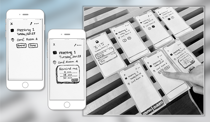
User feedback led to designing a clickable prototype representing the testers’ preference among these UI considerations:
- Option 1 was preferred by 4 users because of button placement directly below the event details, which held their attention.
- Option 3 was preferred by 1 user, because the buttons “read like a simple yes or no.” But this was confusing to others who were unsure if it would generate a response to the event owner.
Design
Mid-Fidelity Digital Prototype
After learning user’s preferences, a mid-fi digital prototype was produced to demonstrate a refined scenario and task. Iterations on the screen text and the ability to scroll through time increments in a pop-up were implemented to achieve the following:
- Scenario: You are in studio time and pre-occupied on a project. A notification appears before the next lecture in 30 minutes. You are worried you will lose track of time.
- Task: Tap the notification and set a reminder for 15 minutes.
Mid-Fidelity Usability Testing
During usability testing, five participants interacted with the clickable prototype, navigating efficiently to reflect the following path:
- Tap on the notification and open the Google Calendar event listing.
- In the reminder pop-up, click “Remind me” to set an additional reminder.
- Choose a time increment (i.e. scroll to 15 minutes).
- Save, and return to calendar view.
Usability Test Report
Outcomes and Results
4 out of 5 users were able to set an additional reminder on the mid-fi digital prototype. The process was straightforward with efficient navigation, and I’ve indicated this as a Medium issue based on the following feedback and addressable issues:
- 2 users were pleased with the feature’s in-screen presence (as a pop-up) and with the ease of scrolling through time increments.
“Scrolling is more natural.”
“The process of editing a reminder was usable.”
- 1 user didn’t understand the meaning of ‘Okay’ on the event listing, whether denoting “save” or “dismiss”.
- 1 user would like to see the reminder reflected in their calendar view, after completing the task.
“I need an indication that the reminder is set.”
Analysis: The presence and wording of the “Okay” button was confusing in the user path, but did not slow them down. For further accountability of the reminder feature, it would be useful to have visual confirmation that the reminder was set.
Recommendation: Program the “Okay” button to appear only after a reminder is set, or remove it altogether. Confirm the interaction with a visual indication in the full calendar view.
Moving forward with these recommendations and applying learnings on the UI will be the next step toward delivering this feature integration.
Next Steps
Improving on the newly integrated reminder feature, l will return to the mid-fi digital wireframes to adjust elements that affected the user journey.
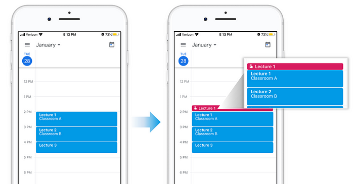
Maintaining a clear path in setting the additional reminder will remain important while improving the UI to build the desired visual indication of the newly set reminder. This will be shown as a task element on the full calendar view page (as part of Google Calendar’s existing task settings), pictured in cherry blossom color in the projected high-fidelity iteration below.
This polished feature integration will help keep students like Alex on track and provide greater accountability for fast-paced schedules, whether caught up in studio time or attending lectures in a timely manner. For stakeholders, this can be valuable in keeping all General Assembly students, and even alumni and staff, as long-term users among other calendar based apps in the space.