Member-only story
How Google’s homepage has changed over the last 20 years
Google is well know for its minimal design of its homepage, but has it always been this way?
Google became the world’s largest search engine, with over 70% of all searches performed through its search engine.
“Focus on the user and all else will follow. With this in mind, we seek to design experiences that inspire and enlighten our users.”
This post is going to explore how the google homepage has changed over years. Since the homepage can change many times daily, and varies per device and viewport size, I have looked at this with a desktop viewport, and opted to perform comparisons when Google have used their standard logo, no special event logos.
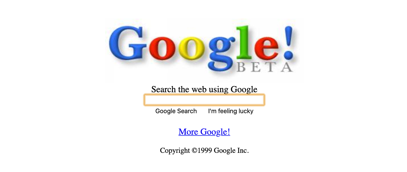
1998 — Google! Beta

Google actually served content on google.com before this, but it was just a holding page. This is the first instance they started functioning as a search engine. They had the I’m feeling lucky button from the start, which I’ve always personally liked.
1999 — Lets have a minimal look
Around this time, table based designs were used all over the web, but it looks like Google decided to remove the table underneath and opt for a simple minimal approach. If you compare the 1999 Google homepage to present times, you will notice that actually very little has changed in terms of the way it looks.
2000 — Lets put links to the Right

One of the major changes in 2000 was the introduction of the links to the right of the logo. This is what we would now consider as a nav bar…

