Google’s Heart framework: Choosing the right metrics for your product

Video explanation of the Heart Framework
If we improve something, we had better be able to measure the impact and learn from it.
If we can’t, we really need to question why we’re doing it, because it will be hard to know if we’re right, wrong, or somewhere in the middle.
I can’t count how many times I’ve had heated discussions about design solutions, with everyone making subjective arguments like “I don’t think it will work”, “I don’t like it”, and so on.
And at some point, someone always throws the final punchline: let’s test it, let’s AB test it, and so on. And that might actually be the right thing to do. But for that to work in practice, it’s important to use the right metrics.
The biggest problem was that nobody could tell what we were supposed to be measuring.
That’s always a sign that your design process is broken. You start working without knowing the goal and without knowing how to define that you’re on the right track.
That’s where the Heart Framework comes in handy.
The Google team has developed a few useful methods to help select and define appropriate metrics that reflect that:
- The quality of the user experience (the HEART framework)
- The goals of your product or project (the Goals-Signals-Metrics process)
Simply put HEART stands for:
- Happiness
- Engagement
- Adoption
- Retention
- Task success
To use this framework, a team will identify goals, signals, and metrics for each of the five categories of HEART, as shown in the figure above. test

Goals
Goals are broad objectives. For Happiness, a goal might be “Users find the app helpful.”
Signals: indicators that your team is making progress towards their goals. A signal might be “Users recommend the app to their friends.”
Metrics
Metrics: quantifiable data points that indicate success or failure. You can measure how many users tend to recommend the app to their friends.
These frameworks can be applied at different levels — from the entire product to a specific feature.
You don’t necessarily need to create metrics in all of these categories — you should choose the ones that are most relevant to your specific project.
It can be happiness and “adoption”, or some other combination.
The hidden benefit for you as a designer.
Before I get deeper into the details of this framework, I want to highlight a hidden benefit of how this framework could help you in your design career.
The measurable impact of your work
Now, if you want a raise or want a strong argument that your work has a positive impact on business — there’s no better way than to talk about numbers. Business people love numbers. And when you shape your design process to be tied to metrics, you have an objective way to name how your work has impacted the business, the actual measurable value you bring.
E.g. You have an annual review. And instead of mumbling about how good you are, you provide the data that supports your claim. That your idea increased conversion rates by 20%, that the change you offered minimized error rates by 40%, and that this idea put extra money in the company’s bank account.
… back to heart frame
Now if you look at the order of each metric, it doesn’t seem right. I think it’s easier to remember the acronym HEART, but for brainstorming it’s better to use that order:
Adoption, Task Success, Engagement, Retention, Happiness Since it follows a Customer Journey or Life Cycle.
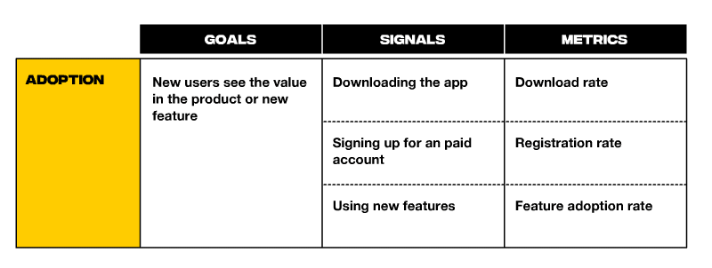
Adoption
Adoption is quite simple and usually refers to the number of users who use a feature or product for the first time.
Signals of adoption can include downloading the app, signing up for an account, using new features
Metrics: Download rate, registration rate, feature adoption rate.

I have my course for designers called “Sell the design” which teaches designers how to find dream clients and sell to them. And I track my conversion rate, which is how many users visit the landing page and what percentage sign up for the course or sign up for the newsletter.
If you’re interested in this course, you can get 3 lesson for free, just leave your email below.
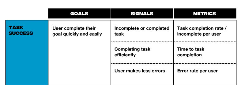
Task success
After onboarding, you may want to track whether the user can achieve their goals with your product or new features. Task success refers to the efficiency, effectiveness, and error rate of a user completing a task with your product’s workflow.
Signal ideas: incomplete or completed task, time to complete task.
Metrics: Error rate, time to task completion, task completion rate, etc.
A task is more efficient if it takes less time to complete effectively. It is effective when it either completes the task with higher quality or a higher hit rate.

E.g. I can track how many people completed the course and how much time it took them. For blog posts, I might track how many readers scrolled all the way to the end of the article and how much time it took them. For complex systems, I can track the time and amount of errors to complete tasks.
Engagement
Engagement measures the frequency, intensity, or depth of a user’s engagement with your product. How many users have visited the product in the last 7 days? Month and etc.
How often do they visit my website? Or what is the open rate for my email?

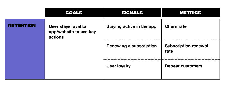
Retention
Retention measures returning users’ continuous, repeated engagement with the feature or product over time. This allows you to track how often people use your product or feature, or buy your new offerings, etc.

Happines
How do users feel about your product? Are they satisfied with the quality? Basically, you need measures of user attitudes, which are often collected via surveys. For example satisfaction, perceived ease of use, and net promoter score.

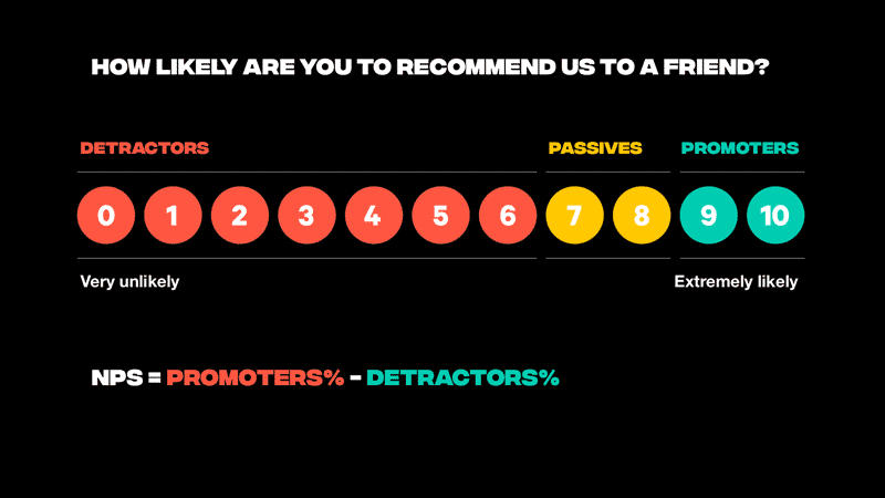
Net Promoter Score is a great tool to measure satisfaction. The Net Promoter Score (NPS) is a measurement of customer loyalty and satisfaction that asks customers how likely they would recommend your product or service to others on a scale of 0–10

NPS is calculated by subtracting the percentage of customers who answer the NPS question with a 6 or worse (known as “detractors”) from the percentage of customers who answer with a 9 or 10 (known as “promoters”).
Passives (score of 7 or 8) do not actively recommend a brand, but are also unlikely to harm it through negative word of mouth
Given the available range of -100 to +100, any score above 0 reads as “good” because it indicates that a company has more promoters than detractors.
Top-rated companies typically have an NPS of 70 and above
Summary
The Heart framework is a great tool for designing discussions for product teams. In conjunction with the Goal Signal metrics process, it brings business metrics into your design process. In short, the data you collect helps you have more fruitful discussions and is a powerful tool to support your design decisions.
Originally posted gecis.co


