Grab attention of your website readers with Z-pattern

When you first come across a website where do your eyes go? What is the first thing you read or see? Where is your attention drawn to? It’s easy to imagine that every user will excitedly read every letter you write or consume every content you put on your website. Forget it, the truth is… they don’t.
People don’t read, they scan.
Scanning means they only stop to read when something catches their eyes. Unfortunately, making something that draws attention is a tough cookie unless we understand how our eyes process information in order to create the right pattern for our visitor to follow.
Several patterns have been recommended to take advantage of how people scan or read and one of them which is used mostly even with big brands like Facebook, it’s called Z-Pattern layout.
But what is Z-Pattern layout?
It’s a pattern that shows how eyes scan contents and offer advice for where to place important information. It suggests that most readers eyes will scan your page starting in the top-left, move horizontally to the top-right then diagonally to the bottom-left before finishing with another horizontal movement to the bottom-right, hence forming an imaginary “Z” shape.
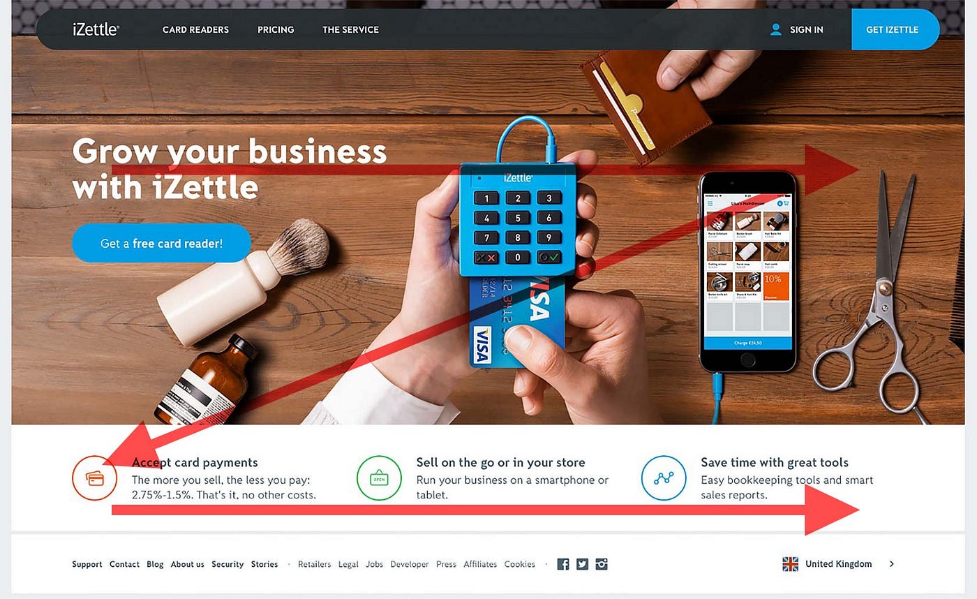
This pattern proves to work because that’s the same way we read a book or newspaper- Top to Bottom, Left to Right.
How to apply it?
Before you start designing page layout to catch more eyeballs, it’s essential to find answers on the following questions:
- When visitors land on a page, what information do you want them to notice?
- What do you want them to do?
After that, applying Z-Pattern layout is a very straight forward process. All you have to do is to impose the letter “Z” on the page. Ideally, you want people to see your most important information first and your next most important information second and third. Thus, important elements should be placed along the pattern’s path and visitors should be presented with the right information at the right time.


More ZzZ…
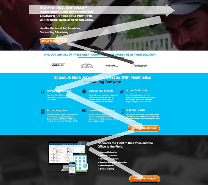
Z-Pattern doesn’t just end there with a single “Z” because it can be extended to create a series of Z’s. Also called Zig-Zag, its a series of z-movements instead of one big z-movement. Its more realistic as the reader will continue to move to the right and then a little down and back to the left before starting another horizontal movement to the right again. Its how we naturally read large blocks of text.
Finishing Up
personally find Z-Pattern easier to use and meaningful to start with, but you are not limited by it. There many patterns out there, Gutenberg, F-Pattern, Pattern of Focal Point, etc., you can choose to reinforce any pattern that you see can fit your contents and readers.
Cheers!
Feel interested or need someone to develop your website? Check my portfolio here geofreyxvr or shoot me an email: geofreyxvr@gmail.com