Member-only story
Great branding isn’t just about design. It’s about the soul.
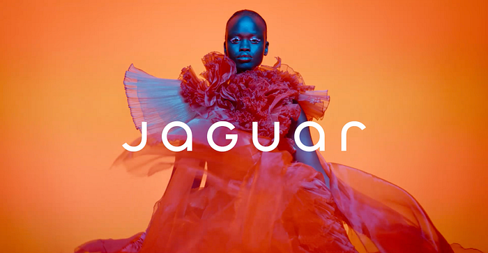
Is Jaguar’s logo a bold embrace of chic modernism or a minimalist misstep, and what does its transformation say about the soul of branding in a world shaped by AI?

The article presents a ‘Soul of the Brand’ framework, a go-to guide for any brand hitting the refresh button. It’s more than a checklist — it’s a lens to uncover a brand’s essence, ensuring that any transformation is grounded in its core identity while opening doors to bold, creative possibilities.
Whether you’re refreshing a legacy brand, creating a startup’s identity, or brainstorming the next big idea, it offers tools to examine how a brand connects emotionally, adapts dynamically, and stays relevant without surrendering its authenticity. It helps brands reimagine their future while respecting their past. It ensures every element, from logo, storytelling, and AI to sensory cues, works together to scale higher, leap further, and connect deeper.

Using Jaguar as the star of this branding case study, we explore what worked, what didn’t, and most importantly, what was left behind. It’s not just for a logo redesign; it’s a lesson on evolving without losing your soul.
The cat is out. But is it better?
Jaguar’s leaping feline, a symbol of power, elegance, motion, and one of the most instantly recognizable motoring symbols in the world (COOLING, 2023), has vanished. In its place stands “JaGUar,” a minimalist typographic logo. Minimalism seems to be a trend (Cousins, 2015) these days. While sleek and modern, this rebranding feels like a mid-life crisis dressed in neon. It's a bold choice but not necessarily a better one. Rebranding is a corporate rite of passage, a way to signal transformation. For Jaguar, the decision to ditch the iconic leaping cat feels like swapping a timeless tuxedo for a tech startup hoodie. It whispers “relevance” but risks losing the roar of rebellion.

