Member-only story
Grey is the new black: a study on progress bars
#24: Turning bar charts into progress bars
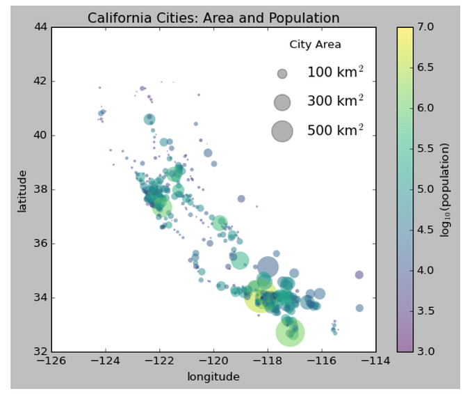
There are limited cases when stacked bar charts come in handy. Sadly, that doesn’t make them unpopular. Even though they only allow a convenient comparison of the two outermost categories, they are often used to represent many more. But there is a case where they do magic. Progress bar — to put it in two words.
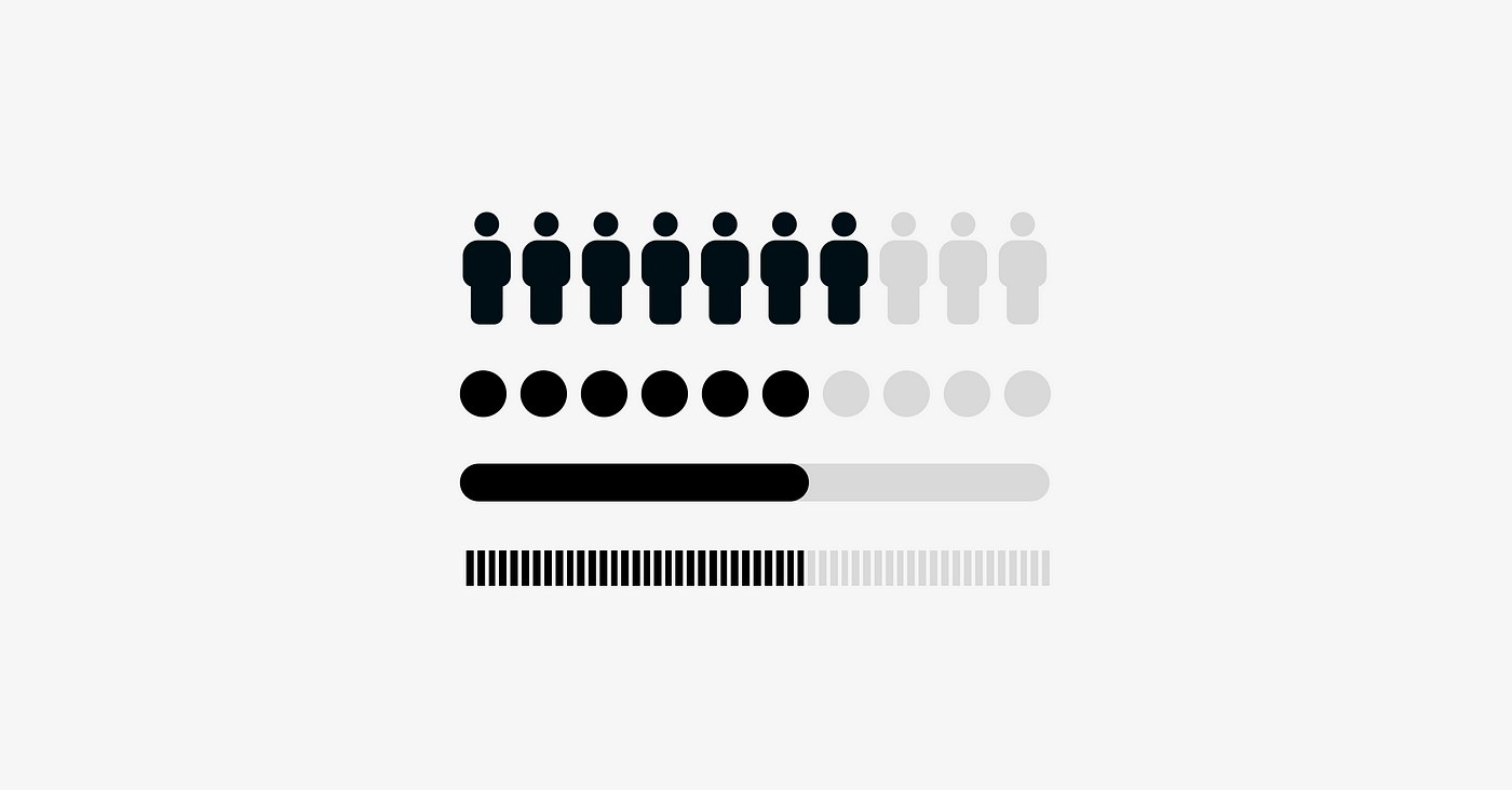
The progress bar is a basic stacked bar that shows only two states — when something occurs and when it doesn’t. Choosing a color, we can emphasize either the opposite or the complement. Imagine the case where we want to show a gender distribution. If we use red to show women and blue to show men, we will focus on two opposite groups. On the other hand, if we use red for women and grey for men, we will show women among all people rather than two different groups.
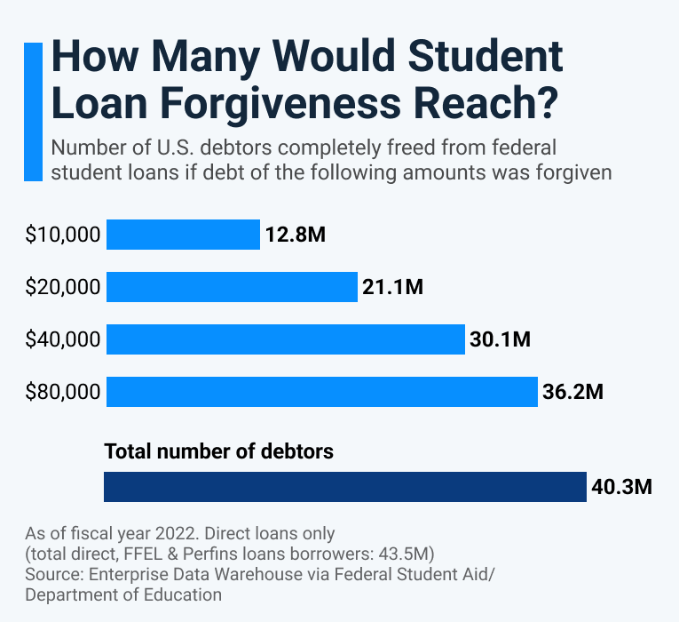
The latter is precisely what the author of the Statista chart tried to achieve. The intention behind the chart is to show how many of the direct loan debtors would have been forgiven in each of the analyzed scenarios. We can see how the number of wholly freed students will change with the increase in forgiven amount. The analysis is complemented by the baseline of the total number of debtors. Unfortunately, all information is shown as separate bars, making the comparison challenging to notice and conduct.
Good data visualization solutions
Elements that work in this chart
Putting data in the context
I like that the original chart enriches the data with the baseline. Providing the number of all debtors puts the number of freed debtors in context. Without that, we wouldn’t know whether 36.2M is significant. Additionally, it tells us something about the distribution of the debt amount. The chart shows that only a fraction of the students went into debt for more than $80K.
Meaningful description
Another aspect helping understand the visualization better is an intriguing yet meaningful title…