How to Design an App to Support Local Farmers — Grow It, a UX Case Study
Design of a mobile app for consumers of local products to rent land at a local farmer to get every week fresh vegetables.
On average, our food travels 600 to 800 km before arriving on our plates. So it’s not surprising that consumers are increasingly concerned about its origin. This is why community-based agriculture is becoming increasingly successful, as in France with the AMAP system. These associations encourage the consumption of local products while supporting local farmers.

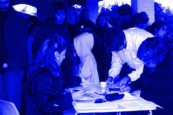
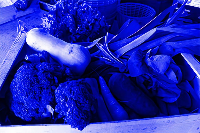
The principle is simple: A group of consumer signs an agreement (1)with a farmer, who will produce for them vegetables for a whole season (2). Every week, the consumers will pick up a bag of vegetables (3).
For the consumer, it is a guarantee to have fresh and local products. For the producer, it is a stable source of income while reducing the number of middlemen. However, this ‘short supply chain’ remains for many farmers a niche and they can’t fully live from this activity.

Objective
I designed an app making access to local products more convenient for the consumer interested in supporting local farming. The consumer can rent and choose the vegetables to grow and receives a weekly delivery of fresh vegetables.
Challenges
How can we make access to local vegetables more convenient for the consumer, so that farmers can make more profit from the direct sale of products?
Farmers are worried about the decrease in their revenues due to market uncertainties and the too many numbers of middlemen involved in the sale of their products. They would like to reach directly the customer without having to sell their products through supermarkets.
After pitching different customers, the most relevant feedback identified was the lack of flexibility of the current French community-supported farming system.
My role
I led the design of this app independently from user research to high fidelity prototype. These roles included:
- UX strategy
- User research & analysis
- User Flow & Stories
- Persona creation
- UI design & prototyping
- Usability testing
Scope & constraint
For this project, the scoop was limited to the sale and delivery of vegetable products, which represent currently the biggest product group in direct sales of farm products.
The Research
The survey
The surveys helped me understand the farmer’s needs and the costumer’s pains with the current direct sales of local farm products. Those are the main results of the surveys:

Interview
To get a better understanding of the problem, I conducted user interviews. I have approached one user being part of a French Community-supported farming and another one who is not part of this community but who wish to buy more local products. Through the interviews, I could get a better understanding of the results of my survey.

The customers can’t choose their vegetables
The customers can’t choose the vegetables they will receive. They must be content with what they get. They can possibly receive the same vegetables several weeks in a row.

Limiting pick up time
The pick up happens in a limited time slot. If not picked up, the vegetables will be thrown away.
A too-long engagement period
For some people, the engagement period of 6 months or 1 year is too long. Moreover, they will still receive vegetables during their holidays.
The quantities are not adapted to small households
The quantity of vegetables is usually for a family of 4 persons. Couples or single people end up throwing vegetables every week.
Difficult management of expectations
People who are not familiar with community-supported farming don’t always understand that the hazards of the harvests can influence the number of vegetables they will get.

Take away
This research allowed me to discover the problems of three types of personas. For this project, I chose to focus on ‘health-conscious consumer’ or ‘new potential consumers’. Through my research, I found out that current and new customers share several pain points.

The farmer
- Motivation: He wants to produce good products and live from his production;
- Pain Points: The distribution and the sale of local products take him a lot of time;
- Gain: He would rather like to focus on producing rather than selling. He would be ready to give away between 5% to 20% of the total cost for a service doing the distribution and selling for him.

The militant consumer
- Motivation: She wants to live in a sustainable way, support local farmers and has a good value for her money at the same time;
- Pain points: She regrets sometimes the lack of diversity of products and still receives vegetables when she goes on holiday.
- Gain: She wants to have more diverse products and a more flexible subscription model.

The health-conscious consumer
- Motivation: He wants to eat healthier, in a more sustainable way and support local farmers.
- Pain points: The quantity of vegetables is way too much for him. He is sometimes too busy to go to pick up the vegetables.
- Gain: He would like to be able to choose his vegetables. He wants a shorter period of commitment and more convenient pick-up times.
Implementing The Results
Based on my learning, I defined the following key principles for the app:
- Choice: The app allows the customer to choose his own vegetables to grow.
- Flexibility: The customer can choose different subscription duration with the possibility to pause them for a short period
- Convenience: The app offers different delivery options, including home delivery, and picks up.
Value proposition
“For the consumers who are willing to support local farmers, who aren’t fully satisfied with the current community-supported farming system, this proposition help them to have more choice, flexibility, and convenience in term of quantity and choice of products and delivery options. To avoid that consumers have to adapt their eating habits according to what they get, this solution involves them during the whole production process. With this system, the consumers choose themselves their vegetables (1) to grow — within a selection from the farmer — , rent a plot (2) where their vegetables will be grown. The consumers can then get their products delivered or come to pick them up (3). With this system, the farmers can focus on the production, have a stable source of revenues, while reducing their dependency on middlemen.”

User Stories & Happy Flow
User stories helped me to define several flows within the app. In that way, I can find a solution corresponding to each key principle of the app (choice, flexibility, convenience). The following are some examples:
- Choosing a farm:
“As a health-conscious consumer, I want to choose a local farmer that suits me, so I can be certain of its origin and the quality of my products.” - Choosing vegetables:
“As a health-conscious consumer, I want to be able to choose myself the vegetables to grow, so I can decide what I will be receiving every week and feel more involved in the production.” - Getting the vegetables delivered:
“As a health-conscious consumer, I want to have the freedom to choose how and when I can get my vegetables, so I still get my vegetables, even when I have a busy week.”

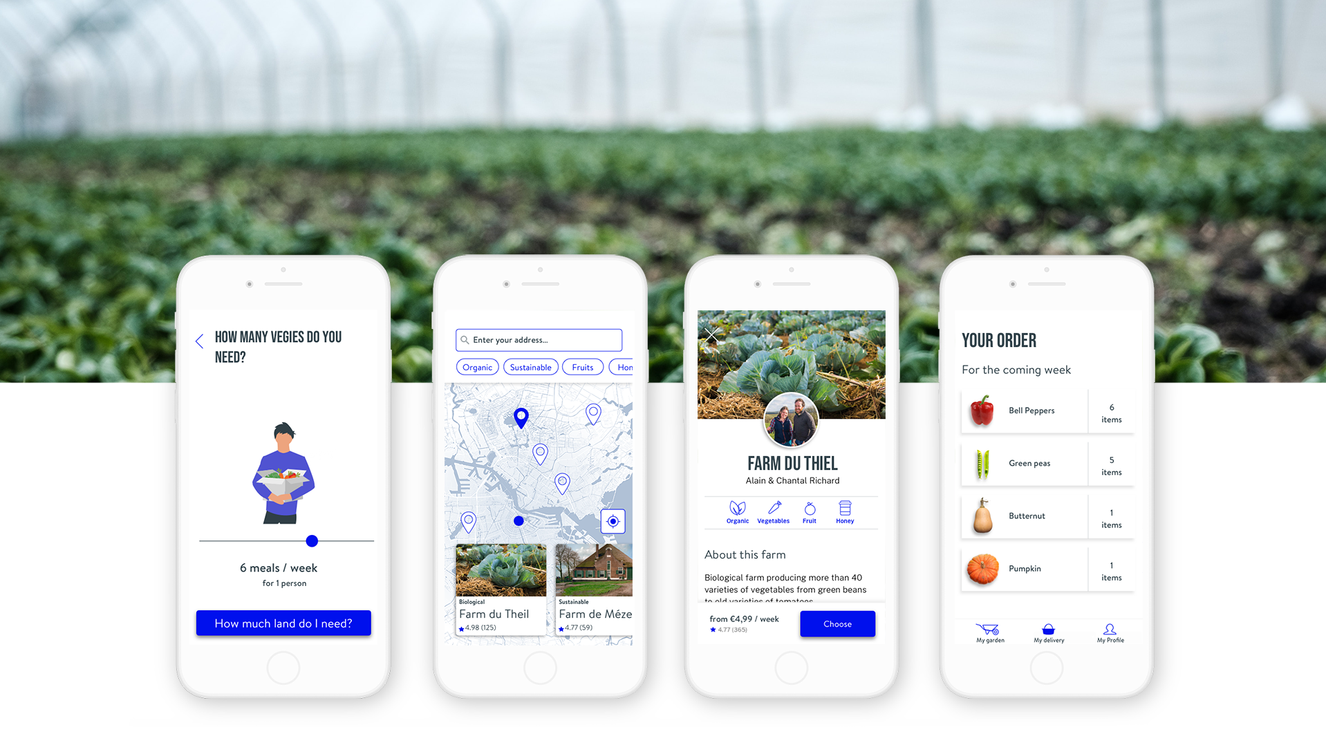
The Solution
Low-fidelity wireframes
At this stage, I visualized the happy flow of this app ‘selecting vegetable and getting them delivered’. I sketched various solutions and ran user tests. It came up that visualizing the plot where the vegetables will be ‘virtually’ planted (screen 3.2), helped the consumer to understand that the number of vegetables might vary from a week to another.

At this phase of the design process, early user feedbacks were crucial to eliminate pain points and enhance usability, such as:
- Adding filters when looking for a farm (screen 2.2 and 2.3)
- Specify the diet of the consumer to refine the choice of farmers and calculate the size of the land to rent (after screen 1.5).
- Reduce the number of steps to plant the vegetables (screen 3.1 and 3.2).
Mid-fidelity wireframes
After creating mid-fidelity wireframes, I converted them into an interactive prototype using Invision. This prototype was used to run the second round of user tests, in person, that enhanced features and eliminated user pain points.

Among others, in ‘Choosing a farm’, the users are asked how many meals they would like per week. They would see consequently a preview of the vegetables they might get every week. They got confused to have to select the vegetables ‘again’ in ‘My Garden’. For clarity, I removed the preview of the vegetables in ‘Choosing a farm’.

High-fidelity-Wireframes
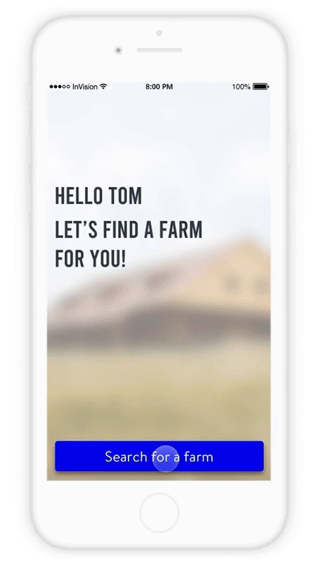
Onboarding
Onboarding is one of the most critical phases of the app. In order to create an account and determine the size of the plot, the users need to do a consequent number of steps. To keep them engaged, I made these design decisions:
- One step at a time, to keep the user focus.
- Creating a conversation with the user with active wording — ‘My first name is…’. This gives them a feeling of control when creating their account.
- Showing the number of steps with a progress bar at the top of the screen.
Choosing a farm
The users can look for a farm close to their home address. From the map, the users can select a farmer profile and review it. On the farmer’s profile, the users get more information and can decide to choose that farmer.
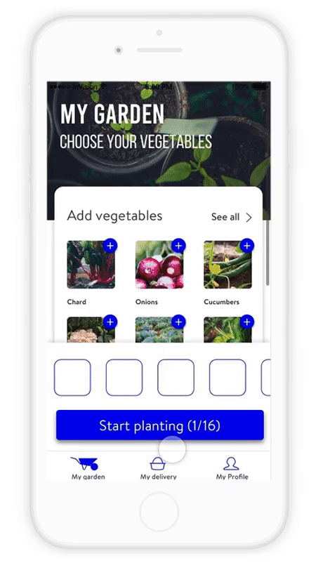
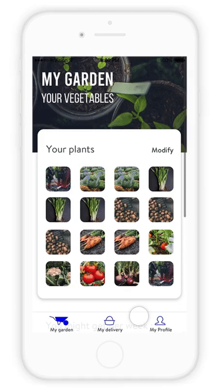
Planting vegetables
‘My garden’ is designed as the main screen where the users can manage their garden. The first time the users will land on that screen, they will be asked to select the vegetables they would like to grow. They can select the vegetables one by one or choose a pre-made mix of vegetables. They can then preview how many vegetables they might receive per week.
Getting them delivered
The users will be notified when their vegetables are ready. They can add some extra items, choose to get them delivered at home, or to pick them up and select a delivery time. After getting their confirmation order, they can track their order.

User Testing
I conducted user testing in-person with three individuals. In general, participants could navigate easily through the app; but testing also detected some pain points:
My garden:
When choosing vegetables, participants revealed they got confused with the term ‘recipe’. They didn’t know if they should expect to receive a meal or the actual vegetables. The change to ‘vegetable mix’ made this feature clearer (1).
It was difficult for the user to see which vegetables they already selected. I solved that by displaying the selected items at the bottom of the screen (2).

My delivery:
When confirming the order, some participants wished to have their vegetables delivered every week at the same time, instead of having to set the same day and time every week. The addition of a toggle with ‘deliver weekly at this time’ makes this option possible (3).
Conclusion
Next step: service design
In a post-COVID-19 era, we can assume that local agriculture will certainly be increasingly relevant to make our food supply chains more resilient. Grow it offers a convenient way for the customer to get locally grown vegetables and being involved in community-supported farming. By renting a plot, the user isn’t only a consumer, but also become an actor in the production process. In that way, expectations are managed, and this system still gives a stable source of income to the producer.
My next step would be to design the worst-case scenario. Because of time constraints, I have focused on the happy flow of the app. But what will happen if the farmer can’t provide the right amount of vegetables? In that case, a good service design should ensure that the customer should get other vegetables or a refund. This should be investigated and designed further.
Thank you for reading this far! I hope you enjoyed that article. Let me know if you have any questions or comments on my design for Grow it. If you’d like to have a chat about anything design related, I would love to hear from you! You can also connect with me:
References: Artworks by Icons 8, Photography by Unsplash, other illustrations & UI by Antoine Fourrier.

