A complete guide to alcohol markers
A guide to alcohol markers including tips and techniques on how to use them.
There are a few different types of art markers (paint pens, water-based markers, solvent markers) but this guide will be specifically about alcohol markers. Since Copics are the most well-known and used brand of this category, I’ll also include some information about those.
Note: All of my illustrations are done digitally, but since this is an article about alcohol markers, I’ve made an effort to make them look as similar to alcohol markers as possible. Underneath relevant illustrations I’ll note how close to actual marker textures they are :)
What Are They?

Thick markers filled with dye-based alcohol ink. Since they’re alcohol inks, they’re waterproof but do have a strong smell compared with water-based inks. They’re also generally nontoxic (this is dependent on brand), transparent and blend smoothly. Their transparency means they’re ideal for layering techniques (like watercolour) while their easy blends make them easier to use. They have a fast drying time (thanks to the alcohol base), which could be good or bad depending on your style and needs — anything you draw will dry before you have a chance to smudge it, but this also means you need to work fast while blending.
They’re used by illustrators, graphic designers, concept artists, architects, manga artists, cartoonists and calligraphers (and more, wow). Some fields use them for quick sketches and concept work while others use them to create fully realised art, so they’re a very versatile tool.
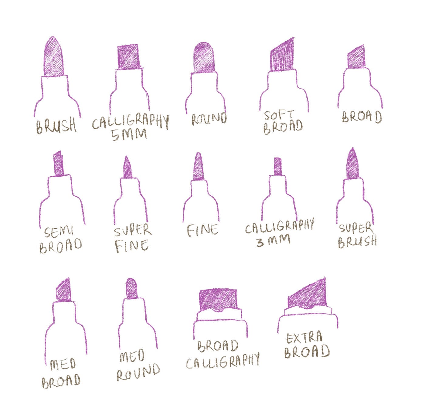
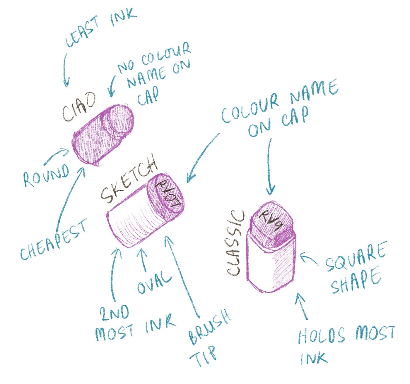
As mentioned before, the most popular brand of alcohol markers is Copic (manufactured by .Too in Japan). Copics have the largest colour range (358 colours), are refillable, have replaceable nibs and are tested for consistency across colour ranges. All art markers have nibs in a variety of sizes but Copics have the widest range of these too — a calligraphy nib (3mm), semi-broad nib, super fine nib, standard fine, brush nib, round, 5mm calligraphy nib, soft broad and standard broad.
Copic also has four lines of marker bodies which come with different nibs, but since the nibs can be bought separately and are interchangeable, it’s not a huge deal if you end up buying the wrong one (unless you’ve bought a 72 colour set).
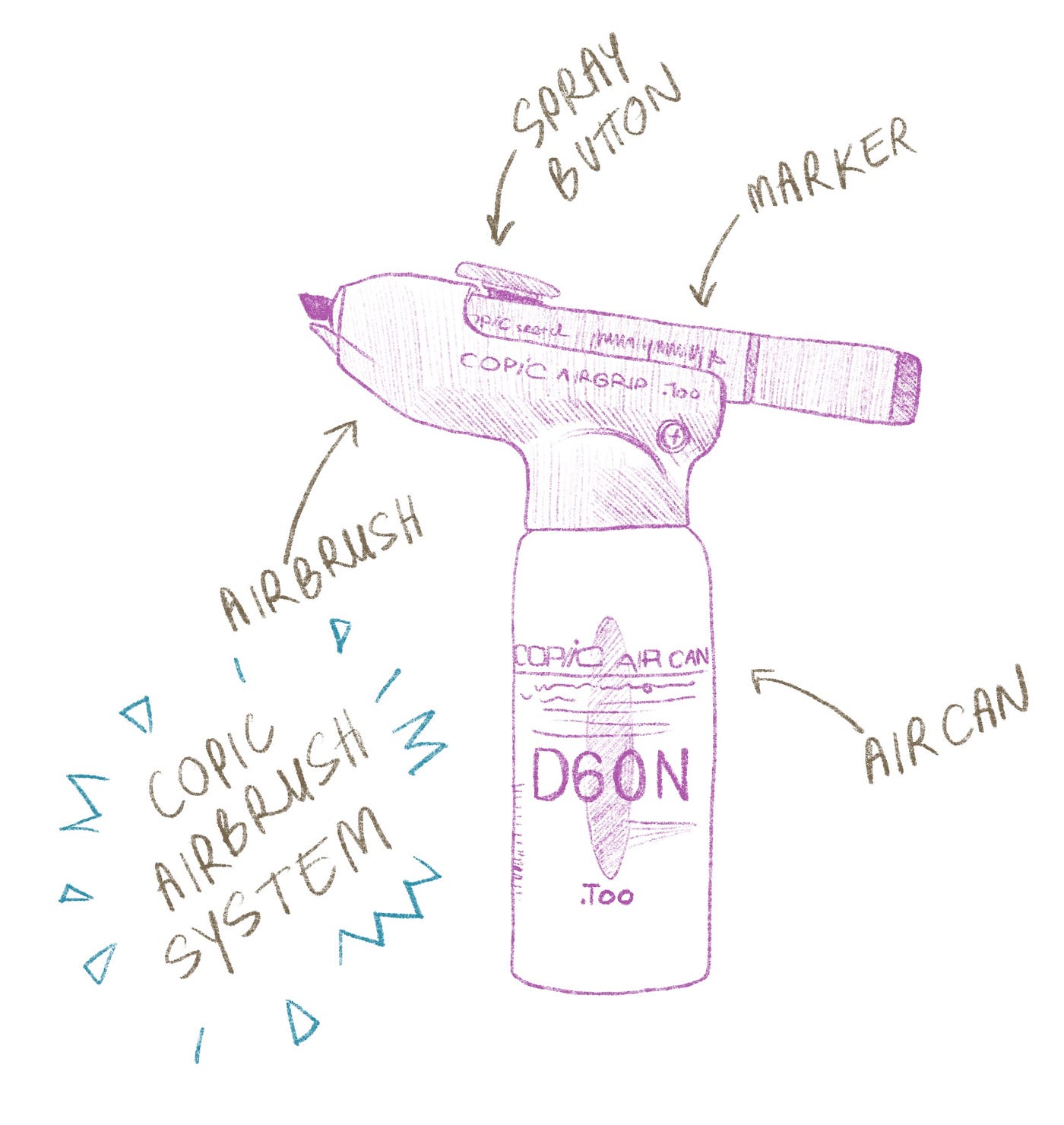
I don’t want to centre this guide around Copics too much, but it’s also worth saying they have an airbrush system to go with their markers and a range of fineliners with ink formulated to go nicely with their Copic marker ink.
Required Materials

- Bleedproof paper
- Pencils (for undersketch)
- Eraser
- Copics
How To Use
- First of all, make sure you’re in a well-ventilated area. It doesn’t have to be as airy as an oil painter’s area, but the smell of the inks could give you a headache or make you a bit dizzy if you’re sensitive to odors or aren’t used to them.
- Remember to make sure you’ve got some scrap paper or similar beneath your drawing paper since the markers will bleed through and leave marks on whatever is underneath.
- Break out your markers and play around! Here are some techniques you should try out before applying any ink to linework:
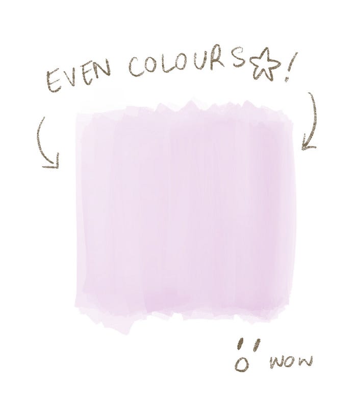
Even Colour Laydown
When you colour something in with an alcohol marker, the ink settles and blends as it dries, resulting in a smooth colour. Try to colour in a given area without going outside of the lines while also keeping the colour even (since the ink is transparent, this means going over the surface with your marker evenly). Alcohol inks will bleed a little, and the amount of bleed differs across brands, so take note of this as you’re doing this exercise.
Layering Colours
Using the same colour, try to create a gradient by layering the ink. You can do this by making a patch of even colour, then progressively going over that colour in smaller strokes. Note that the paper will only be able to hold a certain amount of ink, and the ink will reach a certain opacity, so laying down ten layers of strokes won’t necessarily be better (or even visible) than less. You’ll get used to judging when is enough as you practice.

Blending Colours
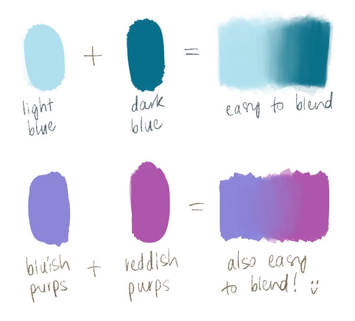
If you’re new to blending, keep in mind that it’s easier to blend colours that are:
- In the same colour family (so blending a light blue with a dark blue, or a bluish purple with a reddish purple)
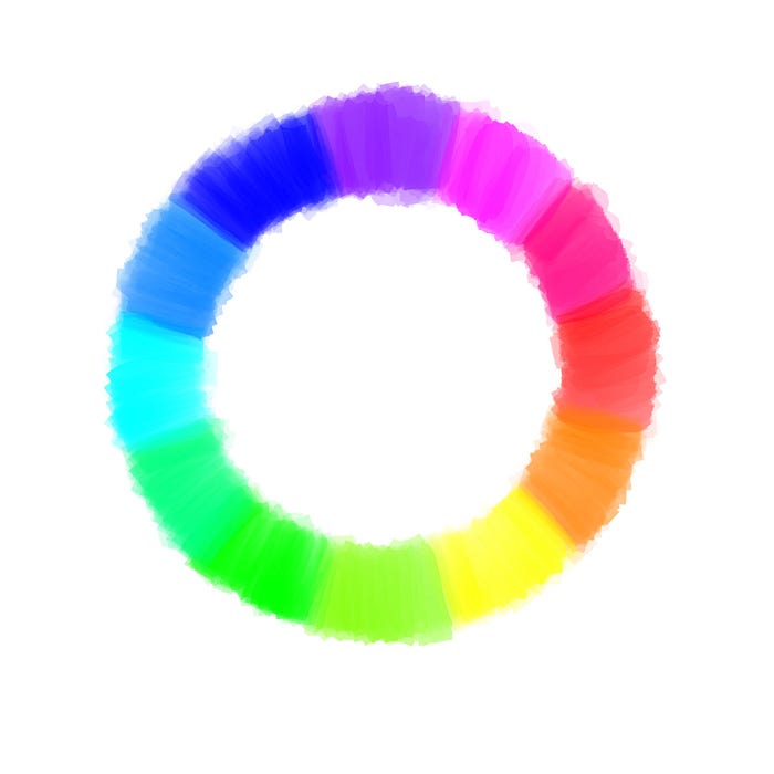
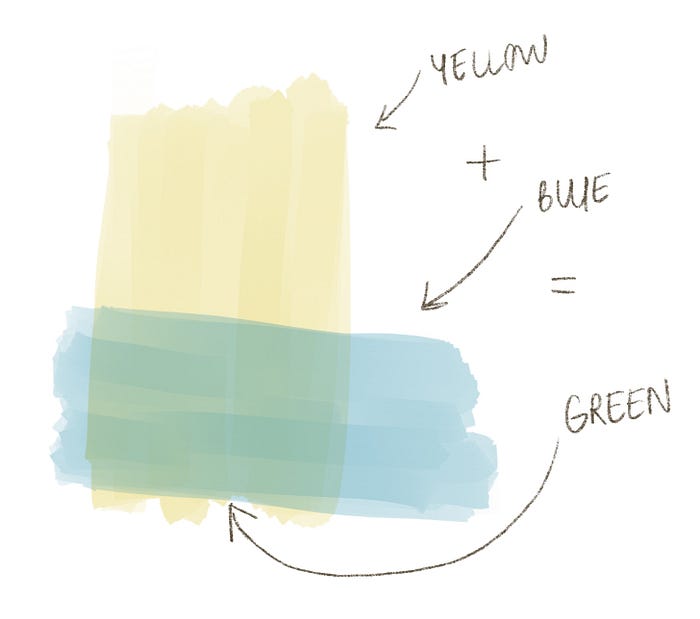
- Near each other on the colour wheel (so it’s easier to blend blue with green than it is to blend blue with orange)
Start off with just two colours. Lay the first colour down, then the second, making sure the overlap the first a bit. Then take the first colour again and gently blend it into the colour transition until it becomes smooth. This is a good technique for creating shaded areas and gradients, and can be done with a few different colours if you’re fast enough.

Another way to blend is to lay colours over each other entirely to create new colours.
Note: Keep in mind that the tips of light markers will be stained with darker colours. Make sure a tip is clean before applying it to your art by first drawing a few strokes on a piece of scrap paper until the colour comes out clean.
Using the Colourless Blender
Some brands of marker will also have a colourless blender available. These are markers with a colourless ink inside and can be used to soften transitions between colours or to lighten areas. To use it as a blending aid, simply colour it over the transition and let it dry. To lighten an area, apply the blender without rubbing too much and let dry.
Making Highlights
There are a few different ways to make highlights with markers —
- Using the colourless blender, as mentioned above (for a soft highlight)
- Coloured pencil (softly textured highlight, also good for glints and hard edges. Start light and layer as needed over the marker layer)
- Gel pen (good for opaque, small details. Just line or dot the pen over the marker layer where needed)
- Gouache (good for opaque and easier to apply to large areas, unlike gel pens. Goes over the marker layer)
- Alternatively, you can just leave the area uncoloured and let the white paper act as your highlight.
Note: Make sure your marker work is completely dry before putting any mixed media highlights over the top.
Layering with Other Media
You can layer other media on top of alcohol markers, but it won’t mix or dry very well the other way around (putting alcohol ink on top of other media). Here’s a list of other art materials that look great with markers:
- Coloured pencils
- Gel pens
- Gouache
- Graphite
- Acrylic
You can also experiment with surfaces like wood panels, canvas paper or even drafting film. Do keep in mind that rough surfaces (like unsanded panels or drafting film) will ruin a marker’s tip faster than smooth paper, and thick absorbent surfaces will soak up more ink, making you run out faster. This doesn’t mean that other materials aren’t worth making art on, but you should be mindful that it’s going to be more expensive to sustain an art practice on alternative materials.
Changing The Nib
When your nib is torn and fluffy and can’t draw crisp lines anymore, it’s time to change it. You can use a pair of tweezers to gently pull the nib out and push the new one in. It’s a very easy process, and if you don’t mind getting ink on your fingers you don’t actually have to use tweezers. Once the new nib is in, cap the marker and shake it a little so the new nib can soak up some ink.
Refilling The Ink
When the marker is drawing streaky, uneven lines, the ink is running dry and it’s time to refill it. Just as when you change the nib, use either a pair of tweezers or clean fingers to gently pull the nib out. Drop some ink into the barrel (the exact amount depends on the brand and marker line — when you’re buying markers, it should say how much to refill them on the brand’s website), replace the nib and cap the marker before shaking it a little.
Final Tips
- Since alcohol ink is dye-based, they aren’t lightfast and will fade, especially if stored or displayed in a sunny area or humid environment.
- If you want to have a copy of your work that will last a long time, remember to scan or photograph it. If you’re selling your work, let your buyers know the best ways to store the artwork (out of sunlight, away from moisture).
- If you’re just starting out, buy a few greyscale colours first to see if you like how they blend and work. When you start going into colours, pastel and lighter colours are easier to use and blend than darker colours.
- If you can’t find a colour your want, you can buy empty markers (not all brands will sell them, but Copic does) and inks to mix.
- Some brands (like Copic) make sure their colours are compatible across marker lines, so you can buy different sorts of marker bodies without having to worry about ink compatibility.
That’s It!
Good luck with your art adventures! I’ll be making a few other art-related guides in a series (learning pathways, graphite pencils, coloured pencils, etc) so leave a comment if there’s a particular art thing you’d like me to write about :)
*Note: I haven’t been paid to talk about Copic (since going digital, I actually don’t use them anymore at all). They’re one of the few alcohol markers I’m very familiar with, so that’s why there’s extra info on them (in addition to them being the most widely used, and what uni students are recommended to use). I did also like Letraset markers, but those have been discontinued for a while so I figured they weren’t worth writing about.