TV Guidelines: A quick kick-off on designing for Television Experiences

Just like designing a mobile app, designing a TV application can be a fun and complex thing to do, due to the numerous guidelines and best practices to follow. Bellow, I listed the main best practices to keep in mind when designing an app for a 10-foot screen.
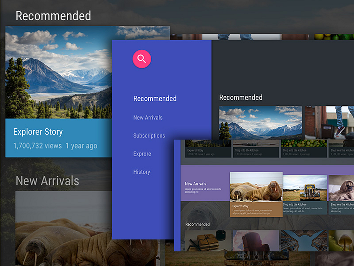
Project your design to monitor or TV
Just as you would always check your Mobile App on a mobile device, you should always check, or better, design directly on the TV to have a realistic perspective of your design.

Ambience
One thing you want to keep in mind is that you’re designing for a screen that gets a lot of light exposure during the day (sunlight can be an enemy here) and lots of contrast during the night. That being said, contrast and legibility are key factors to a TV UI. Make sure that while you’re designing, you always test the legibility of your fonts and color contrast.
A good thing is to change your monitor-TV position from time to time, so you can validate the contrast and legibility of your design according to the sunlight exposure.


TV Screens
Unlike portable computing devices, the television experience occurs across varying amounts of space and needs to be legible from ten feet away (distance). Make sure you keep this distance from your screen while checking the legibility of your UI.
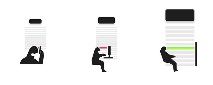
Resolution and viewing distance can make it difficult for people to process too much information. Try to keep your design clean, reduced to the simplest possible components. The amount of information displayed on a TV should be comparable to what you’d see on a mobile phone, rather than on a desktop.
Safe Areas
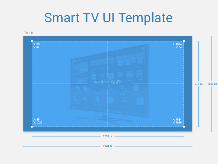
Due to overscan, not all TVs display content all the way to the edges of the screen, causing the edges to overflow off the visible screen area.
Google Android TV, Apple tvOS and Amazon Fire TV set different safe areas guidelines to avoid overscan, but they all keep at least a 5% margin to define a generally safe area.
Google and Amazon Fire TV guidelines suggest you keep the 5% margin into your TV screen designs to account for overscan area. On a 1920 x 1080 screen, this margin should be a minimum of 27 pixels from the top and bottom edges and a minimum of 48 pixels from the right and left edges of the picture.
Apple tvOS is a little more generous and suggests to keep an area spanning of 60 pixels from the top and bottom of the screen, and 90 pixels from the sides.

Preview colors on a real TV
TV screens have a higher contrast than computer screens, which can make colors seem more saturated, brighter, and vibrant. The color gamut (the range of colors that can be displayed) is also less than that of a PC screen. In your app, use less saturated colors. Cool colors (blue, purple, gray) work better than warmer colors (red, orange).
If your brand guide implies you to use a color palette that is making your colors seem more saturated and brighter, define a darker or lighter variation of your color palette to achieve a better balance between brightness and saturation.
Always test colors on an actual television to understand how your color choices translate to the big screen. If possible, preview your app on multiple TVs because colors can vary dramatically between television models.
Choose your type carefully
Google Android TV, Apple tvOS and Amazon Fire TV use different fonts as the system font. If you’re building for one specific platform, you can choose to use its system font as default. But if you want to use your own custom font, make sure they are legible at a distance.
Custom typefaces are supported all TVs, but can be tough to read at a distance, especially if they’re too thin. Unless your app has a compelling need for a custom font, such as for branding purposes or to create an immersive gaming experience, stick with the system fonts. If you do use a custom font, make sure it’s readable from across the room.
Documenting Interactions
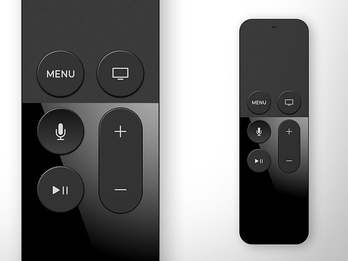
When it comes to documenting your interactions, doing it for a TV app can be a little bit tricky. Unlikely a touch screen, where users can only touch on its surface, on TV, users can do multiple actions over one object by pressing any of the remote control’s buttons, such as return, menu, go back and such.
The one way that I found very helpful and easy do document all the interactions possible to happen, was to detail above each artboard the correspondent action to the main navigation buttons. Apple tvOS, Android TV and Amazon Fire TV all have pretty slim and minimalist remote controls, keeping only the buttons that really matters.
Besides that, you can always create a reference folder containing some recordings of your favorite interactions to use as an inspiration. This works better if you can communicate those references within your development team and let them know when to use each one.


Specific Guidelines for each platform
As for any other platform, make sure you understand the guidelines for creating a TV app for Android TV, Apple tvOS and Amazon Fire TV. For all of those platforms, you can easily find Sketch templates to speed up your process. If you’re planning to have an app to run across multiple platforms, you wanna make sure you keep your app unique and consistent. I suggest you go through specific guidelines and best practices for image, font size and grid usage, and choose what better fits your product.
Design and User Experience Guidelines for Fire TV
tvOS Human Interface Guidelines
Designing for Android TV

Thanks for stopping by! :)