10 heuristic principles for mobile interfaces

Jakob Nielsen was consulting and teaching usability engineering in human-computer interactions when he began to pick up on a lot of patterns. So in 1994, he collected and released a set of evaluation principles for usability heuristics that reflected what he had learned. Today, after nearly 25 years and the transformation of the computer into a smartphone, Nielsen’s principles still stand strong.
Human-centered design amplified the importance of the user, and design processes have adapted accordingly; however, though Nielsen’s principles have remained universal across all screen types, with the continued rise in the use of mobile devices, the emphasis is on mobile interfaces.
Search the web for heuristic principles and a long list of slightly varied sets will populate. Below is a curated collection of ten principles that are inspired by human-centered design and usability thought leaders.
Usability Heuristics Begin with User Needs
Before jumping into the set of principles, it must be recognized that the importance of the user continues to grow. The redesign of GOV.UK, despite being a government website, is a prime example of a user-led product that gained global recognition for its usability.
Ben Terrett, design director of the project, began with a set of user interface design principles that ranged from product strategy to visual design approaches. The very first principle was like a north star to the success of the product: “Always start with user needs. If you don’t know what the user needs are, you won’t build the right thing. Do the research, analyze data, talk to users. Don’t make assumptions. Have empathy for users, and remember that what they ask for isn’t always what they need.”
Heuristic principles for usability evaluations help identify where a UI design is falling short of delivering a user-friendly experience.
#1 Transparency of System Structure
The act of making certain elements and structures visible so the user has a sufficient understanding of context.
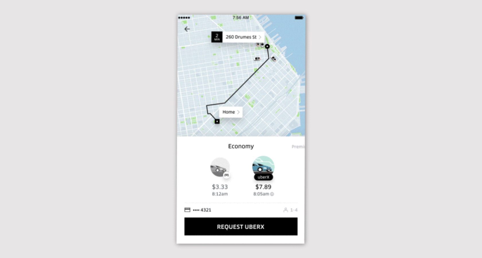
The UI should allow the user to believe they are in control. They should be able to easily answer these questions: “Where am I now?” and “Where can I go from here?” When a system is transparent, the user has the control to make decisions about what will happen next. They gain autonomy and subsequent confidence in using the interface.

#2 Immediacy of Action Feedback
The response to a user’s action that confirms the system has received the request.
Any user action should have an immediate interface reaction. Instant feedback reassures the user that the system is doing what’s expected. Nick Babich, a UX specialist at Smashing Magazine, uses the progress indicator as a good example of a clearly communicated status of an action. He argues it visually informs the user that their action has been accepted and the system will reveal the next action shortly. Without an indicator, the user is left with uncertainty and frustration that can lead to an interrupted journey.

#3 Awareness of Errors
A sufficient amount of information as well as options the user can take when they have gone down a path they’d rather not have taken.
At some point, users invariably interact with a mobile interface in a way that wasn’t intended and find themselves in a frustrating and unproductive situation that doesn’t support their needs. Barriers and dead ends are common reasons a journey ends prematurely. The UI should provide enough indicators to help the user recognize, diagnose, and recover from the error.
Assistance should always be easy to access; however, striking a balance is difficult. Too many options can cause cognitive overload. The user should have a clear understanding of how to solve an error and understand how to prevent it in the future.

#4 Flexibility of Use
An interface that can be intuitively and efficiently used by users with differing ranges of experience.
An interactive mobile experience must be independent of outside user guidance. Whether it’s the user’s first time with the mobile app or the hundredth, the interface should accommodate both scenarios.
A seasoned user should have access to shortcuts and deeper systemic understanding, while a new user should never be abandoned in simple confusion. With flexibility in the UI, the user can choose and control a journey that best suits their capabilities and needs.
Jill Gerhardt-Powal’s cognitive engineering principles advise designers to “provide multiple coding of data when appropriate — the system should provide data in varying formats and/or levels of detail in order to promote cognitive flexibility and satisfy user preferences.” An interface that is either overwhelming or restrictive will ensure a frustrating experience.

#5 Familiarity with Universal Experiences
Use of design elements that relate to common human experiences and expectations.
The history of GUI began when Apple used real-world references in the first user-friendly computer interface design. “Lisa” was designed with elements like a folder icon to indicate file organization. These physical references were useful when digital interactions were unfamiliar to most people, but with digital literacy on the rise, universal references no longer need to be so literal.
Common user expectations have developed as we spend more time interacting with screens. We expect a “+” to expand into more information, and a navigation menu to stay at either the top or bottom of a mobile screen. By tapping into references that the majority of users will understand, an interface becomes intuitive.

#6 Limitation of Information and Design Aesthetic
The creation of a minimal design eliminating unnecessary elements that could interfere with a streamlined and purposeful experience.
A general rule of thumb for all digital interactions is to eliminate confusion. In order to reduce decision time and error, Jill Gerhardt-Powal challenges designers to reduce uncertainty by displaying data in a manner that is clear and obvious. This can be achieved by removing unnecessary content and by using color, layout, and typography to lead a user through a screen. Users shouldn’t be distracted but provided with enough guidance to easily achieve their purpose.
Ben Terrett often used the fourth of GOV.UK’s design principles: “Do the hard work to make it simple.” He believed it is up to the design team to fully understand the issues they are dealing with, as well as the process leading to the best solution for providing an intuitive, informative, and successful user experience. Some of their methods are described in this case study.

#7 Prioritization of Function Over Form
Design decisions are driven by what an element is meant to do rather than prioritizing its visual style.
“If you think something is clever and sophisticated, beware — it is probably self-indulgence.” — Don Norman, prolific product designer and author of ‘The Design of Everyday Things’
The visual design of an interface should always begin with defined functions. When style and trends are prioritized, the outcome may look beautiful and draw a lot of attention, but can ultimately lead to a disjointed user experience. A visual form cannot save a dysfunctional design.
Visual cues can be used to direct a user in the app’s functionality. Fritt’s Law states that shape, spacing, and size can lead a user to understand a situation and take the desired action. It’s here that form supports and amplifies function.

#8 Availability of Information
The strategic placement of interface elements at users’ fingertips so they don’t have to rely on memory.
It’s easier to recognize something than recall it from memory. If a mobile interface function relies on a piece of information or the understanding of a system that isn’t universally familiar, the information should be accessible so the user can reference it easily.
One of Nielsen’s heuristic principles suggests the designer should “minimize the user’s memory load by making objects, actions, and options visible. The user should not have to remember information from one part of the dialogue to another. Instructions for use of the system should be visible or easily retrievable whenever appropriate.”
Jill Gerhardt-Powal suggests “bringing together lower level data into a higher level summation to reduce cognitive load.” She also states that “display names and labels should be context-dependent, which will improve recall and recognition.” It’s important to be aware that a user seeing an interface for the first time will not have the knowledge and familiarity with the information that the designers do. Repetition of information may seem excessive to a seasoned team but can be essential for new users.
#9 Reliability of Consistency
The use of consistent and standardized elements such as words, situations, and actions to create a cohesive experience.
Humans are drawn to patterns — we use them to make sense of the world. Make patterns within a mobile interface and it becomes a teaching tool for users to learn what to expect and how to interact with the interface design.
“This isn’t a straitjacket or a rule book. Every circumstance is different.” GOV.UK’s Design Principles state that an interface should be consistent, but not uniform. As Jill Gerhardt-Powal echoes, “New information should be presented within familiar frameworks (e.g., schemas, metaphors, everyday terms) so that information is easier to absorb.”
#10 Judicious Redundancy
The constant practice of reflection during the design process in order to ensure the user interface design principles and usability heuristics align with the product’s purpose and user needs.
Jakob Nielsen was the first to admit that it is impossible to present universal specifics for UI design. For instance, two of his heuristic principles could conceivably contradict each other — #6: provide all the information a user needs to make a decision and #8: eliminate anything unnecessary.
It is up to the heuristic evaluator and the design team to determine the best decisions for their unique use cases. If the product is human-centered and built around user needs, the team will be supported by knowing this, and have a strong sense of purpose in making those decisions.
Further reading:
Originally published at www.toptal.com.


