Member-only story
Hierarchy strips in user interfaces
Show that you understand the WHY of your visual work.

Presenting your work is essential on every stage of your design career. Whether you’re working with developers, clients, stakeholders or just trying to get your portfolio to have the most impact.
Presenting a digital product design on its own is often not enough. Sure — great work can defend itself, but that extra level of planning and thinking is what separates design from art.
UI Presentation
UI-oriented case studies often come with a similar set of elements that dates back to the print and brandbook times. Sure — we sometimes try to innovate, but are mostly relying on foundations set by a completely different industry.

And while it’s great to show all that in your UI case studies, there is definitely space to add more. Before we get to the hierarchy strips let’s add two other elements that are also necessary for the presentation to be comprehensive.

Grid, layout, spacing
We live in a world of soft-grids and flexible layouts now. UI design work is all about finding beauty and clarity within constraints.
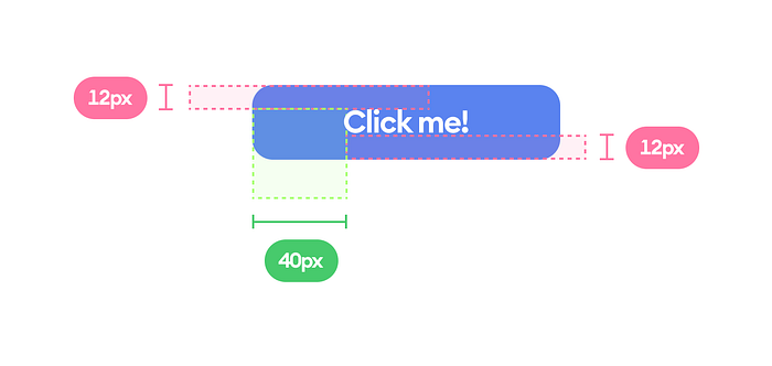
Consistent, planned spacing is what makes a screen design easier to scan, read and ultimately process. It’s what we should be aiming for. The spacing presentation has become rampant in the last year after I shared my blockframing grid designs, but a lot of it seems to be missing a crucial feature.
They usually look like this:

There are some issues with this approach. Arguably we should be using points not pixels to define our interfaces because we still do mix the vector with the raster.


