Hipmunk design system part 1: colors — a UX case study

It goes without question that color helps inform how we perceive the world. Color evokes certain emotions, guides actions, and helps inform expectations.
In web interfaces, we can use color to create and reinforce patterns. Through reusable patterns, we know that blue text often means a clickable link and red often means something went wrong. Back in 2016, Google was experimenting with new link colors which confused many users when it switched to black. The tech giant also experimented with a variety (over 40 in fact) of shades of blue in order to test clickability. When used correctly, color can help emphasize and guide actions within our products; however, it can also lead to complex interfaces if it is not used with consideration.
After performing an audit of our product, it became clear that there were few guiding principles as to how we used color to create patterns and emphasize actions. As teams grow and scale without a system in place, it becomes more difficult to build consistently. Often times, new colors get introduced for one-off cases, leading to an insurmountable amount of tech and design debt.
I wanted to start from the ground up creating a system to scale design and build a system with ample documentation and training so that we could build faster without breaking things.
We also want to be empathetic for the wide variety of how people see or don’t see color.
Our product should be accessible to everyone. Color should help reinforce patterns but not define them.

Getting Started
We kicked off our design system process with allocating time during our sprints to work on unifying, testing, and implementing a new color palette. Since colors affect all part of the system, we wanted to focus on thinking through this piece first.
We had an initial color palette in place that defined our brand but it was limited to 12 defined colors. It contained 4 primary blues, 4 shades of gray, and 4 accent colors.
I started looking into our code by running our site through CSSstats and matched them with our current color palette. I discovered that what we had in our initial style guide didn’t match what we saw in production.
Although we only had 12 colors defined in our style guide, CSSstats showed that we had 95 unique text colors and 103 unique background colors.
We began mapping all the colors we saw in production to what we had in our style guide. This allowed us to see variations in our colors and see how they mapped with our current style guide. We also searched our code base to see how each color was being used within our product. This allowed us to make more informed decisions later on.

Creating a new palette
Universal design and accessibility wasn’t a huge focus for Hipmunk; however, it’s something we want to design for in the new system.
We went through several rounds of reviews and testing to find the right number of colors and the right shades.
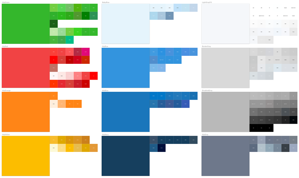
In the end, I took our base colors and expanded it into 10 stops. Each base color had 5 levels of tints and 4 levels of shades applied. It was a simple method that allowed us to hit the ground running. There are more systematic approaches to selecting colors based off of algorithms, but we wanted to move quickly and be flexible with our approach.
I tested each color for contrast and accessibility using Stark, a color-blind simulator and contrast checker for Sketch.

Naming convention
When performing the initial audit of how use used colors at Hipmunk, I discovered an inconsistent naming convention. We had colors defined by their actual colors such as $navyblue, $lightblue, and $bluegray. We also had them defined by their use case such as $bordergray, $alertred, $warningred, $warning_pink (yes we had several warning colors). There was absolutely no structure and it was clear that colors were being created for specific use cases. This lack of structure led to new variables being created for one-time use cases.

We opted to use a variation of an actual naming convention mixed with functional naming. Our base red became $hipred-500 with $hipred-50 being the lightest and $hipred-900 being the darkest. We started with 50 being our lightest so that we would follow a similar convention to how fonts are weighted.
We also started creating functional naming to map back to these colors when needed. We started creating variables such as $bordercolor to map back to our base colors. This helped our developers easily know which colors to use.
Staging up
After we defined our color palette we wanted to see how the overall color changes would affect our products. I received access to our GitHub and started the tedious work of defining the SASS variables and plugged away at doing a find and replace. I refactored over 3,000 lines of code moving static HEX values to use a variable defined in the new color system and converted the names to use a singular naming convention.
We then combed the entire site to see the reflected changes and allowed us to make minor adjustments as needed.
Deployment and Education
In preparation for deployment, we gathered as a team to review all the changes in our staging environment. We were able to test the changes across all platforms and devices to ensure nothing was broken.
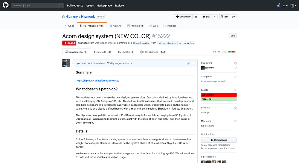
After extensive testing, I created a pull request and summarized the changes. Once the changes were deployed, I announced the update in our distribution lists and slack to educate and inform broader teams of the new change. We then scheduled training to walk through all the changes in depth with the front-end engineering team.
The entire process took one whole quarter to create the new color set, test, and implement.

Key Learnings
After completing this process for colors, I met with key stakeholders to discuss learnings and what we could do differently. This is what I learned:
- Roll out changes in smaller increments. It was difficult to do a PR review when 440 files have changed and over 3,000 lines of code needed review. Yikes!
- Communicate clearly. Communicate often. Gather as much feedback as possible in slack and in-person meetings during the whole process.
- Diversify your design system team. Be sure to include someone from each team that the design system might affect. This means front-end, design, marketing, mobile, etc.
What’s Next?
We took an iterative approach in order to move faster with limited resources. We wanted to get our code refactored and the front-end engineering team and the design team working with the same colors as soon as possible.
We will continue to refactor our code to build more efficiencies in our development process as well as continue tweaking our colors for greater accessibility.

