Horror Vacui, the fear of white space (UX Alphabet Series)
The UX Alphabet is a curated series of UX concepts and their descriptions. The goal of this series is to help readers gain a better understanding of terminology used in the field of UX and to help expand their knowledge.

“There is just too much white space.”
When I started out as a designer, as soon as I would hear this phrase, all time would come to a screeching halt. I would roll my eyes in disbelief. Yes, there would be some internal cursing and disbelief in what I had just heard. I would then begrudgingly appease the stakeholder by filling all the white space with unnecessary content and end up hating the design and my life. I would think to myself, there goes another design I can’t be proud of. Does this sound familiar?
You might have seen The Oatmeal comic, “How A Web Design Goes Straight To Hell”. It’s the one where a bright eyed designer is excited about redesigning a website. Slowly but surely the client keeps asking for minor changes that take the redesign straight to hell. “There is too much white space.” is just an indirect request that adds to the demise of the designer. What makes this a sad yet hilarious comic is that the statement about having too much white space usually is the precursor to a website going straight to hell. Other statements such as, “Can you make it pop?”, “Make the logo bigger”, and “I don’t like blue” all speed up the process of a design going to hell.
Fast forward to now and I approach the statement about having too much white space as an opportunity to educate stakeholders. As a designer it is our job to help others realize why white space is an important part of design and an important part of a great user experience.
“White space is to be regarded as an active element, not a passive background.” — Jan Tschichold
What is Horror Vacui?
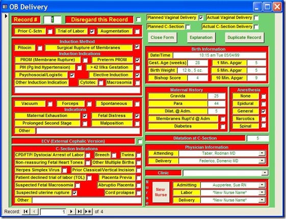
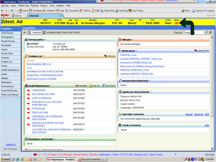
Horror Vacui, is Latin for fear of empty space. Mario Praz, an Italian born critic of art and literature coined the term to call out the cluttered art of the Victorian era. In those times having more, meant affluence, so every little space was stuffed with details.
Now, the term has become the norm in the design fields such as interior design, print design, and digital design.
Examples of Horror Vacui


What is White space?
White space, also known as negative space, is a fundamental part of design. White space also doesn’t even have to be white color. Any color can be used to get the same effect as the white color. White space is a tool designers use to carefully layout content and craft their message. It is the space between the content, lines of text, graphics, figures, icons, and objects.

Types of White space:
- Micro White space
The white space between lines of text and within grids, etc. This white space helps legibility and readability of content. - Macro White space
The white space between major elements on a page. For example, the left and right columns of this Medium page
Importance of White space
- It improves readability
- It adds emphasis
- It clarifies relationships
- It implies sophistication
Effective use of white space emphasizes key concepts, improves comprehension (up to 20%) and reduces cognitive overload. Source
How to respond to the statement: “There is just too much white space.”

Client: There is just too much white space on the home page.
Your response: The users of your website are looking for specific information. If we add too much non-essential information, it will distract them and they may not find what they came to your site for. There is a concept called Hick’s Law. It states that the more options that are presented to the user, the more time it will take them to make a decision.
Stakeholder: There is just too much white space on the product page.

Your response: The goal of this page is to increase sales of your product. Users tend to prefer simple over the complex. They want to understand things quickly so presenting them with easy to understand content and images will help them grasp the usefulness of this product. The philosophical idea called Occam’s Razor states simply that among competing ideas, the one which is simpler should be selected. We can apply this idea to design by saying that a simpler layout is better than a layout with a lot of complexity.

Client: “There is just too much white space on the on the product dashboard.”
Your response: The goal of this page is to provide critical information to the user so they can take appropriate actions. Users want the information that is most relevant for them to complete their tasks. Stuffing the dashboard with extra content (noise) will reduce the effectiveness of the dashboard. The concept of Signal-To-Noise ratio points out the need to remove all the unnecessary information, reduce the noise, and make the essential information, the signal, be clearly visible.

Client: There is just too much white space on the features page.
Your response: The goal of this page is to help users understand the features of the page in a clear and easy way. Users want to find the features that are important for them. The Flexibility-Usability tradeoff concept states that there has to be a balance between how wide of an audience (flexibility) the information addresses and how usable it is for a specific audience (usability). Understanding who the user is will help create a more targeted features page and prevent too much information from being displayed.

Client: There is just too much white space on the sign-up form.
Your response: The goal of the sign up form is to help users provide information required for signing up for the product. There are many fields that are required before the account setup can be completed. Users want to start using your product as soon as possible. They don’t want to be overwhelmed by large scrolling forms.
Conclusion
Now that you know about Horror Vacui, the fear of white space, and how to respond to the statement “There is too much white space,” you can educate people about the importance of white space instead of getting frustrated. As the great Mike Monteiro says and even one of his books is titled, Design is a job. It is our responsibility as designers to make sure we guide and educate stakeholders, clients, and team members on the importance of white space.
Now it’s your turn.
How do you respond when stakeholders tell you, “there is too much white space”?

Rizwan wrote this story to share knowledge and help nurture the design community. All articles published on uxdesign.cc follow that same philosophy.


