Houston we have a problem: My design file is a mess

Let’s imagine for a moment you have a new project, an exciting challenge from an industry you enjoy with all the right tools at your hand and great teammates by your side, but it requires you to continue working on a design that someone else already established long ago, which is not a bad thing since the design is amazing, so it’ll be a blast.
The first few days are all about learning how things are going to work, a quick onboarding from the previous designer because he’s already working on another project and getting inspired to create new features.
So what do you do right after the onboarding?
Of course, open up the design file.
But you’re not prepared for this.
The screens are all over the place, dozens of them, with multiple pages of the different stages of approval, using a screen resolution that doesn’t seem familiar, all the colors are different and the style guide you were hoping for, is nowhere to be seen.

You’re just one week away from the first presentation with the stakeholders, so there’s a limited amount of time to learn how to use the file, gather assets for any new screen and start putting your ideas in place, but deep down you feel filthy just by looking at it.

The design file is a mess, but could that have been prevented? If so, how? You’ve come to the right place! Today we’ll learn five key components that will prevent your file from becoming the mayhem no one wants to use.
1. Global styles
What’s the very first thing I do on a design file? It is not a wireframe, nor the grid or even choosing a frame resolution. I set up global color and text styles. Why? because those are the elements less likely to change as the project moves forward.
Establishing styles as soon as possible will allow you to use them whenever is needed, and make any adjustment in the future an easy task, rather than going over every screen and component using them and manually change it.

Pro tip:
Create a type scale with only the styles you’ll truly need, and try not to turn your color palette into Fifty Shades of Grey. Take the pros as an example: Airbnb has just seven text styles, and Slack went from having 136 colors to only sixteen. Less is more.


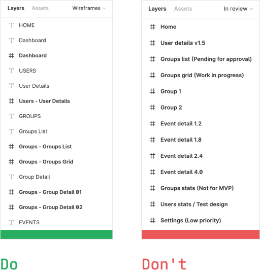
2. Content structure
Think of it as a map. If you can find your way around, how will you have a pleasant trip? The same logic applies here.
Set up your pages and content in a way that makes it easy for any guest user to find exactly the screen or component they’re looking for, just like designing navigation for the users to reach their desired content, even if it’s their first time in there.


Pro tip:
Define your file pages depending on the content each type of user will require: Do you have stakeholders that only look for designs pending to be approved? Use a “Work in progress” page. Does the QA look for component states that are not visible on the final mockups? Add a style guide only page.
If they can find everything they need on a single page then go for it, there’s no need for them to hunt information when they can easily find it all in one place. Just be careful about turning your file into a whole book with the number of pages it can contain.

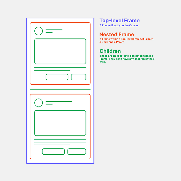
3. Layer hierarchy
Ever since the age of Photoshop, there’s a stereotype about design layers being poorly organized. I mean, as long as the content is inside the frame or artboard it should be enough, right? Sorry to break it to you, but no.
First of all, arrange the frames on the layer panel in the same order you expect the user to read the screen frames on the canvas: From top to bottom and left to right, just like a book and its index. As you dive deeper into the design file you’ll discover that it is useful to find the layers grouped and nested consistently, depending on the hierarchy of the content visible on the screen, with the foreground components at the top of the list and the background content groups at the very bottom.
Pro tip:
Add a prefix to each screen frame depending on the module or section it belongs to, and match this with a text label on the canvas. It won’t matter if the user is more visual-oriented or prefers an index, they’ll find their way to the screens very easily.
4. Reusable components/symbols
Let’s go back to the horror story for a minute. The stakeholder asks for an icon change on the bottom navigation bar, which is used in fifty or so screens. But upon close inspection, you realize those components are not linked in any way, they were just copy+pasted from the original screen where it was created, so you’ll have to change the icon one by one.
Yes, you heard me right: One. By. ONE.
That doesn’t spark joy, does it?
Having reusable components allows you to create things only once and next time you need a change it’ll automagically update the rest of your file, without having to painstakingly change things manually and therefore save you a lot of time, just like global styles.

Pro tip:
Figma allows you to create nested components, placing one or more instances of other components to create a new one, like building with legos, and then update them individually to affect only the components using those instances.
You can read more about nested components with this nifty Figma guide:
https://www.figma.com/best-practices/component-architecture/
5. Naming conventions
And last, but surely not least: Name your layers and components properly. Without this, developers and designers will have to click several times until they find that “Rectangle 1” is the background of the card, “Rectangle 10” is the header image and “Rectangle 24” is an unused shape that got hidden at some point.
A naming convention is essentially a naming pattern that describes the content of a certain object, in a general-to-specific order. A standard sequence would be something like this:

Why is it useful? Because not only it gives you a context of the content, it also serves as a template for development variables, and in turn, create a shared language.
Pro tip:
Use nested frames to keep your instances named in the same way their master component does and enable an easy instance switching, while also giving your developers the right naming convention for their variables: button/primary/hover instance inside the btn_primary_hover frame.

Next time you’re building a new file think about your future users: fellow designers, developers, solution architects, QAs, PMs, and stakeholders. The easier they understand how to read your file, the faster your designs will get approved and developed, so remember to be empathetic and look for improvements whenever possible.
In a collaborative environment, you’re not creating a design file for yourself, it is for everyone else on your team.
You’ll thank me later, because your teammates will thank you first.

