How and why I redesign my portfolio every year
Lessons learned over six iterations of annual portfolio redesign.

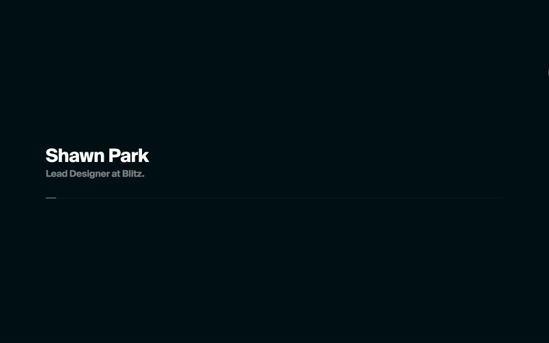
I just pushed the sixth iteration of my portfolio, which builds on from last year’s Korea theme. You can check it out here.
I made my very first portfolio website in 2013. Since then, I’ve pushed myself to redesign my portfolio every summer, looking back on the lessons, documenting new projects, and applying new skills.
Yes, it’s a lot of work — I spend an entire summer for each portfolio redesign. But the fruit of the labor is definitely sweet. I can definitely say annual portfolio redesign is one of the major reasons why I grew so much as a designer in the past five years, and I’d highly encourage other designers to give it a try as well. Here are the why, how, and the lessons I’ve learned over the course of my six years of annual portfolio redesign.

The Why
1. To reflect on what I’ve learned in the past year.
I learn so many new things each year, from new tech and design skills to even how I approach product design process. I then apply these learnings to my annual portfolio redesign. In the last year’s redesign, for example, I used React.js, which was my biggest learning from the year before. Using React makes it super easy to reuse commonly used components like carousels, keeping the code more modular and maintaining the user experience consistent across the site.

2. To update what I’ve been working on.
Every year, I keep my portfolio updated with new projects from work, freelance, and side projects. This is important especially because I work at a fast-changing startup, Blitz. Blitz has changed its focus from a mobile news app (2016) and an esports publication (2017) to a desktop gaming insights app (2018). That’s why it’s important to keep my portfolio updated, in order to document my journey at Blitz and create a best representation of where I am at in my career.

3. To get creative without constraints.
Working on my portfolio redesign is one of the rare opportunities where I can be 100% creative with my work. It’s my website— I am the only stakeholder in this project. As such, I can focus on creating a design that’s unique to myself and try something unconventional without worrying about the opinions of the stakeholders. Sometimes as a product designer, you resort to conventional, safe methodologies as you design interfaces that meet the business and product goals. That’s why you should still dedicate some time to flex your creative muscle, and working on your portfolio is a perfect workout.

The How
Evaluation
I kicked off this year’s design by first evaluating what worked and didn’t work in the previous version:
The Good
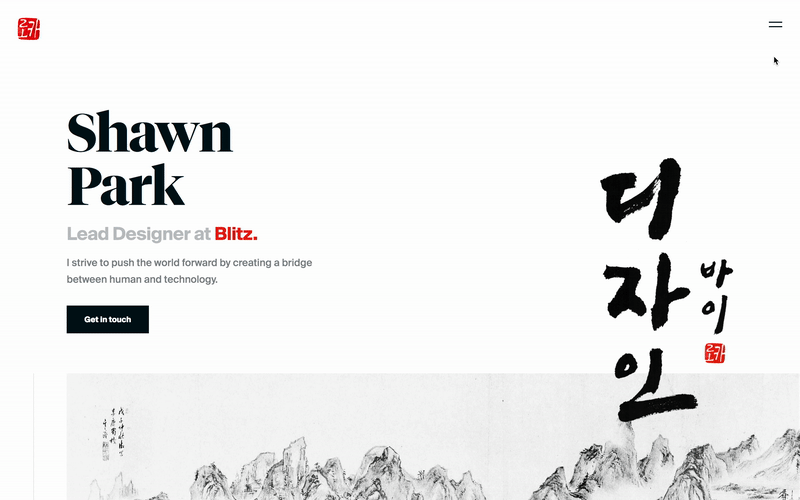
- Theme: It was something unique to myself, embracing and conveying my Korean identity by getting inspirations from Korean art.
- Depth of case study: Case studies were super thorough and in-depth, documenting the process and rationale behind the design decisions.
- React.js: Using react.js made it super easy for me to create reusable, scalable components like carousels and thumbnail series for case studies.
The Bad
- Navigation didn’t work as intended: I had originally wanted people to click on one of the featured case studies — Blitz and Box — but it turned out the number one most visited page was about page.
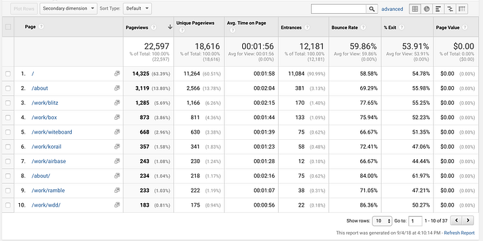
- Case studies don’t speak for itself: There was way too much text for case studies. Most people spent less than 2 minutes on each case study, just glancing at the thumbnails.
- Visual polish: It turned out the web font for Neue Haas Unica didn’t render properly on the live website, ending up with much larger kerning than intended. The spacing could’ve been more generous as well, since I am designing a portfolio website catered towards design-savvy audience, not a functional app.
Approach
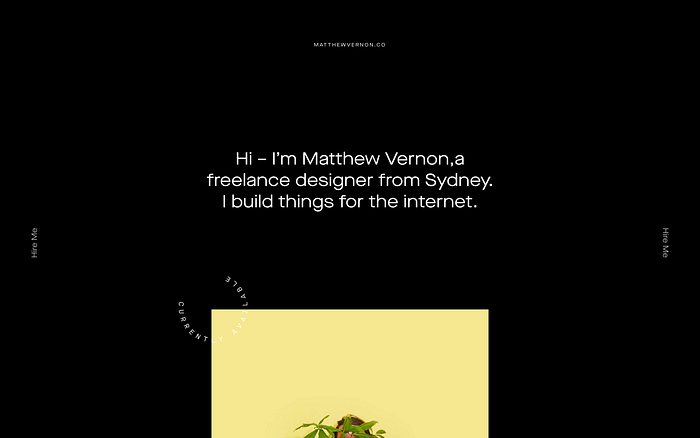
From the evaluations, I kept the theme Korea, but redesigned the website from the ground up. The goal for this year was to answer the question “How can I build on from last year’s Korea theme to be as perfect as possible?”
Improved Navigation
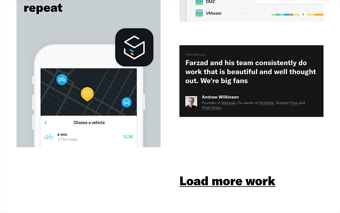
I went for a menu drawer (hamburger) instead of a sticky tab navigation to minimize distraction from the content and deemphasize the about page. I also placed a much stronger emphasis on the featured projects — Blitz, Box, and Witeboard — to get more people to land on those case studies.
Let the work speak for itself
Each case study now has larger thumbnails with captions instead of long blurbs of paragraphs. If the work itself is good, there’s no need to describe the role of each interface element in detail.
It’s ok to be a little bold.
There’s now more generous spacing, wider gutter, and more meticulous attention to typography all around. Remember that I’m designing a portfolio site mostly for design-savvy people, not a functional app for people in 50’s. It’s ok to get a little crazy.
You can check out the 6th redesign of my portfolio site here.
Tips and Lessons
1. Make it unique to yourself
Take a moment to think about how you can make your portfolio website unique to yourself. In particular, the header of your home page above the fold is the area where you can be 100% you and land a striking first impression. Don’t be basic and just write “I’m John Smith. Product Designer at Facebook” in Helvetica or Noe Display. Think about what makes you unique — you could use your cultural heritage, or maybe your background, like a physicist that became a designer — as an inspiration for your design direction.
2. It needs to serve a purpose.
You should still treat your portfolio just like any other product — you should think about who’s your audience and define the goals of your website. Depending on the audience and the goal, you should think about:
- What do you want to get out of your website? Maybe you want to land a job. Maybe you just want to have some fun. Depending on your goal, you should balance out how much you want to focus on function vs. form.
- What’s one page you really want your users to see? Your navigation should optimize for landing the users on that page.
- What do you want your users to do after they have explored your site? You should probably have a strong call to action, especially in header and footer.
3. But it’s ok to get crazy.
At the same time, remember that you are designing a portfolio website, not an app or a promotional site for your company. Your audience will most likely be a bunch of techies who are looking at your work on a giant 27" monitor in 1920x1080 screen res (this is true story from metrics from my portfolio site.) You have room to be generous with spacing, go bold with typography, and try something eccentric. Don’t be afraid to sacrifice just a bit of usability for a touch of delight and personality. This is one of the few cases where you can and should be really yourself when it comes to design.
4. Let your work speak for itself.
“Show, Don’t tell.” — this is the rule of thumb you should be following when it comes to case studies. You should still describe your design process and the rationale behind your design decisions in detail. But you shouldn’t go so in depth to the point where you are explaining every pixel and end up writing an essay. Keep your writing to a minimum and try to prove your point with your design comps. Make sure your thumbs are large enough (either container width or full screen) and keep it distraction-free. If your work is good, it wouldn’t require an in-depth explanation. It should speak for itself.

5. Be selective about your work.
Make sure you curate your best works, which should be no more than three. Having too many case studies will distract your visitors from exploring your best works. Spend time thinking about how you can optimize your navigation to land your visitors to your best works, and make sure case studies for those best works are thorough enough. It’s also important to show a wide breadth of work from multiple categories (consumer, enterprise, fintech, gaming, etc) and multiple platforms (mobile, desktop, web, marketing website, etc). It might be good to have 1–3 featured projects, which are your best works to date, and 3–4 other projects just to show you have worked on projects from wide range of audiences and platforms.
Last but not least, have fun.
When I was a kid, I used to spend days and nights just working on my personal website in HTML because it was fun creating an online presence of myself. Sure, I wouldn’t count them as my “professional portfolio,” but that same passion from childhood is what drives me to work on my portfolio today. It never feels like work. It’s just another hobby of mine like games, and that mindset allows me to get more creative when designing my site.
That’s why I want to end this post with the last piece of tip — have fun. I’ve met so many designers who are stressed over building their portfolios, and that’s a perfect recipe for a designer’s block. This is your chance to be 100% you — unlimited room for creativity and expression. You can take as much time as you want, use whatever tech you want, and design however you want. Seriously, you don’t get opportunities like this often (if ever). Enjoy it.
As I finish this year’s redesign, I’m already excited to think about what directions I want to take for next year’s redesign. I can’t wait to see how much I’d grow as a designer in the next years to come, and share my new portfolio with everyone each year.
Special thanks to Kevin Gutowski, Sagar Shah, and Jeremy Blalock for always providing me with awesome design critiques, and to my potato for giving me motivations to push myself to limits.