Member-only story
One trick Apple uses to make you think green bubbles are “gross”
A brilliant trick you should probably never use.
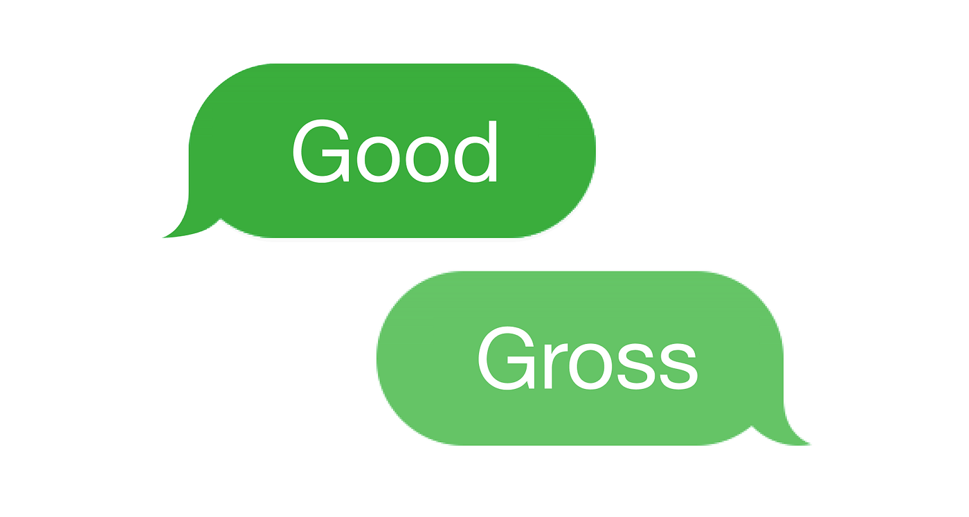
To make sure iPhone users don’t expect iMessage-only features when texting Android users, Apple marks the chat bubbles in blue (“you are texting someone with iMessage”) and green (“you are texting someone without iMessage”). This segmentation has then evolved into discrimination against green bubbles, especially among young smartphone users in the U.S¹.
Why is green worse the blue?
The answer is color contrast
The blue Apple picked for the iMessage bubbles provides a better color contrast against the white text on it compared to the green Apple picked for the Android bubbles. In other words, since text is white, likely Apple picked a darker blue but a lighter green to purposefully make the iMessage text more readable.
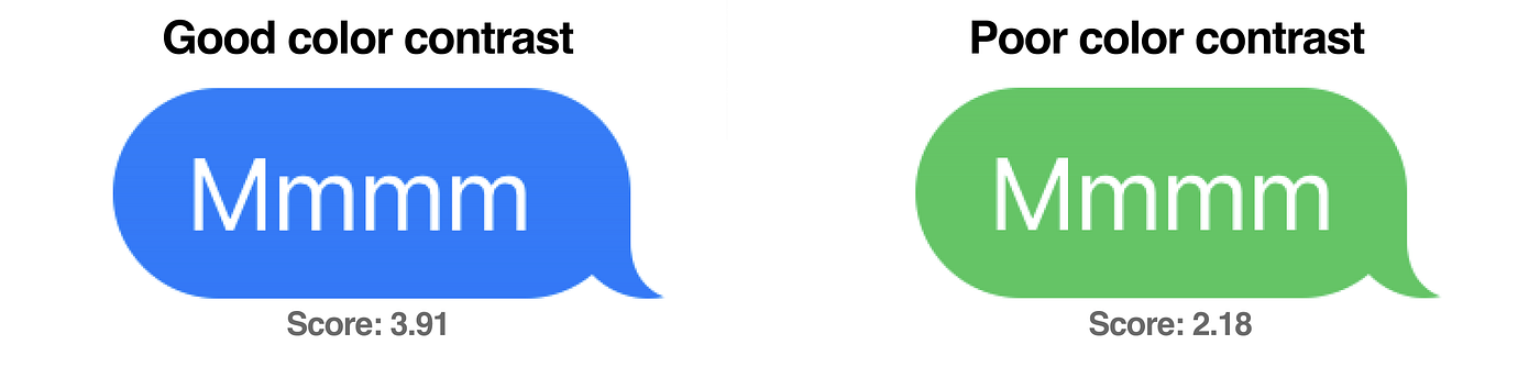
To be clear, it is not that green is gross. It is the low color contrast of the green Apple picked and used against white text is gross.
Color contrast is important because it impacts legibility, and…