UX Collective

We believe designers are thinkers as much as they are makers. https://linktr.ee/uxc

Follow publication

How bullet charts taught me about the importance of layering

Modern data visualizations are often a great way to review design fundamentals.

Kai Wong
UX Collective
Published in
6 min readJun 12, 2021

A computer generated image of several layers floating on top of one another going from blue to red in a gradient.
Photo by Clark Van Der Beken on Unsplash

One of the most interesting things that I’ve found is that working with advanced visualizations often requires a sharper design eye.

While bar and line charts have been around for decades, there may sometimes be situations where a different (and newer) visualization is more suitable.

In these situations, I’ve found that my design fundamentals have been tested, as this often involves taking multiple types of data and encoding it into a single visual. And to illustrate this, let’s talk about a chart that’s emerged in the modern day: bullet charts.

Bullet charts: combining quantitative and qualitative data

If you were asked to combine qualitative and quantitative data into a single visual, what might you do? One of the most common methods of this is to make use of what’s called an annotation layer.

This was a term coined by Amanda Cox at the New York Times to talk about adding text annotations to a graph to give more context or perhaps more qualitative insight.

A bar chart ranging from 5 to -5 is going from left to right with 20 bars. A specific area is highlighted ranging from 1.5 to -2 with a text annotation that says “This changed occurred because…”
An annotation layer over a bar graph

However, what if you didn’t have space to do that, like creating a dashboard? In that case, one thing that you could do is make use of what’s called a Bullet chart. The bullet chart, created by Stephen Few, seeks to encode quantitative and qualitative metrics in a single visualization through smart use of layers.

And it’s main use is to provide the context necessary to interpret data without relying on clunky meters or gauges that sometimes populate dashboards.
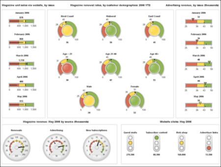
A dashboard that has way too many gauges and meters on it. 10 different stacked bar charts are on the left and right, with colors ranging from red, yellow, and green. Circular gauges are in the middle ranging from red to green, and more circular gauges with numbers are on the bottom left. There are what look to be stop lights ranging from green to red on the bottom right.
https://www.juiceanalytics.com/writing/ultimate-business-driving-machine

While it’s not necessarily the easiest thing for audiences to understand at first, once they learn how to read them, it can provide a wealth of knowledge that provides all of the necessary contexts at a…

Create an account to read the full story.

The author made this story available to Medium members only.
If you’re new to Medium, create a new account to read this story on us.

Or, continue in mobile web

Already have an account? Sign in

Written by Kai Wong

7xTop writer in UX Design. UX, Data Viz, and Data. Author of Data-Informed UX Design: https://tinyurl.com/2p83hkav. Substack: https://dataanddesign.substack.com

Responses (2)

Write a response

Super interesting, this is the first time I’ve seen a bullet chart. I can see it being useful in scenarios where you need an efficient way to visualize your data. Thank you for sharing!

--

This is awesome! Hadn’t used or seen bullet charts in a while, but I love them and hope they proliferate further. Thanks for the great write up, agreed you can learn a lot about graphic/UI/etc. design from working on data visualization systems.

--