How can you make UX research insights visible, traceable, and fun?
A case study from my recent explorations with Miro.

Research analysis and synthesis can be quite extensive and energy-draining steps within the UXR process. Yet both are key to distilling relevant actionable outcomes for dissemination, if you are navigating a fast-paced, disruptive professional reality like Glovo - where ‘GAS’ is one of the driving values - your UXR process should have quality, speed, and pragmatism in good balance.
So I have been wondering: How can I make these process milestones more structured, targeted to what truly matters, and — why not — a bit more fun too?
While working remotely with my fellow researchers, designers, and stakeholders in Glovo, I have been exploring ways to document my work systematically and time effectively, leveraging Miro. This approach helped me speed up my analysis/synthesis process in a way that felt smoother, more enjoyable, and giving me a sense of control all along. Digital tools can help you a long way! In this article, I aim to share my process and its benefits, as an inspiration for other professionals juggling remote dynamics these days.
Step 1) Create a script-inspired custom template

The first step is to lay the foundation of your analysis by creating a simple yet complete template in Miro, to be used for each user session. It should be in line with your research objectives: the key sections and/or tasks composing your interview/usability test script should correspond to mirrored areas in the Miro. By embracing a clear consistency standard for yourself (and the ones you are collaborating with) to apply in each user session, you’ll never lose sight of what really matters — your research questions.
#Tip - Take advantage of colour coding
In the case of small/medium qualitative studies with 5 to 10 users, assigning one unique colour to each participant helps you to trace back faster your data. Whenever wondering about the context of a certain statement or behaviour, the colour of the post-it can lead you back in a second to the whole picture.

In case of more extensive projects above 15 users, I recommend using one colour per target group instead, when possible. Miro allows a maximum of 16 post-it colours and nonetheless, it’ll make your framework more manageable.

Case study
We recently moderated 20 usability tests, in collaboration with one of my fellow UX Researchers: 10 sessions in Spain and 10 in Ukraine, in parallel, with two target groups per country. In this case, I chose 4 colours guiding my process in Miro: 2 colours to identify the countries, and 2 gradings of the same colours to respectively identify the target groups. These visual details made it easier and logical for me to digest the data, however, you might find other tricks of greater help: whatever works for you, try to go for the simplest, most intuitive combination easing your work.

Step 2) Fill in the template for each user session
Make sure to transcribe the relevant data into your template, either right after every session when still fresh in your mind or simultaneously by one of your collaborators. In case you are lucky to have multiple observers taking notes during the session, try to schedule a debrief and approach the filling in of the template collaboratively: 4 or 6 eyes and ears, are certainly better than 2!

If you have structured your template well enough, it’ll be a matter of filling in the blanks quite systematically, no brainers. The template will help you screen what should be in (relevant for the study) and what to leave out or to address as secondary (extra, bonus findings). To prevent from rewatching videos extensively to check on specific behaviours and/or capture additional quotes, add strategic reminders into the template in the first place to keep the focus.
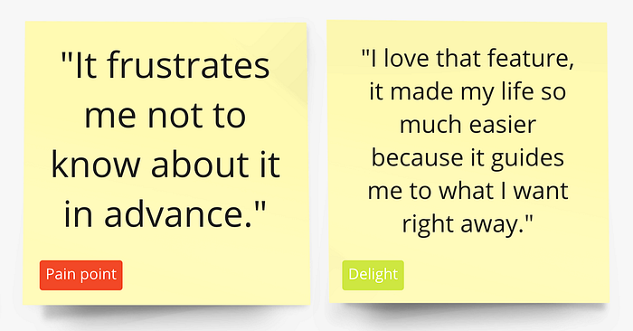
#Tip — Flag key drivers with emojis and/or tags
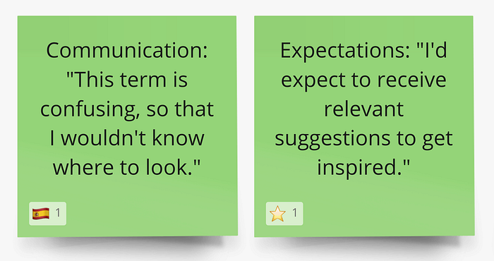
Aside from colour-coded post-its, research nuances can be further highlighted, if relevant, to make each piece of data able to stand alone once detached from its original template. Miro allows you to put a spotlight on any criteria/driver of your interest (age; city; behaviour etc.) via emojis or tags. Emojis are a subtle, fun yet visible additional touch to mark the post-its for visual reference. Tags, on the other end, hold the benefit to be retrievable via the Miro search function.
Case study
In one of her fast-paced UXR projects with 5 users in Spain, my colleague Mariana Itza de Miguel leveraged Miro to transcribe key data and used a more granular template set-up like the one below. She added extra rectangular post-its as a way to classify data even more while filling in the template. This example is just to show the variety of tweaks and ad hoc adjustments that can be explored to match your specific challenges and personal work styles. Test out variations and simply iterate upon them for optimal results!
Step 3) Clusterise and extract valuable insights
As the last step after performing all user sessions and transcribing key output consistently into the templates, it’s the actual analysis and spotting of themes and patterns. As we know, sometimes conclusions are clearer, others require more granular decoding and reframing before you are confidently able to synthesise the insights uncovering a path forward.
Depending on the study type, I either read through the templates per topic scanning every one of them in that specific section, or I take post-its out from the template and create visual clusters. You can approach this in multiple ways, but certainly, the template will already clarify which ones are the relevant clusters to consider. And here you are, ready for dissemination!

#Tip — Miro as a dissemination tool
Whatever dissemination format, media or channel you intend to leverage, it’s good to remember about Miro as a potential asset on the matter. Depending on your audience and the purpose of your presentation, you can arrange your clustered synthesis board with a suitable content hierarchy and data density. Also, Miro allows displaying portions of the board like a slide show and you can link user session videos to the board if you like.
Case study
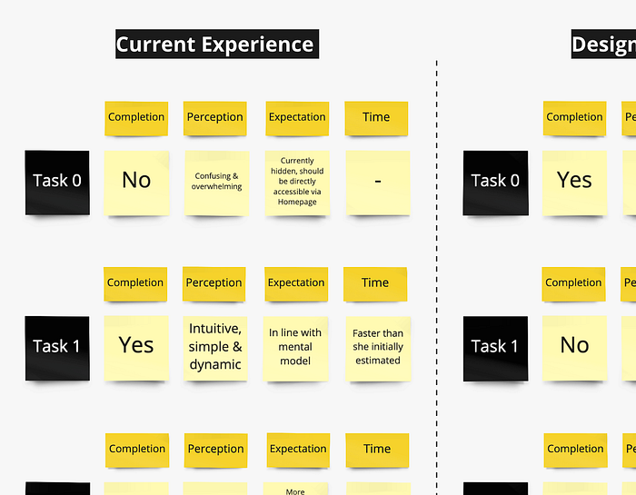
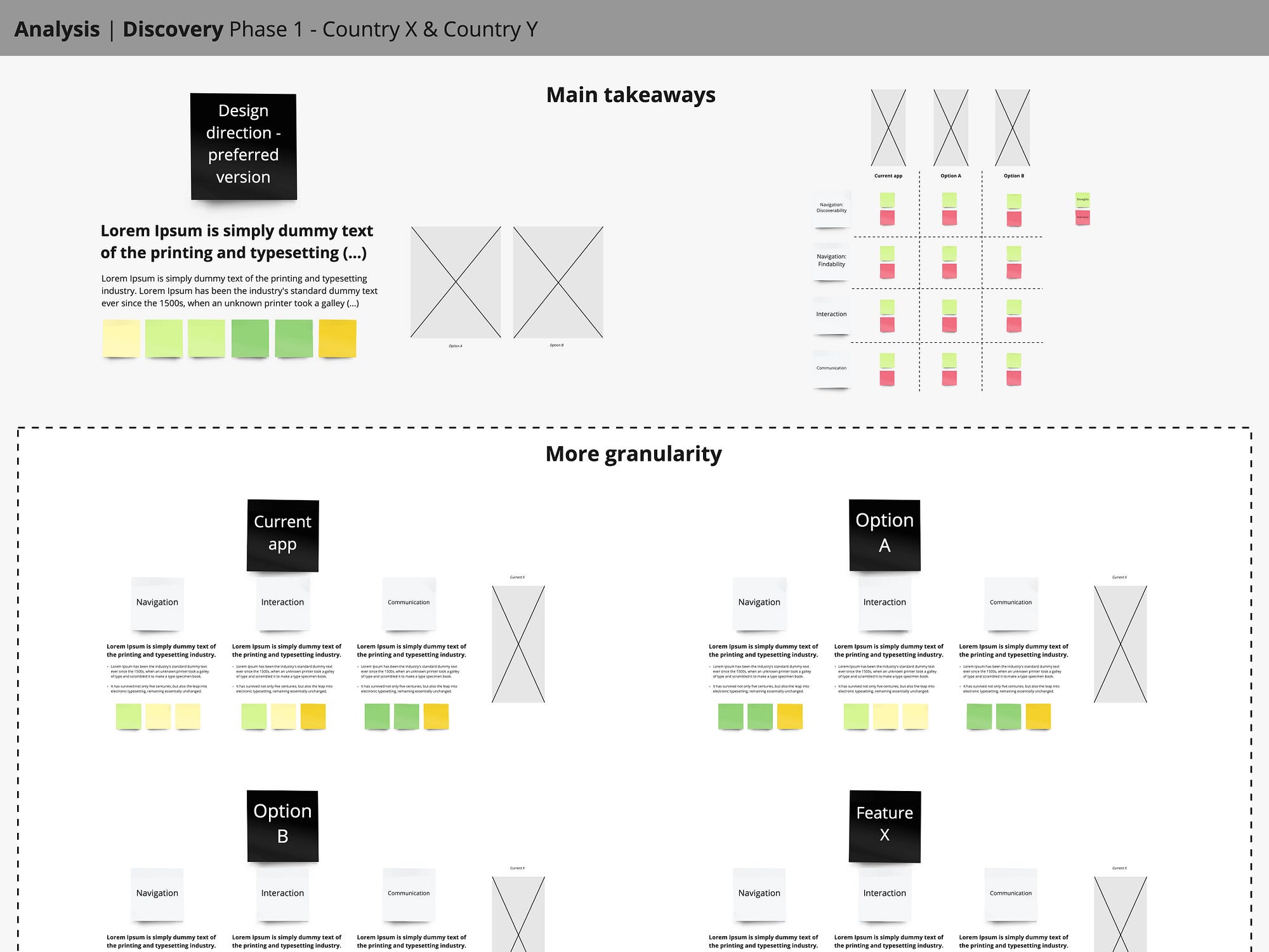
As part of a large project split into two phases — discovery and validation — I found myself juggling a tight presentation deadline where I was supposed to report on the discovery results, to inform the pre-validation work for the design team to pursue. Using Miro as a presentation tool has been a great time saver preventing me from compromising the due attention on data analysis. No need to switch to a formal report: I had all I needed in one place, from user session outcomes plotted out on a side to the actual synthesised results.
What worked for me was separating key information at the top enlightening a direction in just 10 mins, and more granularity at the bottom to access more context if needed. Sharing the link of the board is a good practice to give your audience the optional chance to dig deeper if wished, before or after. Here below is an example of the structure I tested, for reference.
Framework benefits
- Reminds you of the purpose all along: By selecting the key sections to include in the template, the study foundation is laid and so a funnelled approach to analysis/synthesis that clearly targets the research questions.
- Enhances systematic consistency: By applying the same lean transcription framework to every user session, quality standards are more likely to be met, especially when collaborating with others.
- Promotes visibility & collaboration: By building up the study on the board, easily shareable via a link, the whole team can asynchronously track progress for improved remote alignment and collaboration.
- Democratises UXR: By making each research step transparent and open for others to follow, the whole team can get educated and trained to understand UXR value from the very start to the end.
- Allows immediate action & traceability: By leveraging tagging systems, users’ input can easily be tracked to the source, and the board can serve as a dissemination tool of ongoing progress and final results giving you a greater sense of data wholeness and control.
I hope my explorations in Miro will spark your curiosity over testing a wider range of digital tools in UX Research. If you like, I’d love to hear your thoughts on the subject, tips, and case studies in the comments below!
Other readings on the topic:
Thanks for reading! 💛 If you have feedback to share, feel free to say hello 👋🏽


