Member-only story
How Canva reduces trial cancellation
A round of applause for personalisation, transparency & trust
Get these a week early at growthdives.com ✨
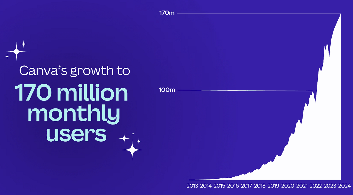
The eye-watering numbers just keep coming in for Canva.
Last year, it hit 15 billion designs published.
This year, it hit 185 million monthly users.
After focusing on the creative industries in the early years, Canva went after some new segments to drive their insane growth curve:
- Launched Canva for Education in 2019: now used by over 70 million teachers and students (for free)
- Non-profit: 500,000 non profits create designs on Canva (for free)
- Launching Canva Teams in 2022: now 9 out of 10 Fortune 500 companies use Canva 🫨🫨🫨 with sales to enterprises increasing 48% in 2023
- Launching Canva Enterprise in 2024: their largest contracts are now in the $1 million+ range, fulled by better security features & more
As well as new segments, Canva’s going after new markets 🇺🇸🇺🇸🇺🇸
This year and last they’re pushing big in the US.
In Jan this year, they published the article ‘Celebrating Canva’s growth in the US’, in which they say that ‘the US is now one of our biggest markets’, with 20% of their 2023 designs created on the platform being creating in the US.
What next?
Well there’s quite a lot actually.
Apparently Canva are ‘only 1% there’.
🥴
There’s now a “Hollywood work kit” as Canva goes after the film industries (think creating storyboards and movie posters in half the time).
There’s also courses, an increasing number of AI features, bulk creators (that can create 1000s of creatives from CSVs), Loom-like recordings and more.
What a wild ride.
And even so in the last 5 months since I last covered Canva.