Member-only story
How Data Visualization helps you understand your UX research results
Intimidated by user research analysis? Visualize your data first

I used to have to psyche myself up to analyze my user research.
I enjoyed talking with and interviewing users and learning how they use the website. However, the thought of staring at a spreadsheet of data after a day of interviews used to fill me with dread.
Whether it’s user interview/testing responses, survey results, or looking at analytics, there are times when UX Designers are faced with a bunch of data.
However, one of the tricks I’ve learned from the Data-Informed UX Design process is that there is a shortcut you can use around specific Data: Data Visualization.
To explain, let’s talk about what Data visualization is.
Data Visualization as a User Research tool (and design pattern)
I’ve previously discussed Data Visualization as a design pattern. However, to summarize it quickly, the primary use case of Data Visualization is to present complex information) visually to make it easier for the user to understand and interpret.
That’s the case if you have to design something complex (like a status-tracking website of dozens of products). However, doesn’t that also sound like what your user research might be: a giant spreadsheet of user responses that we need to understand and interpret?
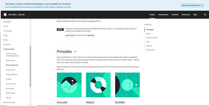
If that’s the case, Data Visualization might be a technique you can use to make sense of data. Data Visualization often relies on many design principles to provide accurate, helpful, and scalable data. It’s part of many design systems, such as Google’s Material Design System.

However, how you use it for your user research processes will be slightly different than how you might use it in your designs: it’s there to make your data easier to read, not statistically significant or beautiful.


