How design speaks through its shapes

Designers use the Psychology of shapes and their influence on design for creating user-friendly interface components. People may not actively notice this, but the mind often subconsciously reacts to visual objects affecting their emotions and behaviour.
Different digital products require different types of components, but it is rarely/never up to the designer’s discretion to choose how a button would look, however, it is generally the psychology involved behind it that defines the truth in the design.
What people perceive is simply the aesthetics, but what they experience is something more profound than that. The way all the elements are laid out in synergy with each other is a deliberate choice to influence the end-user experience.
The Kiki/Boba Effect and Shape Perception

To start things off, let us talk about the “Kiki/Boba” phenomenon. It was a quintessential experiment conducted by Wolfgang Kohler in 1929 but was recreated more comprehensively by V.S. Ramachandran and Edward Hubbard 72 years later in 2001. Both the sets of experiments asked the subjects the same question “Which of these shapes is Boba and which is Kiki?” 95% of subjects paired the sharper cornered image with Kiki and the softer/rounded corner image with Boba. The central observation was that the subjects associated rounded imagery with more rounded auditory sounds and sharper imagery with respectively sharper auditory sounds.
Ramachandran and Hubbard reasoned that because of the sharp form of the shape, subjects tended to map the name “Kiki” onto the left figure, and because of the rounded auditory sound, subjects tended to assign the name “Boba” onto the right figure.
This effect also extends to personality traits that people perceive in specific shapes. People tend to link “round” shapes with easygoing, friendly, nice or pleasant characteristics and “sharp” forms with determined, professional, serious, or rigid traits
This research has proven itself invaluable in multiple fields of design besides the only digital product. For instance, Disney repeatedly refers to this phenomenon while making design considerations for its extensive and highly characterised set of characters.


We could link the Kiki/Boba Effect with how visual shapes can influence the effect it has on the users. Sharp and pointed elements in design could depict more professional, serious and intelligent (and potentially unfriendly) look. While, a little bit of roundness and curves could represent a friendly, pleasant, kind, and approachable feel.
Let’s take a closer look at how this affects product design.
Buttons:

Buttons with sharp corners:
People strongly associate squares and rectangles with buildings, and hence they bring the feeling of trust and strength. It portrays discipline, authority, security, reliability. The straight lines and sharp edges have a more formal and serious tone. Hence, we can see these in accounting apps, financial apps and so on.
Buttons with soft corners:
Circles don’t have angles which makes them softer and milder. Humans are known to respond more positively to a curve since it is smooth and fluid than a straight line which is rigid and immovable. Their presence depicts youth, happiness, a carefree nature, and friendliness. We associate round objects with harmless objects in our daily life, for example, a ball has a friendly and approachable design, unlike a fork or broken glass which provokes an “avoidance response”. Hence in product design, very rounded corners are used for kids’ games and children centric platforms.
Card Design:
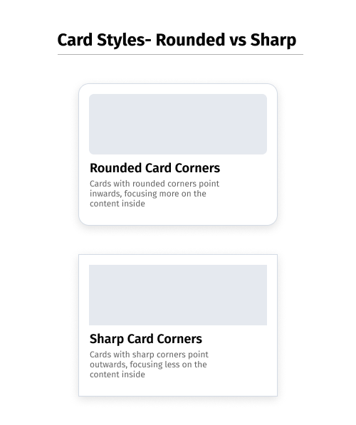
Rounded corners are easier on the eyes since it takes less cognitive effort to process visually. Whenever the cards are arranged in a row, it is easier to count the number of cards because of its distinguishable corners which in turn makes it effortless to differentiate which side belongs to which card. On the contrary, cards with sharp corners point outwards, focusing less on the content inside. It is hard to distinguish which side belongs to which rectangle when the two rectangles are placed next to each other. Thus, making it look identical and attracting less attention to it.
Brand identities also regularly employ Kiki/Boba:
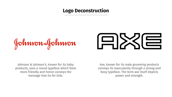
Brand identity talks about the personality traits of the company and attempt at essentially conveying relevant messages to their user/consumer base. Shapes used in the logos play a vital role in the expressions and the characteristics that the brand wants to convey. As mentioned earlier, squares and rectangles convey the feeling of stability, trust, balance so it could be used for more serious products with little space for humour. Circles give out a positive emotional message, unity, and commitment. They hence fit in better for creating messaging for brands/companies that are driven by a more casual or approachable nature. The example above is an excellent demonstration of how two products in the same domain of self-care can be expressed in diametrically opposite ways; considering how one is driven by a more “gruff and masculine” nature (AXE) while the other is aimed at a more “gentle” and “delicate” user base (Johnson & Johnson’s.)
Looking at these various examples, there are clearly multiple visual cues to which we respond to in a certain way because we’re conditioned to do so, whether it’s an evolutionary instinct or something we picked up as part of society.
Designers should use this in various design elements since it creates a more informed design environment, increases the maturity of the piece, and helps prevent the misunderstanding of the message the company wants to communicate. Hence, enabling themselves to create more effective user-interface components for web and mobile products.
The Canvs Editorial team comprises of: Editorial Writer and Researcher- Paridhi Agrawal and Anjali Baliga, the Editor’s Desk- Aalhad Joshi and Debprotim Roy, and Content Operations- Abin Rajan
Follow Canvs on Instagram and LinkedIn. Don’t forget to follow us here on Medium as well for more design-related content.