How designing for context can save lives

We’ve come a long way from the room-sized computer that only prints out numbers on a small piece of paper. While we used those kinds of computers in the workplace and for one purpose only, our devices today have become much more portable, wearable and they can do thousands of things at a time.
Thanks to portability we can use our devices in many different environments: at our work desk for example, in a meeting, in our beds, at the playground with our children, while we cross the road, while we’re driving etc. Their multifunctionality creates its own contexts too, contexts of use. We can use them to write our homework, to pay a bill, to play a game, to communicate, to do research, write, animate and so on.
Adjusting our behaviors to match the context is a part of our survival strategy. We know to keep quiet if we are deep in the jungle where predators live. We also know to keep quiet if a sleeping baby is around. If we don’t, then we would be inevitably running some risks. We run the risk of alerting the predator to our presence or waking the baby up and experience a very cranky afternoon. Environmental contexts can be less extreme too, like attending an official event, or being at an amusement park. We know that we need to act properly at the event and we know to let loose, explore and play at the amusement park.
Digital contexts, or contexts of use, are much more versatile and it is trickier to single them out. Applying for a new debit card online is a context of use for example, or when we’re sending the paychecks for everybody in the company via an automated payroll system is another. Making a public comment on social media, writing a text on Medium or designing a web banner in Photoshop are all contexts of use too. These contexts can also be much broader, like when we’re using our computers for general work or leisure purposes.
To simplify the subject, let’s think about environmental contexts in terms of WHERE we use our devices and let’s think of digital contexts of use as WHAT we are using our devices for. Both are inevitably important to our user experience and can be utilized to make our lives with technology more effective and enjoyable. If we ignore them though, they can lead to mal-adjusted behaviors which can have serious consequences.

Where we fall short
In my previous article, I discussed that in the interaction with our devices, our bodies hardly receive any environmental feedback. The screen is a small virtual space which we mostly use when we are stationary. As such, it has its limitations which we need to take into account. These same limitations apply when it comes to using our devices in different contexts. Our screens don’t emit enough feedback so we can set expectations and adjust our behaviors accordingly to the given situation.
Ideally, our screens would display the right visual cues and morph their UIs into something which will correspond to the unique context we are in. They can warn us to be more alert, they can reassure us when we are doing the right thing and guide us in our intentions.
This is far from our current reality I’m afraid. We live in a digital environment which feels one-note, where everything is treated with the same gravity and has the same value. Every app looks like the other and we sacrificed customization for the sake of consistency and having a certain look. How does pressing a button in an app made for work differ from pressing a button on social media?
Our design and technology still largely fail to recognize WHERE and WHAT we use our devices for. The situation is so bad, it might even put our lives in danger.
The bad examples
Do you remember how many people deleted files in the System32 folder in older versions of Windows? Windows didn’t make the qualitative distinction between deleting files on the Desktop and deleting system files. As far as I’m concerned it doesn’t do it successfully today either. What if instead of a“Run as Administrator” notification we get a warning that says: “You are entering a folder with files which are crucial for the stability of Windows. Modifying anything in the contents this folder might result in critical system failure. Are you sure you want to continue?” and what if then the whole folder was marked red all the while we worked in there? We would certainly behave differently and we would think twice before making any changes.
Work-live balance is also a very popular issue nowadays. A lot of us think that the lines between work and leisure are blurred. It’s very easy to start watching a YouTube video while at work or answer a work-related e-mail during playtime with our children. To address this issue, what if we had a “Work Mode” on our device which will display only the apps you use for work and ban the apps and websites you use for entertainment? What if we also had a “Leisure Mode” that had a different UI theme color and which will ban work-related notifications from ever reaching us? This might need a little customization on our side, but I think it’s easily achievable.
I think we either are afraid to design experiences which will touch our user more deeply and change their mood and behavior, or we aren’t aware that we have the power to do so. Recycling UX and visual patterns with the justification that it simply works runs not only the risk of looking just like the competition, but most importantly it robs us the ability to customize our products. When it comes to designing for different contexts, customization is key.
Customization, in this case, does not mean to be different for the sake of being different, but rather creating visual cues which will help the user adjust their behavior in a supportive, natural and positive way. Below are some successful implementations of customized user experiences designed to address different contexts.
Successful Implementations
Our browsers’ Private Browsing Modes address the context of private browsing spectacularly well and create an environment of privacy and security with the simple change of the color theme.
The various apps and modes for night reading decrease the blue color output on our screens to give us better sleep. There is also a current trend in implementing Dark Modes in apps which also serve the context of the use of devices in the night.
The Airplane Mode on mobile devices is another one which is widely used and one that does its job quite successfully. It’s one of the rare modes that “breaks the rules” and restricts the options on our devices rather than enabling as many of them as possible. The airplane mode does this for our own safety.
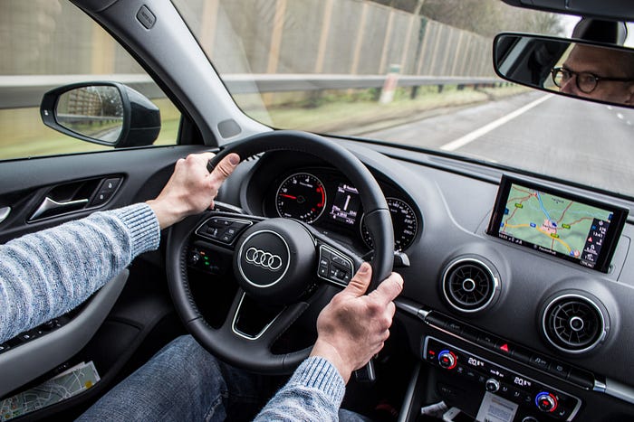
The Navigation or Car Mode is also a very useful UI theme which recognizes the environment in which the device is being used. The navigation apps display different UIs which are easily readable and easily accessible. Voice instructions add another helping layer of interaction which aids drivers without shifting their focus from the road. This is the kind of thinking which saves lives.
Although these implementations work very well, we need a lot more of them in our everyday living. We are missing valuable opportunities which can both increase our quality of life, make us more effective and keep us safe.
Key points
- The portability of today’s devices means that the user can be using their device in a lot more different environments than ever before. The environmental context answers the question WHERE the user is using their device.
- Today’s devices are multifunctional. Each task can create a unique context of use. The digital context of use answers the question of WHAT the user is using their device for.
- Our screens should and sometimes HAVE TO answer to the questions of WHERE and WHAT the device is used for.
- The goal of context-specific design is to facilitate users in their intentions in a supportive, natural and positive manner.
- Context-specific design preps the user, creates expectations and enforces restraints in order to change the user’s behavior to match the corresponding context.
- Designing for context means a high level of user experience customization. Avoid one-note design and strive for designing deeper experiences that reach the user more deeply.
- Minimal interventions in UI can have tremendous effects on context-specific design. Look at successful implementations of this principle in the real world and think about implementing an appropriate solution in your own products.
The screen is such a versatile space and I think it can withstand all the customizations required to achieve good context-centered design. I think this doesn’t have to come with the price of breaking all of our mental models either. We’ve seen that a lot can be achieved by a simple change in color. Small changes like those can sometimes mean the difference between success and error, between a job well done and a serious accident and even the difference between life and death.


