Understanding ‘superview’ and ‘safe area’ to make you a better designer?

TLDR — Safe area is 44pt from the top and 34pt from the bottom in portrait mode on new iPhone devices, treat them as the edge of the screen in your design.
Ever since the bezel-less display came to the market, smartphone manufacturers have been trying to figure out how to squeeze all the required hardware onto their phones. In order to fit a front camera, speakers and sensors need to be added onto the phone with as little compromise as possible, the “notch” was introduced. Although the notch cut out a certain part of the screen, it has allowed all the required hardware to be present whilst still keeping display bezel-less.
This hardware trend has led to a change in how apps are designed and developed. This article will consider how Apple introduced safe area for iPhone X, and how you can incorporate this into Sketch, Figma and XD to contribute to making your designs pixel perfect.
What is ‘Safe Area’ and ‘Superview’?
Safe area is basically a pre-defined reference point for the top, bottom, left(leading) and right(trailing) within Xcode. As of iOS 14.0, if you set a 0pt constraint to the safe area for iPhoneX and above, Xcode will automatically factor in a top margin of 44pt and a bottom margin of 34pt. In the horizontal orientation, the safe area is 44pt left + right, with 21pt bottom.


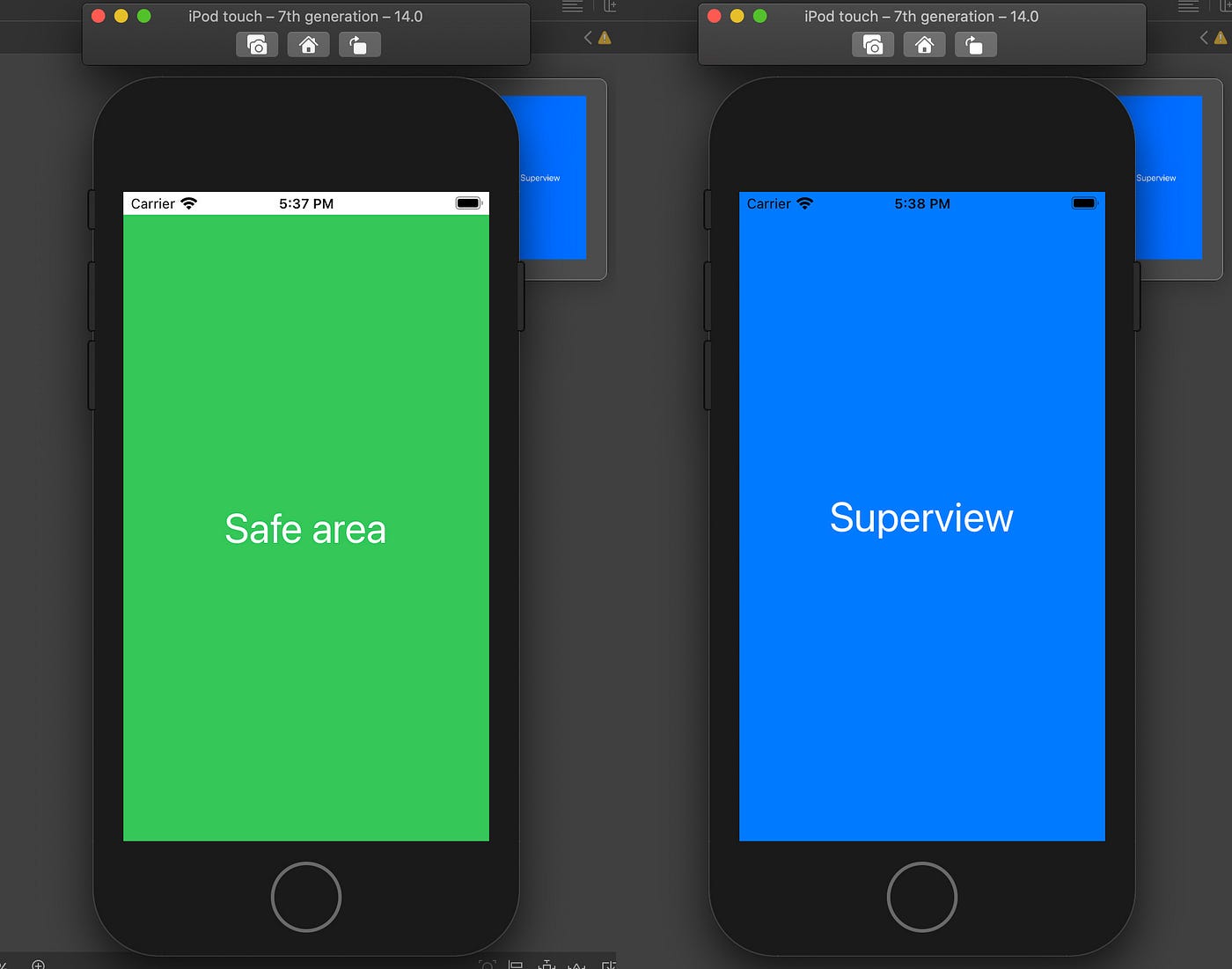
Safe area and Superview in iPhone 8
In iPhone 8 and below, both safe area and superview look identical. The difference is noticed when you build the simulator. The safe area won’t include the status bar, whereas the superview will.

If you want to read more about the topic, you can find a more in-depth article from a development perspective here by Evgeny Mikhaylov.
How does this affect design?
Because safe area isn’t a defined reference point within Sketch, Figma or XD, we need to factor this into our UI to produce pixel-perfect designs. I’ve used two examples below from Figma’s community UI kits to demonstrate this. The first one is from Bravo Studio Blocks by Marta Serrano.
Insufficient room for safe area — The title and the back button are 40pt from the top. In development, this doesn’t leave sufficient room for the safe area. If the constraints are set to 40pt from the Superview then system content might overlap the content in iPhone X, whilst having extra padding in iPhone 8.
Alternatively, we can set the constraints to -4pt from the safe area, but this would mean some of the content will get cut off in iPhone 8.

The second example I’ve used is from ecommerce kit by Commissioner of Design. In the design below, the title and back button sits 44pt from the top. At first, it seems to have correctly factored in the margin for the safe area.

But if we are to develop this using 0pt constraint from safe area, the issue will appear on iPhone 8, as then there will be 0pt margin top, looking like this:

Using correct margins in your design
Now that we understand safe area better and how they affect the 2 main form factors, we can apply this knowledge to our designs. A good way I recommend in creating designs with proper safe area is by adding in properly created status bar and home navigator, then treat these as the outline of your safe area. I found Joey Bank’s iOS & iPadOS 14 UI Kit especially useful as the constraints and size are defined correctly.
Add in Joey’s status bar and home indicator, then lay out your content in the area in between . This way you know exactly where your safe area is across all different layouts, and can base your responsive design from the status and home indicator.
When we transition the design to development handoff, we can simply apply 1 constraint for top and bottom, which will be correctly aligned to the safe area regardless of devices used.
The safe area represents the portion of your screen that is unobscured by bars and other operating system based content. Safe area is pre-defined by iOS across all Apple devices and is present in Android devices as well. Make sure you factor these into your design to protect your vision from being warped during development and have better control over the end product.


