Member-only story
How effective are tobacco warning labels?
Where effective design meets rigged resistance

In school, the narrative around tobacco and e-cigarettes is clear-cut. They’re horrible for us and the people around us. However, as we venture out into the world, the narrative seems to blur amidst the pressure of societal norms. Despite the ominous warning labels that adorn these products, the tobacco industry thrives with record earnings.
So, the burning question that emerges from the ashes is, do warning labels actually work? Let’s face it, the idea behind warning labels is straightforward yet impactful. They act as stark reminders of the danger in every puff, aiming to snap us into the reality of what we’re inhaling. But amidst the loud noise of advertising and the rebellious allure that smoking often embodies, do these warnings get lost?
We will be looking deep into the heart of tobacco control strategies. Tobacco warning labels aim to inform consumers and discourage smoking. This is often a topic of debate, despite studies showing graphic warning labels are effective. As UX designers, we must understand why.
What we’re taught in school
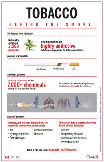
I grew up in Canada and recall receiving extensive education on the health risks of smoking from a young age. In elementary school, we were taught simple but impactful phrases like
“smoking is not cool”
“secondhand smoke is not a joke”
intended to discourage smoking.
We frequently had presentations on smoking’s impacts in physical education class. Making group projects analyzing the effects of smoking on organs left a strong impression. By high school, most students understood the major health risks.

Yet education alone doesn’t always prevent youth smoking.

