How I designed an e-commerce grocery product for 55–60 year olds — a UX case study

While smartphones have become an inseparable part of our lives, there still exists a user base that is unable to enjoy this experience.
I performed a research to discover how the elderly use their smartphones, identified their capabilities and limitations, and introduced key design recommendations.
ASSUMPTIONS AND NOTES -
- This App is focussed only at the people of age group 55–60 years.
- The users have provided access to GPS during sign up (for the app to be able to figure out what items to show).
- I decided to do a quick design sprint and come up with only 3 screens, my design sprint process being -
UNPACK | REVIEW | SKETCH | DECIDE | INTERFACE | CHECK
A. UNPACK
Business Case
Despite the multitude of e-commerce grocery apps in the market, there are no platforms targeted towards the elderly. This app is designed specifically for the age group of 55–60 years old.
Target
Getting elderly people involved in online grocery shopping through the mobile App. My initial approach is to offer something intuitive and easy to use to facilitate their experience.
Research
After having read a few blogs and articles on the internet, the most important questions that came to mind were about our users. We know they’re the “Elderly”, but how do they presently do grocery shopping? What are their pain-points using digital devices?
Not having much time on hand to figure them out, I reached out to my elderly neighbours and relatives (potential users) and gathered their answers for some quick feedback data.
Question 1: How do you prefer to get groceries?
Buy from store — 30%
Buy from street vendors — 50%
Order online — 20%
Question 2: Do you know you can order groceries through an app on your phone?
Yes — 50%
No — 50%
Question 3: Do you own a smartphone?
Yes — 90%
No — 10%
Question 4: How much time do you spend daily on the internet?
Upto 3 hours — 30%
3–4 hours — 30%
More than 4 hours — 30%
NA — 10%
Question 5: What are your pain-points while using your smartphone?
Complex Designs + Eye Sight Issues — 20%
Trust Issues — 10%
Eye Sight Issues — 10%
Complex Designs — 20%
No Guidance + Trust Issues — 10%
No Guidance — 20%
NA — 10%
B. REVIEW
After reviewing the interview notes, I went on to list out users’ needs and subsequent design considerations that would lead to a satisfying digital experience for them.
USERS’ NEEDS
- Clear Layout
- Customisable Display
- Guidance
- Legible Texts and CTA
- Authenticity Assurance
USERS’ PROBLEM #1 — VISION
- Avoid font sizes smaller than 14 pixels.
- Use Sans Serif fonts for better legibility.
- Customisable display size.
- Background and text contrast.
- Test designs using screen readers for disability.
- “Voice Over” feature when content is too long.
USERS’ PROBLEM #2 — MOTOR CONTROL
- Reduce the distance between interface elements that are likely to be used in sequence (“quantity picker” and “add to cart CTA”), but make sure they’re at least 2 mm apart.
- Large touch targets — Buttons should be at least 48 × 44 pixels for ages up to 70.
- Avoid different gestures.
- Haptic feedback on touching can be an excellent way to let the user know that the app is recognising their input.
USERS’ PROBLEM #3 — COGNITION
- Introduce features and gestures gradually over time to prevent cognitive overload.
- Avoid splitting tasks across multiple screens if they require memory of previous actions.
- During longer tasks, give clear feedback on progress of goals.
- Provide tooltips for actions.
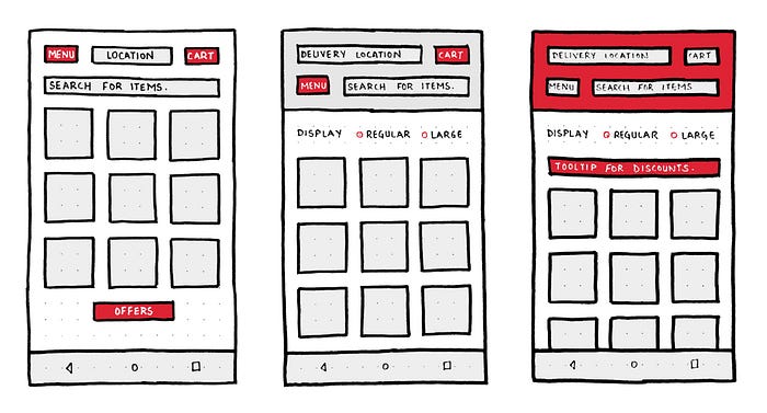
C. SKETCH
KEY POINTS WHILE DESIGNING
- Minimal layout
- Consistent action bar
- Prominent buttons
- Customisable display size
- No back button (Users are smartphone users and are believed to be familiar with the concept of soft keys)
- Distinct images and text to support them
- Tooltips wherever required
FIRST STEPS
Screen 1: Home Page
Menu, Delivery Location, Cart, Search, Offers, Category Image, Category Name
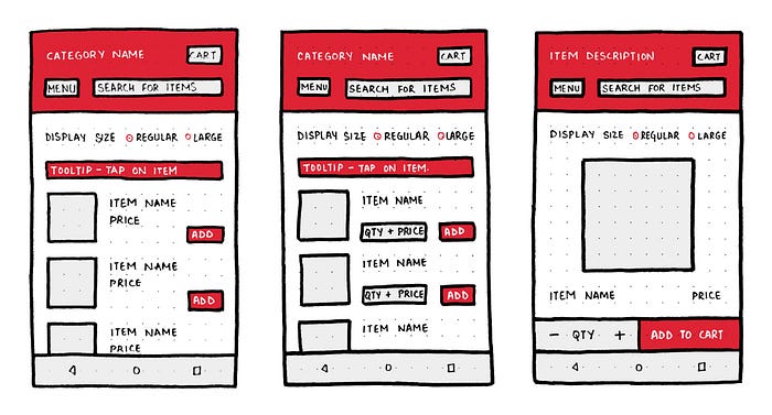
Screen 2: Product Listing
Menu, Category Name, Cart, Search, Item List, Quantity Picker, Add to Cart CTA
Screen 3: Product Description
Menu, Item Description, Cart, Search, Item Photo (Big), All Details, Quantity Picker + CTA
* Add Voice Over feature wherever required.
D. DECIDE
FONT
- Name — Proxima Nova
- Family — Sans Serif
- Size — Minimum 14 px
COLOUR
- Hex Code — #DD2334
- I was confused between Green and Red. But I chose a shade closer to red because in A/B tests with two different call-to-action buttons, red button outperformed the green one by 21%. One of the possible explanations for this is that red excites people. (Source)
BUTTONS
- Button Size — Minimum 48 × 48 pixels
- Colour — Contrasting with background
Note — In the designs, the buttons have been given enough padding to satisfy the minimum requirement.
E. INTERFACE

- I tried to make every action as descriptive as possible. I added icons to “Cart” and “Search”. The navigation bar has the menu-inscribed button instead of hamburger menu icon.
- To make the users onboard with the “scrolling” gesture, I provided a “scrollbar” on the right side.
- We discussed in our user’s problem that our users need some assurance that the products are authentic and what better way to show than to see other people shopping. And that’s why we can have highlighted text under item image “21 people viewing”. (Haven’t implemented in design yet).
F. CHECK
CHECK ON OBJECTIVES
Clear Layout
The layout is quite simple and easy to understand. I have used more of white in background so the texts can have a great contrast and be legible.
Customisable Display
Regular and Large options.
Guidance
Users are guided by the medium of tooltips.
Legible Text and Clear CTA
The fonts have proper line-heights and enough amount of white spaces around them. The buttons are bold and visible.
Authenticity Assurance
We introduced counts of people currently viewing the products by using real-time data.
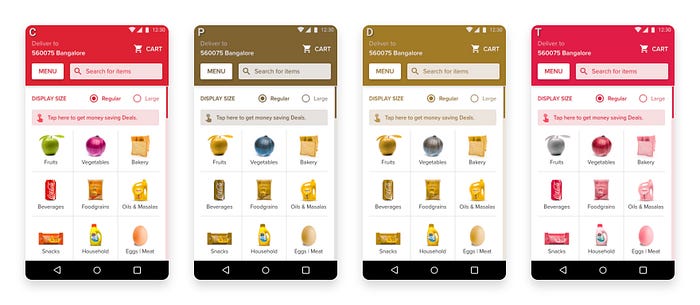
CHECK ON COLOUR VISION DEFECTS
