Member-only story
How I increased this travel app’s booking revenue by redesigning it — a UX case study
Giving the power of flexibility and efficiency back to travelers.

Introduction 👋🏻
Like most people, I love travelling. The feeling of being foreign, all new again, is irreplaceable.
Last month, I decided to push myself creatively as a designer and write about my Passpod app redesign.
Giving more flexibility and efficiency to travellers for booking.
Passpod is a Digital Tourist Pass that provides seamless connectivity and offers on local attractions anywhere in the world. Released in 2017 available in Indonesia.
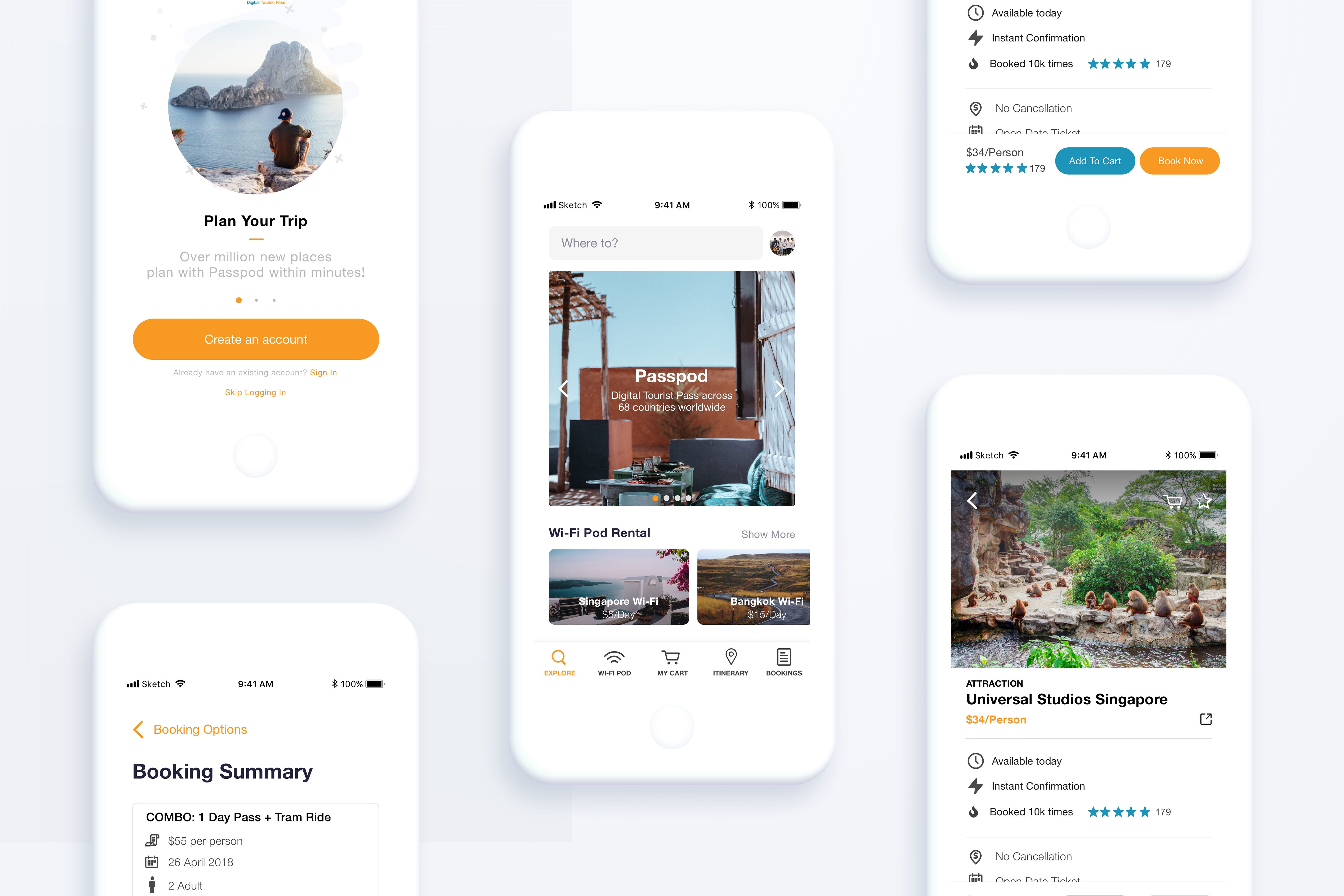
Redesigning the travel app
At Passpod, I found opportunities to redesign alongside with software developers and designers, and of course, write this article.
My Role: Head of Product & Design
Task: Research, design and collaborate on improving the existing app
Timeline: July 2018–Aug 2018
Let’s Begin!
I tap on a UX evaluation known as LEMERS to evaluate Passpod app between Klook (also a travel activities provider) to see how the app fair together. Note: We did a guerrilla evaluation with 3 testers.

From the analysis, it was clear that some work needed to be done.
Understanding the Problem 🔬
The things that get people confused, stuck, or frustrated.
Mainly, users utilise Passpod for it’s Mi-Fi (Wi-Fi portable Device) Rental and Activities (Tickets for holiday activities) Booking. What we’ve discovered when browsing through was that the utility of the app was well-organized.
However, we noticed that 60% of users were dropping off halfway on the checkout page for these Mi-Fi rental and Activities booking.


