How I made a UX design for a coffee shop roaster with a scientific concept — a UX case study
Wasn’t the easiest work I’ve done, especially in 2 weeks.
This case study refers to the e-commerce website UX design for an artisan coffee shop roaster, in Vancouver, Canada.
The project requirements were defined by Red Academy Vancouver/Spring 2019.

Week 1
Interview Phase — Failing
Do you want to know how not to fail on the first day of the project?
We were in five designers (Alex, Andrew, Jill, Oliver and me) doing a domain and organizational research just a few hours after we received the project to work on.

During this part, we just focused on understanding how the market/industry works.

In our conversations, we tried to understand what kind of questions could be asked to the people working in the industry and what sort of relevant information we could get from consumers.

Our five different backgrounds, experiences, work styles and personalities should be a perfect combination and a spectacular fusion power, but instead, we collided.
So, in this conflicted environment, we developed two questionnaires to interview professionals from the industry and consumers. However, when it was time for the interviews we were not well prepared?
Interviewing Industry — 5 participants
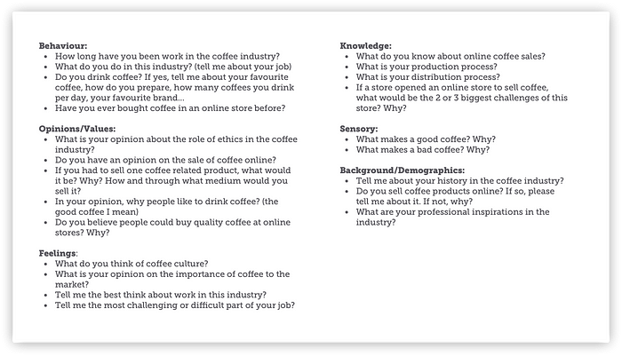
Interviewing Consumers — 16 participants

We totally or partially dismissed the shallow questions and moved to a more natural and robust approach, full of details. From these conversations, we obtained the first fundamental results for the project conclusion.
So, lessons learned:
Star collision is only beautiful in photography, otherwise it's chaotic.
Waterfall projects suck.
Lack of collaboration and over-competition suck too.
Creativity & naturalness are more relevant than control & standardization.
A double dose of chamomile tea would help.
Survey Phase — The Gladiators
Do you think something has changed from day one? Of course not!
And once again we were there: The Gladiators — fighting each other for no particular reason.
The final product of this stage was a questionnaire with demographic and behaviour questions (which were ordinary and didn't help at all). Fortunately, after hours of debating and against the odds, we agreed to add the 3 last open questions.
These questions brought several relevant guidelines as an user experience design requirement.
The survey — 13 questions & 123 participants

Statistics
Through my solo journey, I had conversations with coffee professionals and consumers. I was able to blend the demographic data from the survey with the information collected from the chats.
Finally, an idea started to form in my mind!

Lessons Learned:
Problems do not solve themselves magically.
Knowing how to communicate does not make you smart, creative or a better professional.
Sometimes it’s possible to get something good through chaos — I guess!
Contextual Inquiry + Affinity Diagram & Persona Creation Phase — Staying alive
If Mark Watney planted potato in his shit to survive on Mars, I will eventually learn how to survive creatively in this project.
In the Affinity diagram, there we were again, colliding, competing for space, strategy or even for mere perception. There was no way to work as a team, but this time it was funnier.
As an Affinity Diagram result, we surprisingly created a large panel with several post-its, grouped by multiple criteria.

In the contextual inquiry stage, we split again from each other to work individually, authentically, and creatively, without adopting patterns.

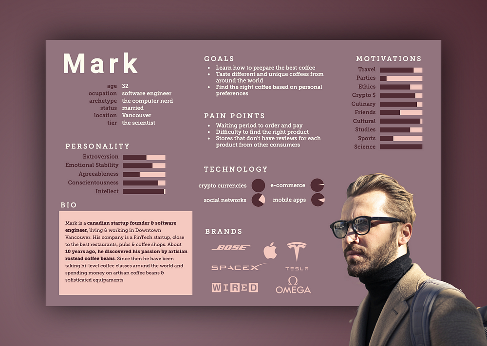
Mark — the tech-savvy persona
Creating the persona of the project was very amusing but also a job full of details and analysis that directly influenced the result of the project.
The primary persona of my project is a traveller, tech-savvy man, 32 years old, founder of a fin-tech startup and absolutely crazy about Stephen Hawking (the God Particle) theories, Albert Einstein theories, Higgs Boson theory, Unified Field theory and Cern.
This tech persona has been deeply in love with coffee, travel and science for more than ten years.
Lessons learned:
With our individual perceptions, we were able to add much more to the project than when we were not listening.
Dedicate yourself to always do the best you can.
Week 2
Building & Testing Phase
Interstellar — I mean: we survived to the event horizon, and nothing was absorbed by a black hole, so it’s time to shine.
Understanding all the data included in the survey results, interview data, behaviour and feelings observed in the contextual inquiry exercise was the most relevant part of the project for me, up to that point.
For this project, my main inspiration was: Cern & the Higgs' Boson Theory


The design concept:
The design concept was created for Mark’s persona, who represents the usual Vancouver’s technology professionals profile.
I thought — I want to create something extraordinary for this guy, where he can enjoy the two or three things that he likes most in one go.
Mark + travel around the world + science + Higgs' boson + Cern + particles accelerator + coffee + roasters = beans from all parts of the world, accelerated within the coffee roaster
Supporting my strategy
Storyboard, sitemap, user flow, user stories, scenarios, use case and tests
Through all this data arsenal, I was able to create the concept for this UX project and, to support the project further, I also created:
a) storyboard: example of a story about a coffee-lover character who comes home exhausted after work and needs to renew his energies. His wife suggested an espresso since their coffee grinder recently broke. This character loves to buy coffee with the highest quality, he buys sophisticated coffee equipment.

b) site map: this map is an open view of the distribution of the website pages that will be built for Mark.

c) user flow: this flow represents an overview of Mark’s navigation macro processes on the site, without opening up the details of the processes.

d) user stories: For website development, both from a design and a code point of view, user stories help identify the goal to be achieved, with the deployment of planned features.

e) scenarios: these scenarios represent Mark’s problems, wishes, or needs, and will be treated as the project scope.

f) use case: is a graphic representation, most commonly used to describe the relationships between actor and the actions he/she needs to perform in the system.

Low-Fi Prototype — already testing my scientific concept
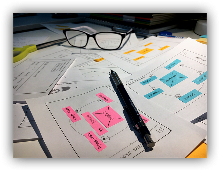
Then I created a paper prototype to test not only the navigation, but to test acceptance of people for a more innovative, organic, and experimental design approach. In just 3 clicks Mark was able to find his favourite product.

Testing
More than ten people tested the prototype on paper, and there was no request to change the navigation, but several suggestions to improve the order of the navigated pages.
It was a very cool experience because people were so open and I could clearly see that there was no indication of rejection about the innovation shown by the prototype.

HIGGS, artisan coffee shop roaster — UX final design
Obviously, it’s a wireframe, with a colour palette in blue, just like any other wireframe. The typography is not refined yet but the idea of this prototype is to offer Mark a more creative navigation.
The design simulates a particles accelerator, combining a molecular structure as the Higgs' Boson, to represent the process that happens inside a coffee roaster, which accelerates the beans using the appropriate temperature and speed, for its perfect roasting.
That was so cool!

Future considerations
All the techniques were relevant to the project’s development, and I noticed that some of them could be used in more than one stage of the project cycle. For example: Process and Moodboard flows can be constructed as AS-IS in the research step and as TO-BE in the planning and testing stage. I think it could help in understanding if the desired increment / improvement was delivered or not by the project.
Some preparations could have been made before the project began, avoiding conflicts, confusion and resulting in a better & effective presentation.
Conflicts among team members are typical, often healthy for the project, except when it is not. Misaligned teams rarely produce positive results so we should consider this for next projects.
Case study: Project no.2 — Full-time UX Program RED Academy Vancouver

