How I recreated the SpaceX dashboard UI

 A couple of weeks ago, SpaceX Crew Dragon launched from Kennedy Space Center to transport astronauts Robert L. Behnken and Douglas G. Hurley to the ISS. Lots of things were revolutionary about this launch, but the one that caught my attention was that astronaut’s main UI was a set of touchscreens. So I decided to try and see if I could piece it together from existing footage.
Previously, control panels were a set of buttons, switches and knobs pretty far from what we saw last May.

Inspired by Andrew Goodlad and his work with the Tesla Model 3’s controls, I decided that I wanted to do the same for the Crew Dragon. First I had to gather as much footage from inside the ship as I could find. The problem was that most of it was outdated or was from previous iterations. Crew Dragon’s final design was hard to find or was too pixelated to understand. Luckily I found some really cool videos by Everyday Astronaut and Discovery that were a great reference to work from.
The first section I assembled was the button panel below the screens. The ship has 5 different panels: the first one is the Command panel; the second is the Power panel; the third one is the Pyro panel; the fourth one apparently has some entry commands (was the hardest one to find footage of) and the last one is another Command panel.

Once the panels were done, I began working on the screens. The first thing I did was to assemble the global navigation menu. All screens share a 5 section navigation. My assumption is that astronauts can navigate by tapping on each of the options. The sections are not labelled, so I had to piece together a menu shot and a screen shot to compose a full screen.

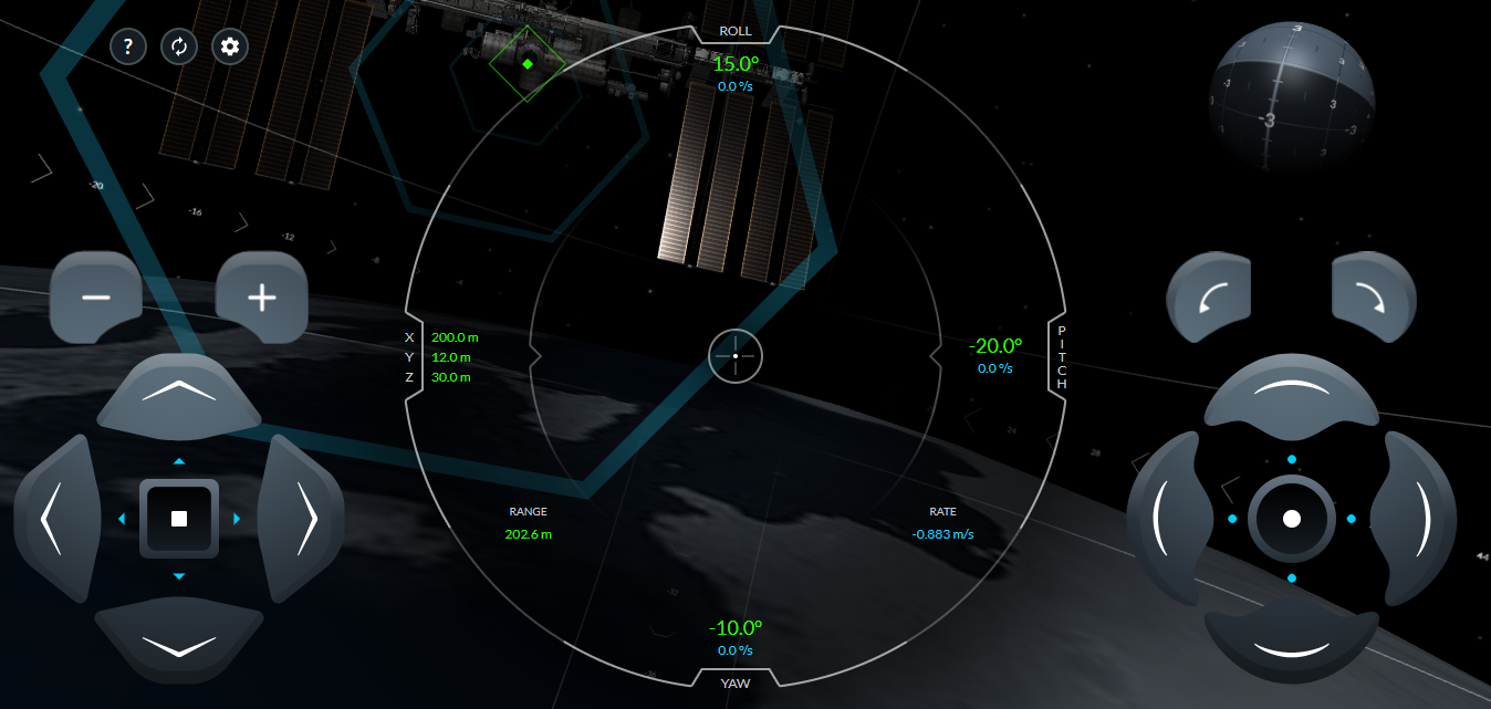
After that, one of the easiest screens was the docking screen. I found this really cool simulator by SpaceX where you can try and dock the Crew Dragon to the ISS. I played with it a few times (found it pretty hard by the way) to understand how it works in real life. This was the only screen where I had that chance so I went all in. Though it’s a bit different from the final design, it was helpful to define sizes and relations inside the screen.
The next screen I assembled was the cabin audio settings. It was hard to find good pictures from inside the cabin, so I used a still frame from Everyday Astronaut’s video and with a bit of Photopea magic I could isolate individual seats. The speakers are a vector illustration done in Figma.
After that screen was done, I assembled the navigation view. It’s a dashboard of sorts, composed by a side menu with different sections for easier navigation, a top bar with real-time indicators and a globe where real time trajectories are shown. At this point, I had most styles already defined so I was moving rather fast. The only one left for the first version was the testing screen. It’s not the fanciest one but it’s a pretty big deal because apparently tests in the Crew Dragon have zero-fault tolerance. Which means that in the scenario something goes wrong, the launch is cancelled.
Final Design
That’s what the final design looks like. To top it all off, I added some interactions so we can play around and navigate across some of the screens.
Anyways, here’s the link to the prototype, feel free to play around and let me know what you think! Right now you can navigate between the different sections using the bottom left tabs and also navigate between the different seats in the audio settings. There were barely any animations shown in the launch footage so it’s all built on my assumptions. I’m planning to add more stuff in the coming days.
Also, here’s the link to download a full res image of the final design.
If you or someone you know are hiring, let me know! I’m looking for a job as Product Designer. Let’s connect on twitter and here’s my portfolio on Notion.


