How I redesigned the restaurant detail page for Dineout(a table reservation platform) — a UX case study
With the increase in the trend of eating out and more people becoming tech-savvy, the restaurant industry in India is growing at a rapid pace. Times have gone when table reservation was a hassled process involving multiple calls and follow-ups for waiting and confirmation.
Dineout- A platform where the user can discover restaurants, reserve a table, and avail of exciting offers. 📱
🤔 Problem Statement:
In the Dineout app, the Restaurants Detail Page(RDP) encounters the second-highest amount of traffic. Here, the user can reserve a table, check the restaurant’s menu, compare deals, and get offers before deciding where to make a reservation. Hence, the information shown needs to be highly functional, usable, and valuable to a user.

Issues:
The major problem was that information was unorganized, irrelevant, and not arranged in a user-friendly hierarchy. Our main focus was to reduce the visual noise to make information easier to read and scan while keeping the architecture of the overall page more or less the same and not distracting the user away from the current RDP.
👥 User Research:
To get valuable insights, we first started out by studying and analyzing data from Google analytics and then interviewed some actual users. We interviewed diners at different restaurants who dine out frequently and our colleagues from different teams to understand the priority of restaurant-related information required while making restaurant reservations.
Our qualitative research was focused on the following open-ended questions-
- How often do you go out?
- Do you use an app to reserve your table?
- Who do you generally go out with?
- What are your preferences while selecting a restaurant for dining out
and a few more general questions…
After interviewing our target set, we found out….
Important features and deciding factors for the users while reserving a table.
🧐 Challenge:
The biggest challenge was to incorporate suggested changes in the existing design, keeping the same design language of the product and not redesigning the whole structure of RDP.
💡 Brain Storming Ideas & Solutions :
Multiple sketches were made to reach the best solution and after a series of discussions with the stakeholders, the best ones were converted into high-fidelity wireframes.
High-fidelity Wireframes:
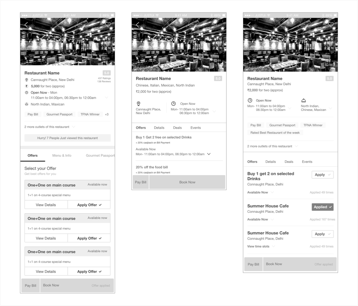
As the information showed was pre-tested with users as to what to show and in which hierarchy. But to reach final conclusion wireframes were again tested by the users.
🙌 Final Solution :
The main intent of this project was to facilitate users to make quick decisions. The major changes incorporated are as follows:
- Clear and spacious restaurant image as it is a major deciding factor.

- The restaurant name and area were moved down from the image.
- Other useful information like the cost for two, timings, cuisines, and any other notes was brought up upfront.
- Information is still shown in tabs but now it’s a long scroll, which was working as separate tabs before.
- UI change of the overall page.
- Introducing information like help and similar restaurants.
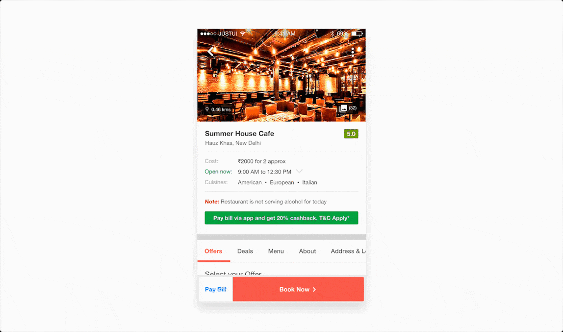
📱Prototype :
✌️ Nuts & Bolts :
Following the MVP technique for the product, the design was made and implemented quickly (including the research part).
For validation, a few users were interviewed again and once validated the design was rolled out to 10% of users first. Once the results were satisfactory enough it was soon rolled out to 100% of the users set.
🏀 Dribbble Link
Thank you for reading! If you like it please leave claps. 👏🏻
I will be looking forward to your valuable feedback. 🙂
More where this came from
This story is published in Noteworthy, where thousands come every day to learn about the people & ideas shaping the products we love.
Follow our publication to see more product & design stories featured by the Journal team.

