How I reimagined Crunchyroll’s homepage — a UX case study
What is Crunchyroll?
From their Facebook page:
“Crunchyroll is a fan-favorite, global destination for Japanese anime and manga. With more than 950 shows, 25,000 episodes and 8,000 hours of officially-licensed content, Crunchyroll serves passionate viewers their favorite titles with professional translations in multiple languages.”
Project Background
As I was using Crunchyroll one day, I couldn’t help but notice how outdated the website is. I saw the potential for a redesign, but I didn’t want to just focus on the look and feel. Rather, I also wanted my design work to support their business objectives. When discussing this with my brother, a seasoned Product Designer, he mentioned that his friend is a part of the Crunchyroll product team. Without hesitation, we reached out, and here’s what happened:


Role: Sole Designer
Tools: Figma, Interaction Design, Prototyping, Design Critiquing
Timeline: June 2020 — July 2020
Existing Homepage Analysis
I began by analyzing the existing homepage to get a better understanding of my starting point. Below are screenshots of the homepage without an account, with a free account, and with a premium membership. I’ll be referring to these as variants. Everything below the fold is identical.

These variants exist to support Crunchyroll’s conversion funnel — the steps, each its own conversion, in a user’s journey. My assumption is that Crunchyroll wants to optimize its conversion funnel for premium subscriptions.

As a new visitor, Crunchyroll wants you to sign up for a free account. As a free user, Crunchyroll wants you to become a premium member. In other words, there are two steps between being a new visitor and being a premium member. The messaging between variants is reflective of this. For example, the CTAs (calls to action) in the first variant encourage you to create a free account.
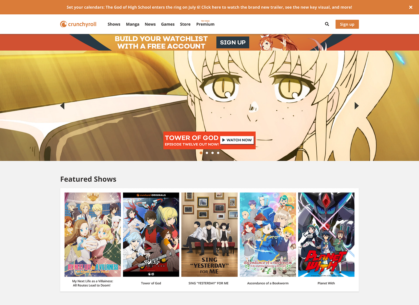
Below is a full screenshot of the existing homepage (new visitor variant).
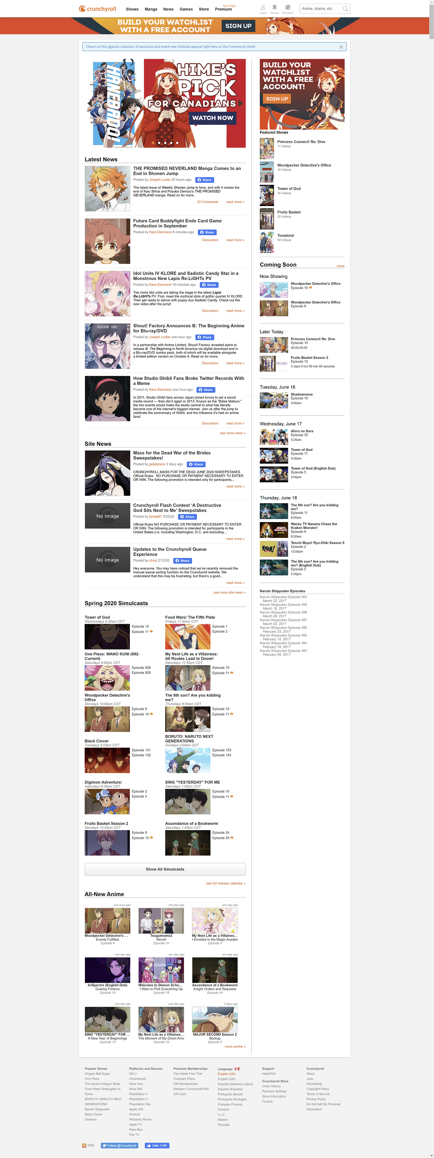
What each variant has in common is the same content sections:
- Hero Carousel
- Latest News
- Site News
- Seasonal Simulcasts
- All-New Anime
- Featured Shows
- Coming Soon
- Naruto Shippuden Episodes (interesting — probably for SEO)
I believe this content section uniformity presents a future opportunity to introduce dynamic content. For instance, premium members might get personalized suggestions based on their watch history.
From a layout and content standpoint, I made some observations:
- Image CTAs and hero images are generally small
- Content sections are tightly packed
- The store is given no real estate
- Heavy emphasis is on the news
- Featured Shows are small and can be overlooked
- The announcement bar is unconventionally placed below the navbar
- There are no explanations for simulcasts or the orange crown icons
Hover Popovers


When hovering content in Seasonal Simucasts and All-New Anime, additional information appears. It is only in these two content sections that this behaviour occurs. The following is shown:
- Show name
- Episode title
- Episode number
- Date posted
- Episode description
- Premium availability
Homepage Redesign
I focused on the variant of the homepage for new visitors
Assumptions
- Crunchyroll wants people to sign-up, and the homepage is meant to convince them
- E-commerce is a vital revenue stream for Crunchyroll
- Video content is Crunchyroll’s main value proposition
- News is less important than video content for new visitors
- Not everybody knows what a simulcast is or what the orange crown icon is
Business Goals
- Help people see the value of Crunchyroll while making it easy to sign-up
- Raise awareness of the Crunchyroll store to increase ecommerce revenue
- Make the experience of scanning and reading the homepage more pleasant (e.g. cutting excess text, reorganizing the layout)
- Minimize confusion about what things mean (e.g. what’s a simulcast? what’s that orange crown icon?)
Evaluating Sections
Focused on the primary business goals, I asked myself these two simple questions:
- Would it be beneficial to add any content sections?
- Are there any unnecessary content sections?
As mentioned, the store has no real estate besides a link from the navbar, making it easy to miss, so I felt it was necessary to address this. This came in the form of a new Store Spotlight carousel.


In terms of unnecessary sections, I only removed the Naruto Shippuden Episodes section because the show ended in 2017.
Afterwards, I sketched some layout options.


Below is how I ranked the importance of content sections when arranging and allocating space. Without analytics, the ranks were based on intuition and the space they occupy on the existing homepage:
- Hero Carousel
- Featured Shows
- Store Spotlight Carousel
- Seasonal Simulcasts
- Coming Soon
- All-New Anime
- News (Latest News + Site News)
Of course, my intuition might be wrong. I encourage that A/B testing is conducted to validate the layout.
As you can see, news has been merged and deprioritized. The reason being, anybody could access Crunchyroll news with or without an account. By emphasizing video content, it helps Crunchyroll convey its value proposition to new visitors.
Increasing Sign-Ups
I approached increasing sign-ups first by further emphasizing the primary action in the navbar.


To reduce anything that would distract users from signing up, Search has been compressed, and Queue and Random have been removed. However, I believe Queue and Random can stay in the other variants.
Another decision I made was to move the rectangular image CTA halfway down the page. This was to reduce the top-heavy concentration of CTAs. It is also meant to remind the user of the primary action after they see some content.

Emphasizing Video Content
I noticed that Crunchyroll tends to market its video content rather than what the service does. As shown by Crunchyroll’s Facebook ads for Tower of God, a Crunchyroll Originals series, these types of advertisements get the most impressions. So, I assume they also drive the most traffic to the site.
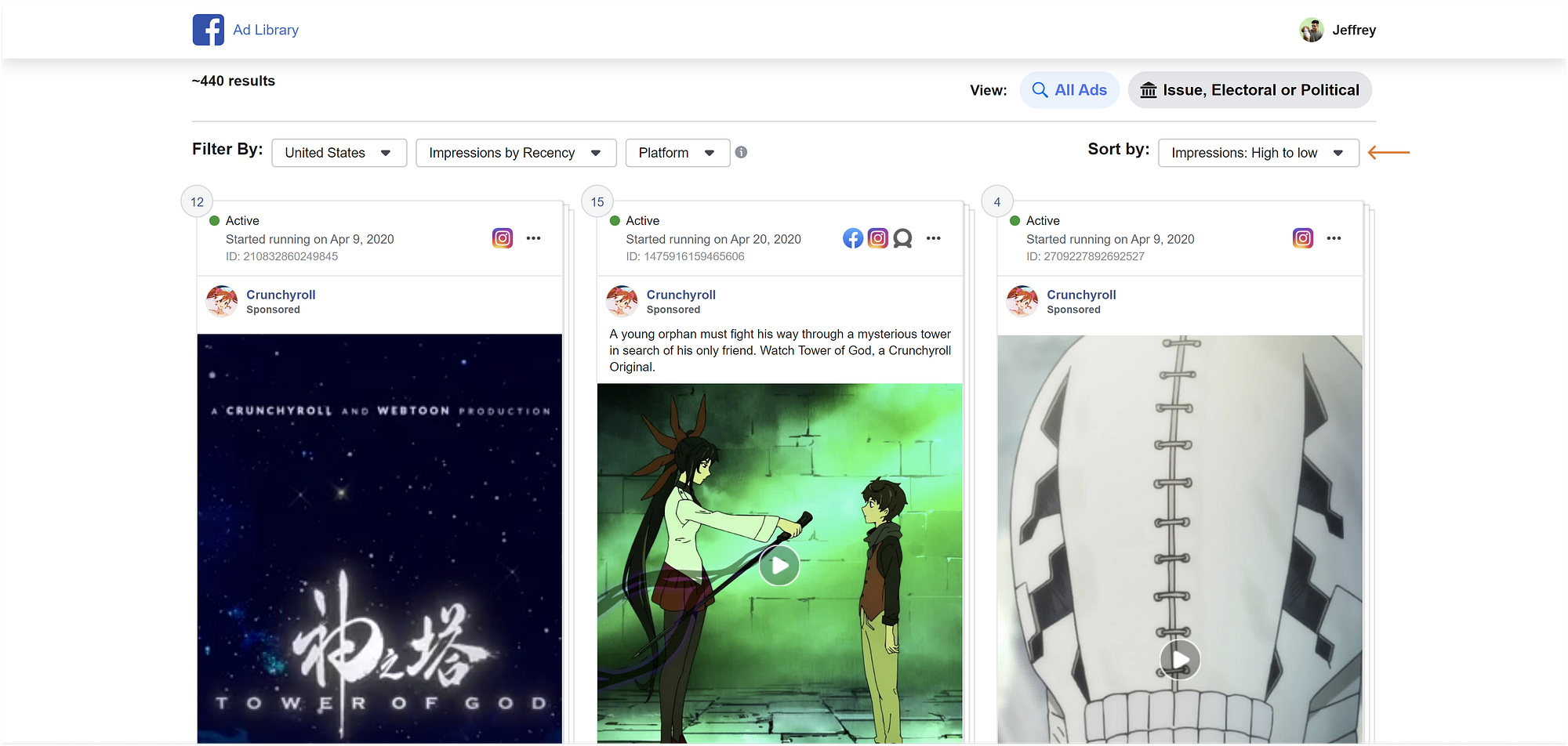
Leveraging their exclusive content is an especially smart angle because it funnels people towards the only site for legal streaming. Seeing this marketing strategy reinforced my decision to emphasize video content.
Accordingly, I made the hero carousel span the entire width of the page to make it more eye-catching. I encourage that this carousel is used to showcase exclusive content or other exciting releases.


The Featured Shows have also been upsized for the same reason.


New Hover Popovers
I decided to bring hover popovers to Featured Shows and Coming Soon for more consistent behaviour. Below are my redesigns of the hover popovers.


To improve readability, I reduced any redundant or non-essential information. Taking this chance to explain the orange crown icon, I added a hover popover with information on premium availability. All hover popovers feature new contextual CTAs prompting users to dig deeper.

A tooltip has also been added with a working definition of simulcast.

Prototype & Outcome
Without a real way to test my redesign on Crunchyroll’s userbase, the potential impact is difficult to measure. For that reason, I established assumptions and framed my central goals around those.
I was, however, able to hop on a call with my brother’s friend to get some feedback. I shared my thought process and prototype. Overall, he was impressed with what I produced given minimal guidance. What positively stood out to him were my conscious decisions to bring the storefront to the homepage and to de-emphasize the news.
We then discussed where I could take this next, and we touched on the evolving space of living room experiences — I’ll leave it at that.
I’m currently looking for design internship opportunities. If you’d like to chat, please send me a message on LinkedIn.
As always, I’m open to feedback. Thank you for reading!

