How I switched education from web to mobile
My design and development process for a study app

About 2 1/2 years ago, I was a typical high school student sulking in a load of AP coursework. For me, the best study strategy was to outline chapters in AP textbooks for all of my classes. Whether it was for biology or history, summarizing concepts in my own words and typing them up was the easiest way for me to consolidate dense information.
After I had been accumulating outlines after outlines on my hard drive, my friends started asking me if they could use my outlines to review topics for exams and essays. I welcomed the idea and from then on, I started to share my outlines. Frustrated with having to use multiple platforms to share my outlines with students— from Facebook to Google Drive to email — I decided to make a website. The site started off as a way for students in my high school to review topics for AP classes, but soon after I created it, high school students from all over the world started to view and download my study guides. As of today, myoutlines.com has over 300K users and subscribers and is #1 Google page-ranked for search keyword outlines.
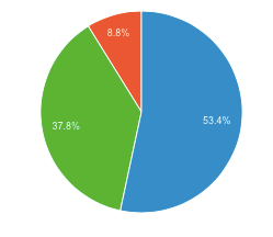
In this new digital age, mobile devices have changed our priorities. Although web platforms are still incredibly valuable, the mobile experience is just as powerful. Over the years, I began to see decreasing trends in the number of users who used the site from a laptop/desktop and increasing numbers of users visiting the site from their mobile device. Check it out:


From when I first created my site to now, the number of users accessing the site from their desktop decreased from 94.6% to almost 57%. Consequently, in the past few months, the percentage of users accessing the site from their mobile devices has increased to almost 42%. Being the data-driven thinker I am, about 2 months ago I started to design and develop a mobile app for myoutlines.com!
The transition from web to mobile is always difficult to initiate, but one of the main motivations for me was the fact that I wanted my users to gain immediate access to my outlines, without the barriers of Wi-Fi, search, or loading pages. I knew that I could offer my users a solid user experience with an iOS app that allowed them to study and review, anywhere and anytime.
Design and development process
User Personas
User #1: This is a typical user of myoutlines.com to review and study when AP exam season comes around (April-May).
User #2: This is an avid user of myoutlines.com to review and study throughout the entire year, using the site to prepare for class quizzes, chapter exams, and essays. (Year round)
User #2: This is a frequent user of myoutlines.com during the times he/she has an exam and he/she needs to review for it. (Usually at the end of every month)
User-wide pain points
- The environment: “I enjoy reading the outlines on paper, but I find myself wasting too much paper since I print out all these outlines to review and highlight. I’m killing trees!”
- Lack of customization: “I want to be able to have a customized list of the outlines I need to review. This way, I won’t have to go back and forth and print out an outline I need to study.”
- Forgetfulness: “I always forget what I have to study for. It’d be nice to have the option to make a list of what to study for and then choose outlines based on that list.”
- Simplicity: “I don’t want to view an app that has so many buttons I need to get through just to reach an outline. Studying is stressful enough.”
Next steps
I wanted to make sure that every user would have a great experience with the Myoutlines app. I brainstormed features to include, but ultimately wanted to keep it simple enough that users wouldn’t be overwhelmed. I took inspiration from Medium’s and the NYTimes’ bookmark feature and the myHomework app’s todo list functionality.
Brainstorming iteration: Deciding how to display the list of subjects and bookmark feature

After developing the bookmarks feature with delegates, alert controllers. and table views, here is the final product user flow:

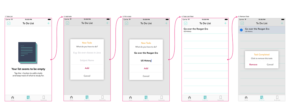
For the to-do list feature, I wanted students to be able to organize their to-dos with the corresponding subjects. After utilizing table views and alert view controllers, here is what the final todo list feature looks like:

When I initiated the development process, I knew that a bookmarks feature was a main priority. The to-do list is an added bonus to help students organize their tasks. I knew that by giving students access to review material on their phone, they wouldn’t have to rely so much on printing, outlining textbooks on paper, or visiting the site with a WiFi network. By having customizable features, the app collects core data and gives each student the ability to customize their review strategies.
Concluding thoughts
As with any app, the iterative process never ends. I am looking into developing new features to increase readability on the app, decrease the time needed to study hard concepts, save student progress, and include valuable study resources. Upcoming features include search, highlight, and study resources such as quizzes and tutoring chat bots.
The switch from web to mobile is often the next step for many companies. In my case, switching from web to mobile meant eliminating the barrier between the user and my site. Not only was there an upward trend on the number of users accessing the site through their phones, there was also an increase in user frustration in terms of reaching the app through Safari/Chrome.
From now on, I predict the users will divide themselves organically — while some users will visit the website through their computer, the other mobile users will visit the app when reviewing on the go.


