How Mozio can double down on material design
Getting to and from the airport impacts all travelers. This is how Mozio can embrace a design language to win over new users.

Background
Mozio has a website and mobile app covering over 2,000 airports globally. Their software platform allows travel brands to sell airport transportation to their customers using white label API integrations. Users can compare and book any type of ground transportation from a metro ticket to black car service either through Mozio.com, their mobile app, or a partner website.
Who says booking airport transfers has to be complicated? I upgraded the mozio.com website with new visual designs, and a refined design language that gives users a great experience from search to checkout. I also created a new experience for their mobile app that removes extraneous tasks and gets users the ride they want, in less than a minute.
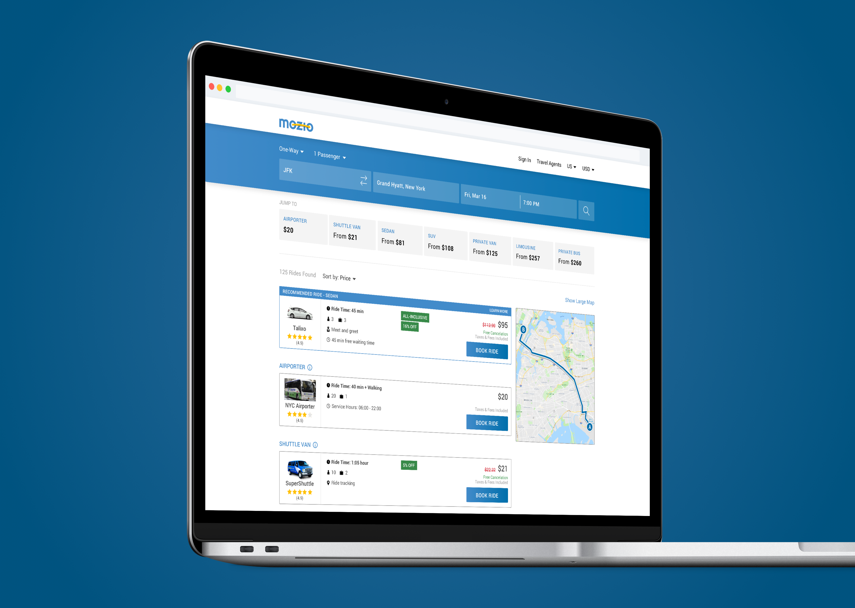

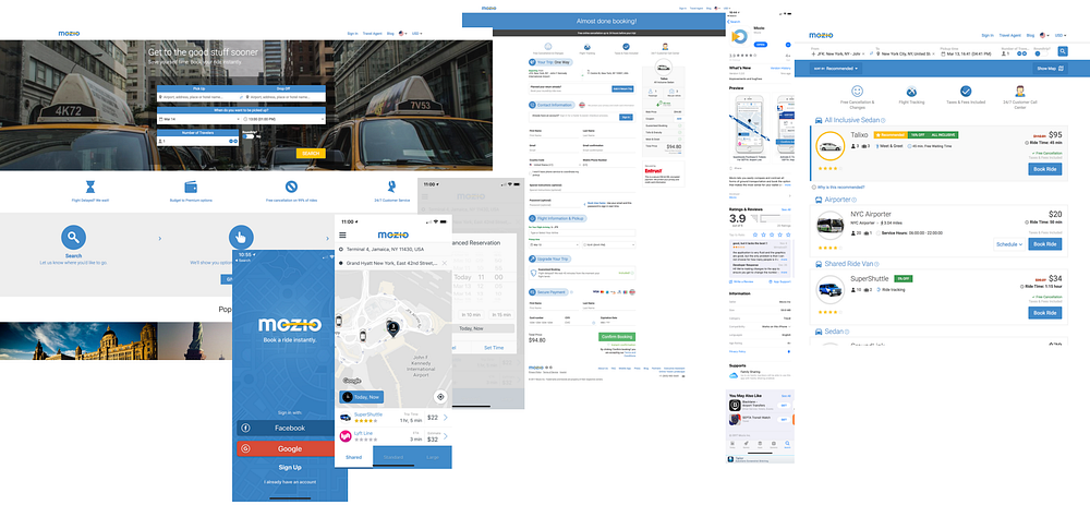
Existing Designs & Usability Testing
I examined all parts of the current onboarding experience for web and mobile — with an eye on user pain points. I also researched product and app store reviews to gain an understanding of users’ frustrations. Then I ran a comprehensive user testing panel to gather feedback on the existing web and mobile experience. 50 testers found 93 different elements they would improve; citing accessibility, usability, and unmet expectations.
User Archetypes
Based on user feedback, I created user archetypes for a typical business traveler and casual traveler to focus my design efforts. The goals for business travelers surround expensive rides and service, whereas casual travelers focus their budget — two archetypes, each presenting different challenges.


Focus Areas
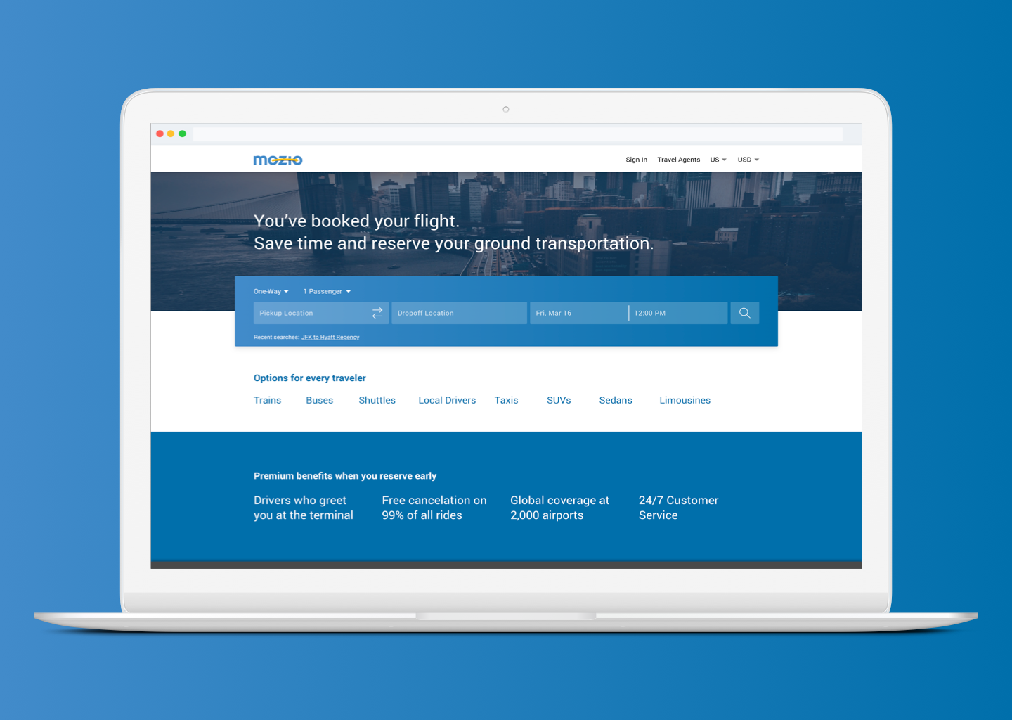
I synthesized my user research to identify, prioritize, and eliminate any usability obstacles. The analysis revealed seven focus areas that I could successfully tackle through new designs, with a high-level goal to implement material design as much as possible.
- Homepage UI (web)
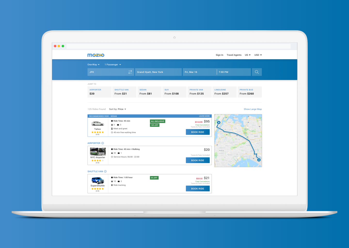
- Search results UI (web)
- Checkout page UI (web)
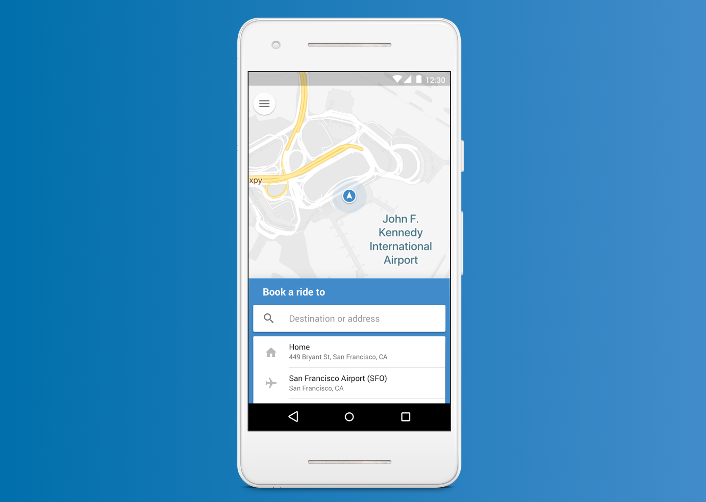
- Shorter user flow (mobile)
- Comparing services (mobile)
- UI refinement (mobile)
- Material design implementation (web and mobile)
Success Metrics
My goals were to address multiple UX issues from new users by overhauling core visual design elements for web and creating a refined new mobile experience. Therefore, I outlined three success metrics for my designs:
- System Usability Score (SUS) of search results page at least a “B” or higher
- Net Promoter Score (NPS) of new mobile design at least a 70/100
- New web homepage design preferred 60% or greater compared with the current design
Design Inspiration
Mozio has implemented various parts of material design in their existing web and mobile app. Based on user feedback, I decided to double-down on this design pattern — applying best practices across the board. It simplified contrasting buttons and text fields, while making both products (web and mobile) visually synchronous.
Based on user feedback that consistently mentioned improving the web and mobile user interface, I created a mood board to inspire a modern design pattern, with foundations in material design.

Build & Test
I rebuilt existing pages with a focus on new users, using a combination of material design best practices, templates, and inspiration from navigation and transportation apps.
To test my prototypes, I ran various tests from UsabilityHub. I asked questions about specific design improvements, created preference tests to determine what prototypes users preferred, and calculated NPS and SUS scores to track improvements using quantitative data. 41 testers gave feedback on 19 screens that led to changes made for 35 UI elements. Results from two rounds of testing are here and here.
Final Prototypes
After two rounds of user testing, I finalized the third version of the prototypes for web and mobile — focusing on my original goal to engage new users and grow active usage.




Conclusion
I successfully tested the new designs against the existing Mozio products and found the designs had exceeded performance goals in the following areas:
- NPS: 90 = Net Promoter Score for mobile prototype
- SUS: “A” = System Usability Score of 88 for search results page (web)
- 70% = Percentage of users who prefer the new website homepage compared to the current design in a preference test
- NPS: +12 =Increase in score by applying user feedback to mobile design
The goal of the project was to address multiple UX issues from new users by overhauling core visual design elements for web and creating a refined new mobile experience. This design sprint shows that by embracing the material design language in a more pronounced way, usability increases, cross-platform design language becomes synchronous, and users achieve their goals with less frustration.
Mozio’s goal is to make booking airport transfers less complicated, and by following a single design language, they can.
Disclaimer: I don’t work for or represent Mozio, but maybe one day. Mozio is a product that inspires me and I’m exploring how to improve their usability.


