Member-only story
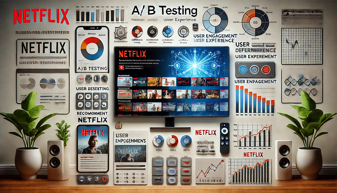
How Netflix does A/B Testing
Have you ever wondered why Netflix has such a great streaming experience? Do you want to learn how they completed their homepage plus other UI layout redesigns through A/B testing? If so, then this article is for you!
I’ll start with sharing my takeaways from a Designers+Geeks event I attended last week at Yelp. The two great speakers Anna Blaylock and Navin Iyengar, both product designers at Netflix, walked through insights gleaned from their years of A/B testing on tens of millions of Netflix members, and showed some relevant examples from the product to help attendees think about their own designs.

Experimentation
I really liked this first slide of the presentation and think it’s smart to use an image from the TV show “Breaking Bad” to explain the concept of experimentation!

The Scientific Method

Hypothesis
In science, a hypothesis is an idea or explanation that you then test through study and experimentation. In design, a theory or guess can also be called a hypothesis.

The basic idea of a hypothesis is that there is no pre-determined outcome. It is something that can be tested and that those tests can be replicated.
“The general concept behind A/B testing is to create an experiment with a control group and one or more experimental groups (called “cells” within Netflix) which receive alternative treatments. Each member belongs exclusively to one cell within a given experiment, with one of the cells always designated the “default cell”. This cell represents the control group, which receives the…