Member-only story
How to name colors in a Design System
Definitive, Semantic, and Contextual naming conventions.

There are only two hard things in Computer Science: cache invalidation and naming things. — Phil Karlton
Colors are the foundation of any Design System, but naming colors can be a struggle even for experienced Designers.
If you are not a Medium member, click this friend link to continue reading.
Over six years ago, I created my first Design System and made a color palette to support a mobile survey app called QuickThoughts. I was using Sketch and loved how Zeplin automatically assigned ‘cool’ color names on import so I renamed all of my colors in a similar fashion.
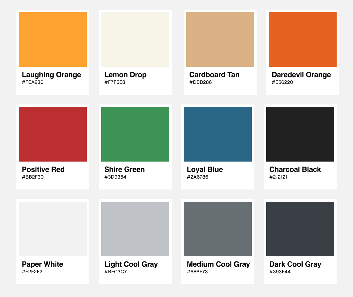
My choice of color names (‘Laughing Orange’, ‘Cardboard Tan’, ‘Shire Green’, etc) seemed reasonable at the time. However, this decision would soon prove to be a mistake when our organization bought another company that had a similar mobile application called ‘iPoll’.
After months of discussing how to include/support iPoll in our organization, the decision was made to deprecate the existing product and integrate its brand into QuickThoughts as a white-label solution.
When I created the color palette, I assumed only Android and iOS would always use a single color theme supporting a single app. Suddenly, we had two themes we needed to support on both platforms. One orange, the other blue.
If I had assigned the color name by its purpose rather than what it was (i.e. naming it ‘Primary’ instead of ‘Laughing Orange’), it would have been easy to change the value rather than the name and the value of the color for both apps. At the time, this foundational change wasn’t possible.
The deadline was tight and the engineering risk of renaming all the colors for both apps was too high, so we suffered the consequences (Both Engineers and Designers saw ‘Laughing Orange’ when the primary color was actually blue) until the newly integrated app was shipped.