How the design of AI tools turns writing into a “collage”
Exploring UI fragmentation in the design of new text tools.

Writing with AI changes writing — and the involved tools. New AI tools for text currently seem to pop up every day. Design theory? Less so. We need to develop cross-cutting concepts to critique and inform the design of AI tools.
As shown in the meme, we notice a design trend in recent AI tools for text: The page UI has been cut into text snippets, cards, prompt boxes, and so on. These fragments can be combined, (re)moved and (re)arranged, and prompted with, or otherwise employed in interaction. They offer new affordances and pose new demands when working in text processing interfaces.
The goal of the following exploration is to make explicit the underlying principles of this fragmentation in the UI design of AI tools, to analyse and inform design.
“Collage” in the design of AI text tools
Here’s the key conceptual insight upfront: A Collage-intense UI involves…
- working with text fragments
- writing in two voices (drafts & prompts)
- material from multiple sources (user, AI/external)
- this all shifts the user’s role from manual writing towards making editorial and compositional decisions.
How is this concept of “Collage” useful? One use is to surface relevant design considerations: Many AI tools for text, such as the ongoing wave of LLM-based interactive systems, “assistants”, “co-pilots”, etc. already implicitly rely on these aspects in their UI design. Giving these aspects a conceptual frame and name ( → Collage) helps us to explicitly consider them in design. This opens them up to examination, both constructively and critically.
How did I get there? Capturing this essence of Collage in the design of AI text tools took inspiration from various sources from Human-Computer Interaction, AI, Literature & Media Science. To empirically ground this, I reviewed the design of 36 recently published AI writing tools through this lens of Collage. This selection was informed by insights from a review of 115 such systems. Indeed, I found varying extents of “collage-yness” that can be identified by considering the four facets listed above. This is a good sign: The concept has descriptive power for design. We will make this more concrete in the next section.
What have fragments been used for so far? In the reviewed designs of AI tools for text, they serve a broad range of purposes, such as getting & exploring ideas; producing, entering, evaluating, and revising text; displaying & developing structure; human learning; and workflow integration.
UI patterns of “Collage”
Based on this concept of Collage, we can define a pattern language for text fragments in the UI and interaction design of AI tools. This is not a general “wireframe library”. Rather, it specifically focuses on the use of different kinds of text fragments in the UI. The figure below shows an overview.

As the figure shows with line style and colour, we distinguish between four text types, as a combination of two voices and two sources:
- Text sources: Is a text fragment written by the user or provided by the system/AI?
- Voices: Is a text fragment diegetic (i.e. part of the draft text) or non-diegetic (i.e. not draft text; e.g. a prompt, annotation, feedback)?
We can use these patterns to analyse existing designs. Moreover, we can leverage them to inspire new UI design directions, as discussed next.
Evolving the page UI via “Collage” patterns
We can employ the patterns constructively in envisioning new designs. That is, we use the concept of Collage to derive generative power for design. To do so, note how the patterns support a specific type of counterfactual reasoning:
- Fragmentation: What would the interaction be like if element X was divided, overlapped with Y, etc.?
- Sources: What would the interaction be like if element X was text of a different source?
- Voices: What would the interaction be like if element X was text in a different voice?
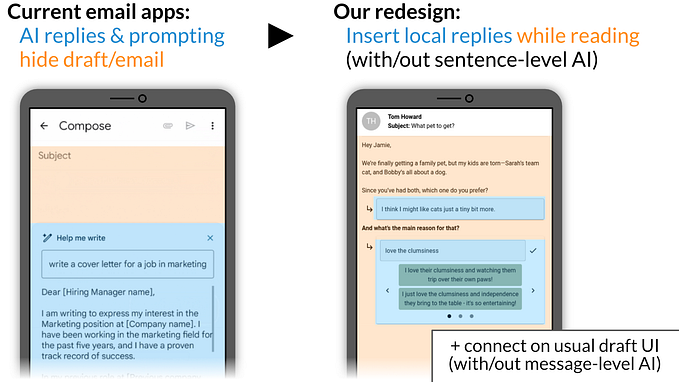
The figure below illustrates what this might look like when employed as an ideation activity to come up with UI design directions for AI tools:

Using the patterns in this way, akin to a morphological analysis, generates new designs. Clearly, these are not complete UI designs, but rather sketches. They capture the types of texts shown in the UI, how these are fragmented in a layout, and how these texts influence or relate to each other. To support using the patterns in a design activity like the one illustrated here, there is a version of activity cards in the project’s open science repository.
Using “Collage” as a critical perspective
The presented concepts can also help us to reflect on designs: If AI tools can turn the process of writing into acts of “Collage”, what might go wrong?
One concern is that designs of this kind treat language as prefabricated material: Thus, we need to think carefully about how we make text fragments actionable in the UI and interaction design of AI tools. Design details matter: For instance, in one of our studies, a button for directly integrating AI summary text into a draft made users think of these summaries as text suggestions. This was not our design intention though; the summaries were meant to provide an overview of a longer draft.
Another related concern is contributing to language scarcity of users as authors: If interactive text fragments offer language as prefabricated material, then the role of AI in writing is reduced to helping users write less themselves. While this may be a relevant design goal in some use cases, it is limiting to consider it the only one. Here’s a central question that we can ask for guidance:
Is my use case mainly about “getting text”?
Or is it actually about helping people think?
We can use the UI patterns above to make this actionable in a design exploration. For example, assuming we have some design with a text suggestion panel, we could ask: What if this AI text fragment in my UI design so far was actually a prompt to the user (e.g. a question for reflection)? Or what if it was split into many suggestions, potentially making each one less likely to be seen as “the system recommendation”?
We have defined and explored the concept of Collage in AI tools for working with text. In summary:
- Collage refers to fragmentation in UI design that supports and demands working with text pieces.
- This goes hand-in-hand with an interaction design that asks users to frequently switch between writing in two voices. That is, writing diegetic text (i.e. writing on the draft) and non-diegetic text (i.e. writing prompts to the AI).
- Involved text material comes from multiple sources; including from beyond the user (AI-generated or retrieved text, AI training data).
Overall, AI tools with UI designs in line with the aspects of Collage are currently shifting user roles in digital writing; away from manual writing, and towards editorial and compositional decision-making.
We see more and more interactive systems built around LLMs that surface the discussed aspects of Collage in their design. Thus, it is worth making it explicit as a concept in design, to be able to better consider it, be it constructively and/or critically.
Resources
This article is based on an essay by the author, to appear at the ACM “Designing Interactive Systems” (DIS) conference in Copenhagen in July 2024. Preprint: https://arxiv.org/abs/2405.17217
Activity cards (see sheet below) for using the Collage patterns in design activities can be found at the paper’s open science repository: https://osf.io/rt4ud/