Member-only story
How to build a legendary park
Learn how El Retiro in Madrid applies UX to transform its green spaces into one of the best places on Earth.

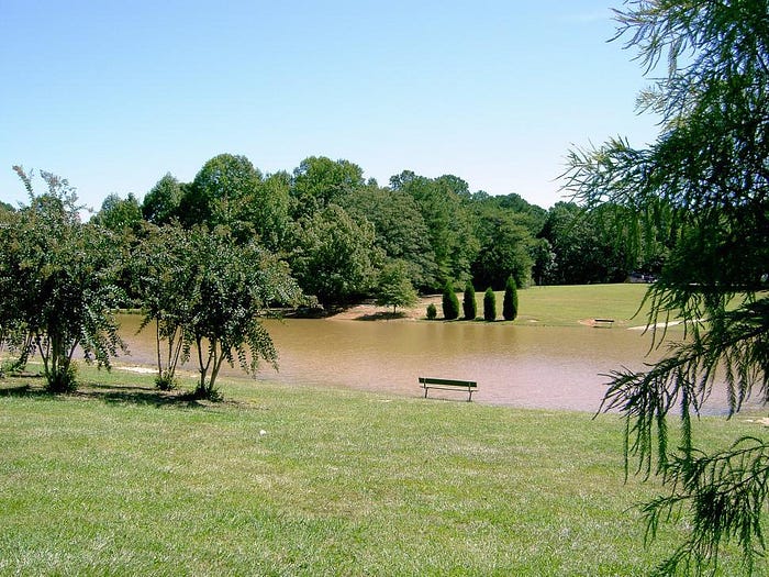
Tinkering with interfaces is cool, but could you apply the laws of user experience to build a great park? Or at least a better one than the one in this picture?
Yeah, the park in this stock image is not a good one. It’s just a green space. A decoration.
When creating parks for users like you and me, designers often default to this same uninspired vision — a stretch of manicured lawn, clean paths, and a few ornamental trees. It’s a classic, almost “golf course” idea of a park: neat, tidy, and entirely soulless.
What is wrong with the UX of the park in the picture above?
- No path leading to the bench. It’s pretty enough to make a photo, but, in reality, people are obviously going to want to walk to the bench. This will create a “desire path,” wear down the grass, and damage the area around the bench:

- All the water is wasted. I despise the human desire to domesticate the world by turning it into a huge green lawn. The grass in this park isn’t natural; it’s like a massive, artificial carpet. Since it doesn’t have enough shade, this man-made lawn won’t survive without an endless supply of water. It’s unsustainable and impractical, especially in a public space that could work so much better with low-maintenance, naturally adapted plants.
- Awkward layout. From one bench, you’re forced to stare directly at whoever’s on the opposite bench — a setup that feels more awkward than relaxing:

- Ignorance of flooding risks. A slight rise in the nearby river’s water level could make this bench unusable. A thoughtful design would consider natural factors like water flow and terrain.
But let’s leave this poor stock image park alone.

