You're reading for free via Raquel Piqueras' Friend Link. Become a member to access the best of Medium.
Member-only story
How to build trust with others by organizing your Figma files
Creating an organizational management system to deliver assets will improve the speed and quality of your work, enable better collaboration and gain deeper trust with your partners!
Hi there! 👋🏻 We are Raquel Piqueras and Christina Yang, we work together at Microsoft where we design a set of internal and external tools that are part of the Azure Cloud.
In the last few months, we have been doing some housekeeping in our Figma files and have realized how much the way we work impacts the trust our product teams have in us. In this article, we will deep-dive into the intentional changes we made to keep our Figma files organized, which resulted in fewer meetings, higher quality work, a more agile environment, and a few praises from our partners along the way. We hope you find it as insightful as we do!
We have put together a workspace toolkit in the Figma community to get started with our method. Feel free to check it out:
Clutter takes away your credibility
Have you ever worked with a large, disorganized Figma file? One that takes forever to load and may crash at any moment? With screens scattered everywhere, it can be difficult to understand the flows or the final product. Imagine being the developer tasked with building the final product from this mess, or the project manager who needs to review the latest design iteration. What if you are a fellow designer joining the project to help?
A cluttered workspace can instantly damage your credibility, even before the quality of your work is assessed.
On the other hand, a designer who delivers clean, organized, and straightforward work may be seen as a leader and gain the trust of their peers, manager, and product team even before they see the quality of their work. They may become the go-to person for new opportunities. Not only will others gravitate towards them, but ideas and creativity may flow more easily, requirement gathering may be more intentional, and building on past work may be more intuitive.
Staying organized is not a skill that is taught during training or when joining a company. However, it can make a significant difference in the quality of our work and the relationships we foster. Keep reading to learn how to keep your Figma files clean and your stakeholders happy!
Part I: One ask, one file
We’ve all been there: a feature quickly snowballs into the entire product design on a single Figma canvas. Large files are difficult to manage and upkeep. They can crash, and iterations blend with the final screens. It’s not a good user experience.
Follow the rule: one feature, one file.
When given a task, consider if the scope is too large to handle. For example, imagine being asked by your project manager to design a dashboard. Upon reviewing the requirements, you discover that it will be a substantial dashboard with multiple tabs, each containing different information themes such as an overview, analytics, recommendations, and a history log. In this case, you may want to challenge your project manager to further narrow the scope of the work and make each tab a separate feature. You could suggest tackling one feature at a time, allowing for a deeper dive into the requirements of each section and proper sign-off before moving on to the next task. This approach not only allows for more thorough consideration of each section but also provides closure in portions and prevents churn.
In this instance, you would create one Figma file per feature. This allows you to keep track of iterations and requirements in one place. It’s also an excellent way to educate your product team about the scope of work you can effectively manage at any given time. And it’s never too late: if your Figma file has already snowballed, identify features, and move them to smaller files before your computer catches fire!
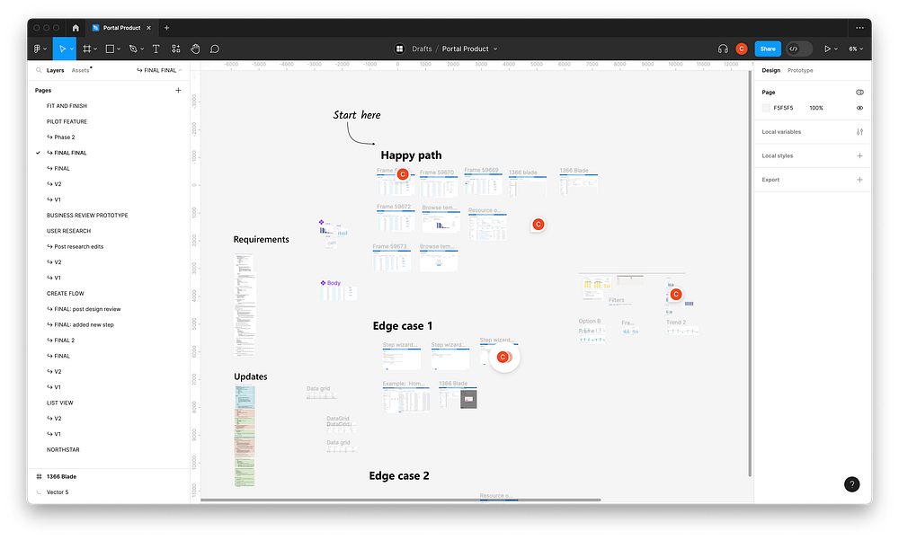
The Sign-Off File
We have found it helpful to have a sign-off file where final designs ready for implementation are stored. In this file, we only include key screens (not every single one) and provide links to other Figma files that cover different scenarios. This is an excellent way for your product team to understand what needs to be built and have a central location with links to all relevant files. This file is also where we add annotations for engineers on reflow behavior, empty states, interaction behaviors, etc.
The Consults File
Do you often find yourself answering small questions that require quick visuals? Do you hold office hours to address clarifying asks? If so, having a designated consults file can be incredibly helpful. Add a page to this file for each consultation you receive. As the file grows, it can serve as a reference point for product teams with limited UX resources to check if their questions have already been answered by past consultations! In no time, you would have created a self-served guide!
Part II: The information architecture of a Figma file
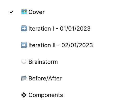
Let’s discuss information architecture (IA) in Figma. It’s important to maintain a consistent structure in Figma files so that our product teams can easily navigate and understand them. When working with new partners, be sure to introduce yourself and the way you work by showing them how you structure and hand off work in Figma. Trust us, they will be impressed by your methodical organization, and you will start new engagements on the right foot! Our Figma files typically contain the following sections:
- The Figma Cover + Key Information
- Iteration Pages
- A Components Page
- A Before-and-After Page
- A Brainstorm Page
Cover + Key Information: The cover serves as a visual indicator for users to quickly identify the contents of the file and its key stakeholders before opening it. This makes it easier to find which file you’re looking for in Figma. On the cover, we include the name of the product, feature name, creators, and other stakeholders such as project managers and developers, as well as the semester or time of creation. Below the cover, outside of the thumbnail area, we have a dedicated section for additional information such as relevant links, notes, and context.
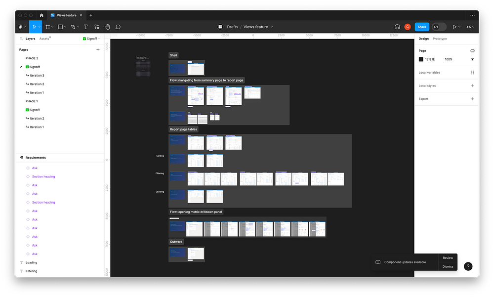
Iteration Pages: For each new iteration (even if only small changes are made), duplicate the page and add a timestamp. This allows you to better track timing, understand how much churn a feature has undergone, and refer to past work.
Components Page: Keeping all components on a dedicated page helps prevent confusion between components and final designs. It also makes it easier to refer to main components, make changes, and keep track of local assets.
A Before-and-After Page: This page helps visually communicate the progress that has been made. It’s a great asset for future presentations or performance reviews, as well as for building your portfolio. Make a habit of starting with a screenshot of the current state of the product!
A Brainstorm Page: This is the only place where you’re allowed to be messy! Remember to never discard ideas; keep them on this page in case they come in handy in the future.
Part III Requirement Gathering
Receiving a well-written specification can feel like a “hallelujah” moment. However, after reading through the document, you may feel overwhelmed as you try to figure out how to translate the requirements into designs.
Clarity comes from breaking down large items into smaller tasks and grouping small tasks under larger categories.
This may sound vague and contradictory, but it ultimately describes how we digest details while making sense of how those details fit within the larger picture.
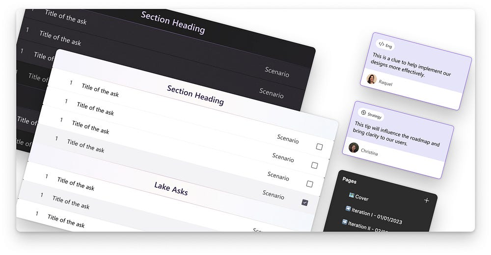
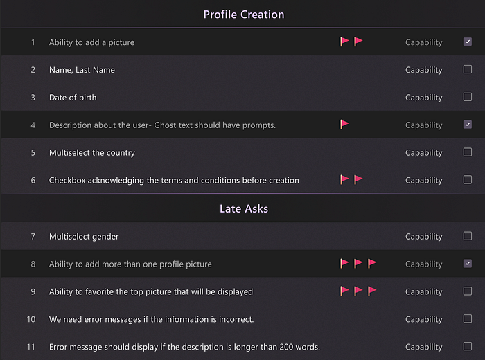
First, break down large items into smaller tasks. After reading the specification document, copy and paste the requirements into your Figma file using our requirement gathering components. For any complex requirements that seem daunting to tackle, divide them into more manageable sub-requirements.
It may seem like a small, unnecessary step to copy and paste information from a document into your Figma file. However, this extra step is a time investment that saves you from having to navigate back and forth between Figma and the document and provides contextual information all in one place. It also ensures that you thoroughly understand the requirements.
Second, group small tasks under larger categories. As you begin to create design explorations, it’s helpful to categorize the requirements into capabilities and scenarios. Capabilities are straightforward functionalities that exist on a screen without needing surrounding context; for example, “the header needs filters, metadata, actions like favoriting and sharing, etc.”. Capabilities are usually covered by design systems Scenarios require surrounding context because they describe flows that outline how a user accomplishes a task; for example, “As a user, I can drill down on metrics from this page.”. These will be the ones in need of your UX brainpower!
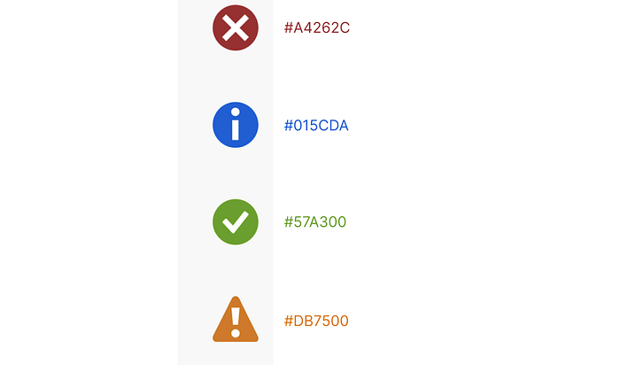
We also find helpful to add flags to our sticky component for the most important requirements so that we understand the priority levels and can ensure to cover them.
By grouping requirements under these overarching categories, it’s easier to:
- Determine which screens are needed
- Figure out which requirement(s) should be covered by which screen(s)
- Visualize how individual screens fit in context (for scenarios)
- Understand what you’re looking at so that when you revisit your past work in a few months, you won’t be lost in a sea of 30 unorganized frames.
Using these strategies will help you map out the requirements for your designs and assist your project manager and engineer partners as well.
Part IV: Simplify Communication
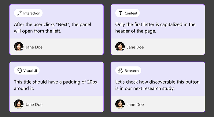
Lastly, our team has created sticky components to enable asynchronous collaboration and bring further clarity to our designs. Our product teams love them! We were inspired by Doordash’s Crit Stickies and created a set that allows for specifying a category or theme (some of our most used categories include Brainstorm, Strategy, Engineering, Content, Interaction, etc.), as well as the author of the note. The stickies also come with responsive arrows to point out different areas of the design.
The stickies allow us to clarify aspects of implementation that may be difficult to grasp by just looking at the screens. They are particularly helpful in providing clarity when the designer is not present.
Closing Thoughts
An organized system in Figma has enabled us to build trust with new partners who have limited exposure to UX. In recent months, we built a tool from scratch as part of a convergence effort, and we firmly believe that this organizational method has allowed us to meet deadlines, avoid churn, and influence strategic decisions for the product. We hope you enjoy using it as much as we do!
If you’d like to get started, we’ve made it easy with our workspace toolkit in the Figma Community. It includes everything mentioned in this article! You can find it here:
Links
Here are some other good reads you might find helpful about this topic:
Happy Figma Housekeeping!

