Member-only story
How to craft an effective landing page? — a UX case study

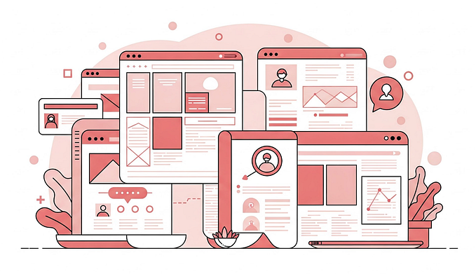
A landing page is a webpage that prompts the visitors to take certain action. Whether the business wants you to download its ebooks, sign up for its upcoming webinar, sign up for a trial, etc. The goal is to let the business sell or capture leads.
A landing page is different from a homepage in that a homepage usually shows business overview with a bunch of links that link to other pages, whereas a landing page has fewer links with usually one primary CTA (Call-to-Action) button that wants visitors to complete a specific goal.
(Depends on the business, a homepage can also be a landing page)
I bet you’ve seen a landing page before; it’s everywhere.
Like the one below I found on Facebook:

The reason why I want to analyze and design a landing page is because I’ve been singing up for a bunch of webinars, “3-part-video-series”, and ebooks these past few years, and I really want to know what makes a successful landing page (and what not).
So, this is going to be a bit of a marketing mix with UX kind of post.