How to create great error pages
As a UX designer, I cannot say my dream brief is to design and write the copy for an error page (just me?). But, the truth is, error pages go part and parcel with UX. Things inevitably go wrong when using a digital product, and the least an interface can provide is some helpful messaging when this happens.
On a recent project I worked on, overall changes to the UX and UI meant we had to rethink our error messaging and move away from odd, vague, and slightly unhelpful language. With this as an excuse, I’d like to offer some tips on putting together awesome error pages, so if these pop up for your user, they forgive you, and even think you’re helpful, charming and kind of hilarious. Thankfully, there are some companies out there that are doing things oh so right!
As a starting point, it’s always a good plan to refer back to the 10 Usability Heuristics for User Interface Design by Jacob Nielsen, mainly this one:
Help users recognise, diagnose, and recover from errors: Error messages should be expressed in plain language (no codes), precisely indicate the problem, and constructively suggest a solution.
Here are some ways to embody this message in your error pages:
Avoid jargon where possible
Using technical jargon for a technical issue is extremely tempting, but a lot of the time it just comes across as just plain gibberish when your audience isn’t a bunch of engineers. Your user is already upset that they couldn’t get where they wanted to, imagine their pain when they encounter another hoop to jump through. Especially when the hoop is on fire and leads to the open mouth of a crocodile.

Own up. It’s not you, it’s me:
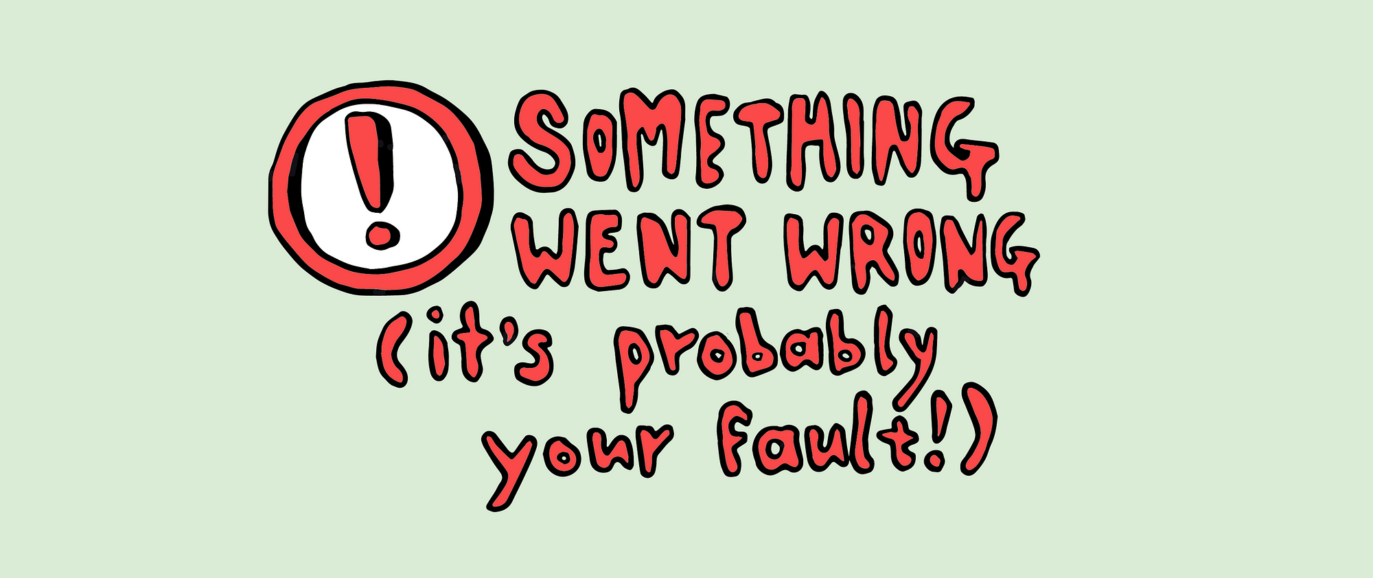
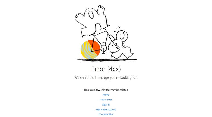
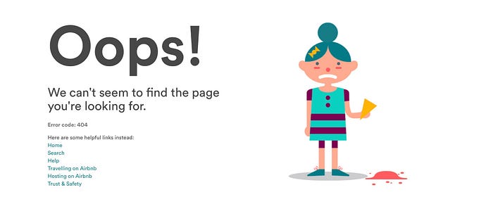
This is pretty obvious for a UXer but NEVER make your user feel like it’s their fault or they screwed up somehow. It’s pretty likely they didn’t anyway, or if they did, well, we can all be silly with technology sometimes. Own up. Apologise. Be transparent: ‘We’re sorry, we couldn’t find the page you’re looking for.’ You can even take it up a notch by using wording such as ‘Oh no!’ ‘Oops!’ which shows empathy and caring whilst being endearing.

Be short. Sweet. And as specific as possible.
Error message pages need to be scannable when it comes to the explanation of what happened, and that message should be kept short and to the point. As I will cover later on, error pages are a great opportunity to add fun and delightful stuff, but firstly, we need to address the fact that something somewhere went wrong. Also, if you know the root cause of the error (for example a page not being found, or a session expiring due to a page staying open for too long), let the user know. The messaging should be as specific as possible in order to provide them with reassurance as well as an explanation so they can try and rectify the problem if they can.

Think about the product tone of voice
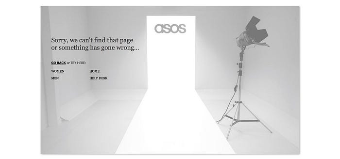
To ensure consistency and not disrupt your user too much, consider your target audience and brand identity. For example, it’s good to taylor your language to the people that usually use your product. Use your common sense. For example, if you’re working on an online banking product, then ‘Sorry bro, your sesh has timed out’ is probably not the best way forward. But if you’re perceived as a quirky, fun brand, you could totally get away with ‘Golly gumdrops! It seems we cannot find the page you’re looking for. Here’s a picture of a unicorn instead’.
Add -if you can- some helpful guidance:
When the error type is quite specific, there are probably some ways to solve the problem. This may be as simple as adding a little button to go back, or a bunch of popular links for them to choose from that will help them navigate to safety. It may even be a list of instructions to try in order to self serve and rectify the issue, such as refreshing the page, clearing the cache, or eating less bisquits close to the keyboard, because, you know, crumbs.
The cherry on top; add an extra layer of delight.
Here’s the exciting part. You’ve added messaging that feels relevant to your user. You’ve been honest and clear about what happened, and you offered some help. Now, you can offer that added delicious layer of delight: fun visuals and humour, to take the pain away and make them smile, even laugh. If your company has a mascot or uses caricatures a lot, this is a great place for one. If it’s not easy to get something of this sort produced, a joke, pun or meme will suffice. Remember your brand identity here, as it’s a great opportunity to tie it all together. Or, alternatively, not worry about this part too much, because you sell insurance or something and a meme would be silly.
It’s how we handle the tricky stuff that defines us, and if you reframe a bad thing as a silly, embarrassing thing, it’s very likely that your user will be understanding, and even appreciate you that little bit more. Because we all love a cute caricature and a corny joke, right?