How to create stronger layouts with the 8pt Grid System
The 8pt Grid is one of the most commonly used Layout Grid Systems there is, and for very good reason.
Layout Grids are everything in UI Design.
Well. Ok. Don’t discount Colour. Don’t forget about Typography. But get your Layout Grids right and you’re half-way there in creating much better looking, and functioning UIs.
Consistent, and scalable spacing helps you eliminate guesswork whilst designing and developing. It requires fewer design decisions. And it enables a much faster turnaround on projects.
The 8pt Grid is one of the most commonly used Layout Grid Systems there is, and for very good reason.
Let me tell you more about it in this article…
Oh. Before you read the rest of the article…
🏠 Growing a SaaS startup? I combine strategic design with proven founder experience to help you build products users love.
Join the Haus waitlist for early-bird perks → https://gohaus.design/
Ok. So what is a point (pt) exactly?
A point (pt) is a measurement of space that is dependent on screen resolution. The simplest explanation is that at a ‘1x’ resolution (or @1x) 1pt = 1px.
‘Back in the day’ when screens were 1x; 1pt equalled 1px. Then your Retina (2x), and Super Retina (3x) screens came along and things changed. Where designing for the iPhone X (3x) your design would then be rendered with three times as many pixels per inch (ppi).
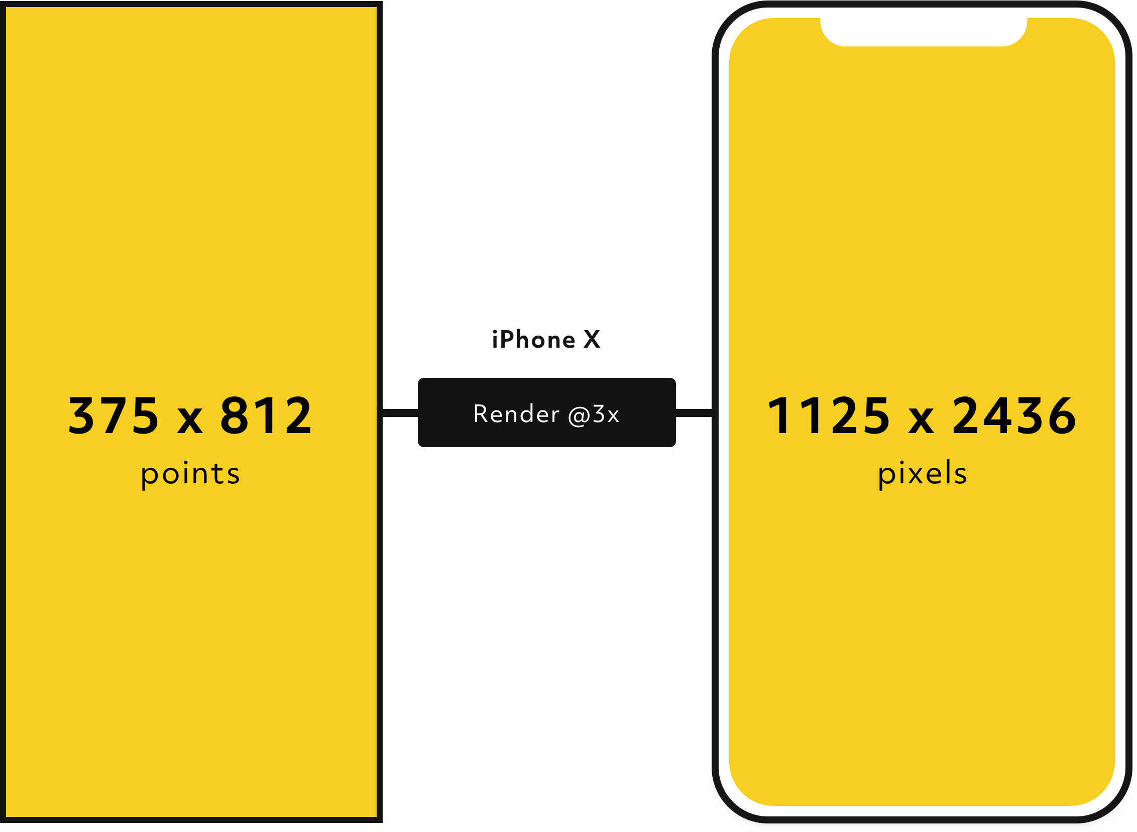
So for example, if you have an icon at the size of 24px, when you export that icon as an asset @2x and @3x the rendered image would be either 48px (2x), or 72px (3x), which will then look great on Retina and Super Retina displays respectively.
I always recommend designing in 1x, then exporting your assets at the different sizes (@2x, @3x etc…) as required. It reduces a lot of confusion.
So why 8pts?
Like I mentioned earlier, the variety of screen sizes and pixel densities has continued to increase which can make the job of asset generation more complicated.
Using an even number like 8 to space, and size elements in your design makes scaling for a wide variety of devices much easier, and more consistent.
The basic principle of the 8pt Grid is that you use multiples of 8 (8, 16, 24, 32, 40, 48 etc…) to margins, padding, and sometimes dimensions, on elements inside of your design.

I always think in 8s now when creating my UIs, with the odd occasion when I’ll call upon 4pt, for example when designing for Mobile where the screen real estate is limited.
Hard, or Soft Grid method?
‘Soft Grid’ for the win every time!
When I’ve created UIs before I’ve always opted to use the ‘Soft Grid’ approach, where you simply measure 8pt increments between individual elements in your design.
This as opposed to the ‘Hard Grid’ approach which places elements into a grid pattern defined in 8pt increments which I find a little too rigid and not practical for when it comes time to code up a design.
Icons & The 8pt Grid
When it comes to icons and the 8pt Grid, you will find that most of them have been designed to sit inside of frames that are multiples of 8 (16x16, 24x24, 32x32 etc…)
If not, then make sure that any icon that you drop into your design you frame it inside a container that uses a value that is a multiple of 8 (ie; 24x24). This will just enable icons to be laid out consistently within your UIs.
Typography & The 8pt Grid
When it comes to Type, using the 4pt Baseline Grid alongside the 8pt Grid gives you a much more harmonious vertical rhythm throughout your designs.
Simply align your type to a Baseline Grid of 4, which uses a line-height value that is a multiple of 4 (4, 8, 12, 16, 20 etc…)
Why 4? Well for me personally, I’ve found that scaling my Baseline Grid in multiples of 8 in the past has just pushed the text too far apart when working with certain text sizes.
The 4pt Baseline Grid gives you more fine-grained control, and brings much better results.
Hopefully with this brief overview of the 8pt Grid you’ll now feel confident in laying out your UIs faster, with more consistency, less guesswork, and fewer design decisions required.
Give 8pt a try. Your designs will look 10x better for it.
Oh. Before you go…
🏠 Growing a SaaS startup? I combine strategic design with proven founder experience to help you build products users love.
Join the Haus waitlist for early-bird perks → https://gohaus.design/

