How to create a successful, high-conversion landing page

Building a good landing page is much easier than building a full-on website, right? After all, it’s just a single page, with a single goal of getting people to enter their email address or credit card number. No bulky style guides — just tons of room for creativity.
Well, a lot more goes into designing a landing page than you might think. What ultimately matters is “conversion” — getting users to do the specific action you want them to do — and how you can maximize it.
What is Conversion-Centered Design?
Marketing campaigns are based on a single purpose, and need a much more focused user experience. An experience that converts visitors into customers.
A landing page should serve a single purpose — the defined purpose of the campaign. If you start building without a clear idea of what you’re aiming for in mind, then you won’t be likely to succeed. This forms the base of a conversion-centered design (CCD) — a design aimed at this achieving this conversion.
In other words, it’s all about persuasion. And the rules of design change quite a bit when it comes to designing conversion-centered landing pages.
The 3 principles of CCD ☕
Rule #1: Hold their attention
Your whole page should intend to persuade the visitor into taking a specific action. This action could be downloading your E-Book, using your service, buying your product, or whatever your campaign aims to achieve.
And every single element should contribute to this goal. The fewer the distractions, or “leaks,” the better the results.
A landing page should, in most cases, have a 1:1 attention ratio. An attention ratio is the ratio of things the user can do to the number of things the user should do, which, for a marketing campaign, is always one.
This is why marketing campaigns should link to a single, dedicated page for the traffic. This will greatly help in reducing the distractions on the page. In most cases, your company’s homepage does not only intend to make a single specific campaign successful. So if your ads link to your homepage, the number of leaks will increase, and will have an adverse effect on your campaign.
Achieve a 1:1 landing page attention ratio
Take a look at the landing page wireframe below. It has a single Call-To-Action (CTA) button, so there is only one thing to do here — attention ratio of 1:1. The purpose of the page is very clear: click the call-to-action button.

Remove your navigation bar
- Yuppiechef saw a 100% increase in conversion rates (from 3% to 6%) by removing their navigation bar
- Career Point College removed the top navigation bar and modified its form layout, which increased the conversion rate by 336%.
- SparkPage’s conversion rate jumped from 9.2% to 17.6% over the month that they ran a test removing their top navigation.
Since your landing page is for a single purpose, your visitors should only be at that place — no leaks to any other page should distract your user. This said, navigation bars with links to different sections on the same page may be useful.
Remove Stock Images

Users know when a photo is stock. It has that feel to it, and they may even have seen it before. And it’s even worse when the image does not serve a very meaningful purpose.
Stock images may even decrease the apparent authenticity, uniqueness, and value of the brand. Replace such photos with custom, high quality images. You could even give a thought to illustrations.
Make your CTAs speak
Don’t keep the default ‘Submit’ text on the Call-To-Action button.
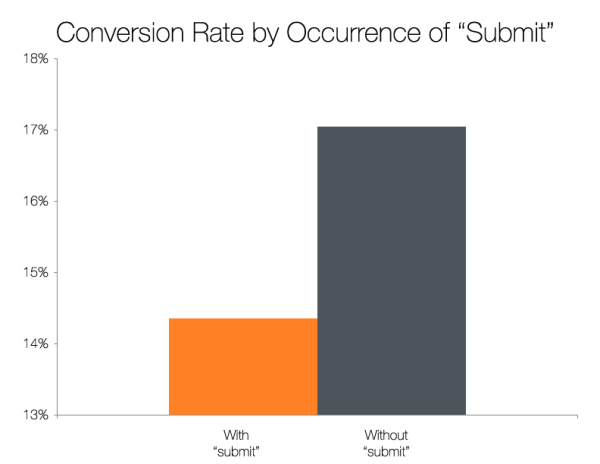
HubSpot tested the buttons with the text ‘Submit’ against those with a different phrase. The results are shown above. The boring, old ‘Submit’ lacks any compelling behavior.
Exceptions to the 1:1 Ratio
On long landing pages, you can use multiple buttons with the same goal, with purpose to the text around it which may have convinced the reader.
As mentioned earlier, it may be useful to have a navigation bar with anchors to different sections on the same page.
This post on The Daily Egg has more details on elements which you should avoid on landing pages.
Rule #2: Put things in context
The context on the page should be powerful and persuasive, so as to increase the conversion rates. This requires the content to be according to the user — how much the user already knows and what they need to know in order for you to convince the person.
The channel that was used to bring the visitor must have given a brief outline, but not the details, as ads do have certain limitations. Your work is to keep the main message same as that of the advertisement and also provide more information that continues to persuade.
The design of the landing page should also maintain the branding and identity of the campaign — both in terms of design and voice. Brand Voice refers to the tone of communication and the style of writing. Here’s a guide to creating the right voice for your brand. The tone of voice of the campaign should be the same as that of the brand, as this ultimately helps in ‘branding’ and increases authenticity, along with the primarily desired effect.
These two points also free the visitors from re-interpreting the headline and allows them to progress to the remaining content.
The Importance of your Headline
The headline is the main means through which we can deliver on the promise and message we delivered through the ad. After all, the visitors were interested enough in the main motive of the campaign. So there is less chance that they will leave if we continue to persuade them with more information within the same outline (and if the advertisement did not make false promises). Why not use this to our advantage?
The headline should also convey the exact point of the campaign and explain what the page is all about. There is a more in-depth elaboration of this point in the next aspect of conversion-centred design.
The headline should appear ‘above the fold’ and should be the most distinct piece of text.

The Evernote landing page has a centered and distinct headline that tells the ultimate utility of the product, and the subheading elaborates on that. They did remember the principles, after all 😉.
Rule #3: Achieve clarity
This appears to be a fairly simple principle, but many landing pages lack this — both in their content and design.
79% of web users scan the page rather than read it. If we make the visitors struggle to find out about our offer, the conversion rates will go down. Period.
Information Hierarchy
Information Hierarchy is the order with which the elements on the page are presented. The elements should have a proper flow and should be connected, with the required ingredients having visual dominance.

Back to headlines. The headline of the above page is quite clear — that’s great. And it reads ‘From now on, things will get better’ — that, my boy, is really bad. How will things be better? Will you impose a ban on Internet Explorer? Please don’t tell me that the aim of your campaign was to ‘Make Things Better’. Please. 😞
Actually, thanks to them for keeping their word. Things do get better — the subheading makes things clear. But actually, a subheading should make things ‘clearer’. The subhead should have been the headline of the page. I suggest you check out the whole post on Unbounce.com that talks about 9 bad examples of landing page design — and what can be done to fix them.
A great way to test the clarity of your design is to take the ‘Squint Test’ of the page — squint at the page or apply a Gaussian Blur to a screenshot. Do the important elements stand out? Are they enough for a correct interpretation of the service, offer, or whatever you aim at?
I read this epic quote about speeches, and can be applied quite well to conversion-centred designs as well:
“A good speech should be like a woman’s skirt; long enough to cover the subject and short enough to create interest.” — Winston S. Churchill
Clear vs. Clever
If to choose one, it’s clarity. It’s (almost) always clarity. Try to be clever while being clear. This can greatly improve the conversion rates. Here’s a great article on Clear vs. Clever Copies on CopyHackers. They also did a test with three variations of the same copy. The results showed that the copy with a clear message and a light sense of humor performed the best. Quoting them,
“Your landing page visitors need to understand (1) where they are, (2) what they can do on your site, and (3) why they should stick around. If you’re at all unclear about any of these things, you’ll lose credibility and the visitor.
But once you have the essential messages in place (and as clear as Voss water!), it’s okay to have some fun and let the creative juices flow. Chances are that if your message makes your target audience smile, you’re more likely to be remembered. And in a sea of Google search results, being memorable is a very good thing.”
Are you ready?
Being equipped with these basic principles will help you make your clients happy with higher conversion rates. I suggest you dig deeper into the principles of Conversion-Centered Design. A resource that I would highly recommend is E-Book The 7 Principles of Conversion-Centered Design. It was also a huge inspiration for writing this post.
Have you got a great tip? It would be wonderful to let others know about it. Share it by leaving a comment below.

