How to defend the originality of your design
Few days back, I downloaded 3 different apps on my phone. To my surprise, the signup screen that came were exactly the same. This led me to ponder upon the very important question that lingers in the UI/UX design community today.
Boss: “Why is your design looking like the ‘X’ app?
Boss (hidden meaning): ” Why is this UI strikingly similar to ‘X’, you better change it quickly to make it look original since you are being highly paid for the originality!”

I always stand by a principle that I learned in my school of Architecture which says ‘Form Follows Function’ which I like to re-interpret as ‘UI follows UX’. The problem arises when all the generic functions in every app( login, upload a pic, search, list of cards etc.) combine with limited standard Android & iOS theming options, making two different apps looking strikingly similar that it raises a lot of eyebrows.
In a situation like this, I prefer not to change my UI if the design process has convinced me that it will give the desired results and take me towards my goal. I try to argue with myself and others with following arguments —
- Use or Function

Time and time it has been repeated that focus on why users use your product. You might be building an e-commerce, game, dating app, learning app, landing page etc. You have to be aware of your goal and carve the simplest way to reach there. You will never achieve perfection but in the given set of constraints, it should work.
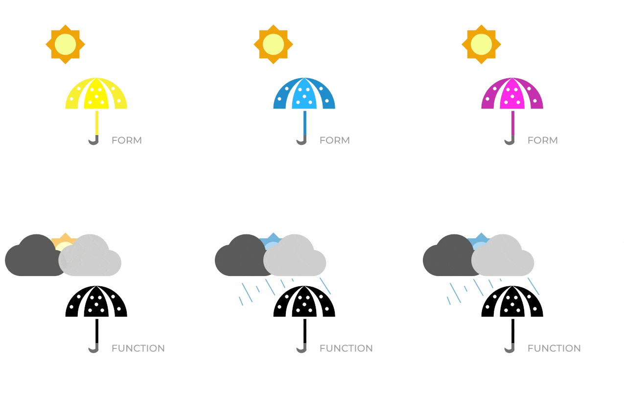
A friend of mine once suggested that he wished to purchase a fancy new umbrella since he is bored of his old one. So I questioned him —
me: Does your old umbrella protect you from the rain?
friend: Yes, perfectly.
Me: How often do you use it in a year?
Friend: 2–3 times.
me: Do you think people notice umbrellas on a rainy day in bangalore?
Friend: umm.. no they are just rushing for shelter.
Me: Do you still consider buying a new one then?
Friend: I hope my mum didn’t giveaway the old one.
As long as the umbrella protects you from getting wet which is its primary function, you don’t need to worry about an aesthetic variation. Such questions should bother a designer if the function is different for instance of an umbrella for a lady who uses it frequently on sunny days and looking for one matching her dress.
Underlying function in Tinder, Meesho and Fynd is to verify and login a user. Since that is accomplished the designers and leaders should rather pay attention to other primary stuff user is supposed to accomplish on the app.
2. It is so obvious
This is one fallacy which designers usually suffer. The journey from Research to wireframe to high fidelity UIs is a long one. But a finished product appears to be so obvious and sometimes even similar to other obvious products that the originality gets ignored. Trust the process and measure the impact first.
3. Inspiration or imitation

‘There is a fine line between inspiration and imitation’ is a grossly overused argument given in such situations. I rather like to keep it very simple. If there is no legal harm I would like to gain an upper hand by imitating a proven model and do not reinvent the wheel given I have exhausted ways to make my plan work for even better results. I love the consistency and so does every user in the world. So by integrating a familiar design pattern, I am reducing any additional steep learning curve for the user.
4. Faulty memory
When people say It looks so similar, they might not know that it is a superficial comparison as what they remember might not be the case. Our brain tends to remember the task accomplished in the screen and it doesn’t need to record each and every detail for doing it.
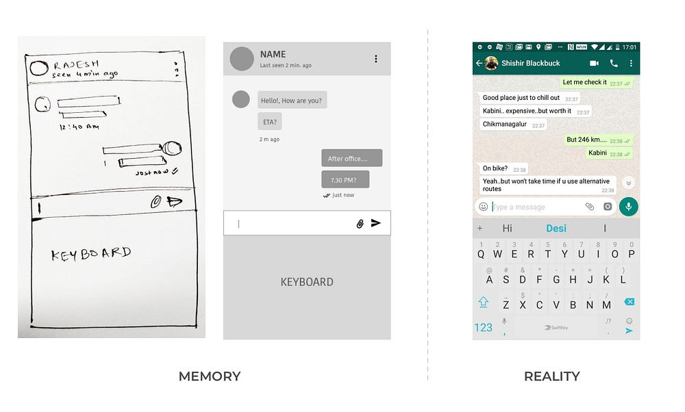
For eg: Do you remember the placement of ‘voice’ icon and ‘send’ icon in WhatsApp?
When I tried to draw WhatsApp interface from my memory, I made this. Very disturbing results considering that I use it on a daily basis.

5. Consistency is in demand
People love to be consistent. It avoids straining our hippocampus for training new neurons and instead repeat what is already stored. Isn’t this an ABCD for habit forming product? Users expect things to be as simple as their last app. They expect the call icon to start a call. A search icon to start a search. It makes them happy to know that like many good apps, this one is simple to use. Some users are so hesitant to change that they are ready to quit the product rather than learn new way of doing the same thing. The infamous Snapchat Redesign is a very good example to support this point.
6. Opinions are opinions
Finally everyone is entitled to their opinion. They might be coming from different walks of life and might throw a hunch or two. But trusting the design process and research is your job expertise and not theirs. If it is coming from someone you can’t ignore, gracefully run a A/B test and conclude your findings. Maybe you find a thing or two that you might have missed. It will definitely lead to a better relationship between you and your boss.
So to conclude, striking resemblance in your UIs is justified as long as you are sharp on your research and do not intend to spend time reinventing the wheel and keep the product consistent for user to avoid any steep learning curves.
The opinions here are completely subjective and based on my first hand expereince in UI/UX field in the last 4+ years. Feel free to pour in your opinions.
Please clap and share your experiences where you faced a similar situation. I am always reachable at vermaviraj91@gmail.com

