How to define color usage through semantic sets for design systems
You’ve created all your color ramps, but how the heck do we start defining how they will be used? Let’s talk about it.
Before we dive in, make sure you get caught up on how to pick out your brand colors and how to create a color ramp.
🎨 Follow along in Figma: Community File
What is a primitive color?
A primitive color is an individual color from our catalog of brand colors, purple.100, purple.200, etc. It is the most atomic form of color and will be attached to a semantic color name.

What is a semantic color name?
A semantic name for a color defines how a primitive color will be used throughout a design system. e.g., foreground.primary.
Primitive colors have more pragmatic names, such as green.200, purple.500, etc. for selected HSL/Hex values because no one will remember #7748F9. These primitive names don’t provide any information about how it will be used within the system. Is it a background color for our primary button? A border color for our focus state? No one knows, and this is why we rely on semantic naming.
Semantic naming is essential not just for color but all other foundational styles. I’ll continue to touch on this concept throughout this design system series.
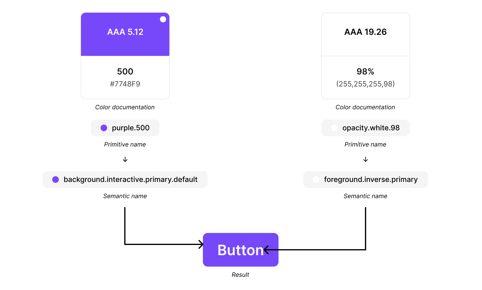
In the example above, the primitive color purple.500 is attached to the semantic name background.interactive.primary.default. This clearly tells me that purple.500 will be the background color for the primary button in its default state.
The primitive and semantic relationship
A semantic name doesn’t replace a primitive name. Primitives attach to a semantic name because you can detach and change the primitive color associated with a specific semantic name.

In the example above, you can see that we are updating the purple.500 to green.600—which automatically updates the semantic color. Once you establish your semantic names, they shouldn’t get changed often, if at all. You can start to see how this can play into theming. To create a dark mode, you only need to change out your primitive attachments.
If you’re familiar with design systems, you’re probably thinking, “But you missed a semantic level that defines your brand color!” This is intentional. It’s not required for a successful design system. However, I will cover strategies for this in my next article, focusing on advanced tactics for color theming.
Creating semantic color sets and naming conventions
There are a variety of strategies for semantic color naming; I will share what has worked for me when building multi-brand systems. Collaborate with your engineers because they will use these names in their code; you have been warned!
What’s with all the periods and lowercase names?
We want our design files to align with code as much as possible, so how we name our styles is important. Engineers typically prefer lowercase naming, but you may also see camelCase, kebab-case, or snake_case for multi-word needs.
The periods between names are equivalent to the backslashes / used to create folder structures for styles in Figma. If you’re familiar with design tokens or using Tokens Studio, this is also how the .JSON file engineers use will be structured. You could think of it like a breadcrumb.
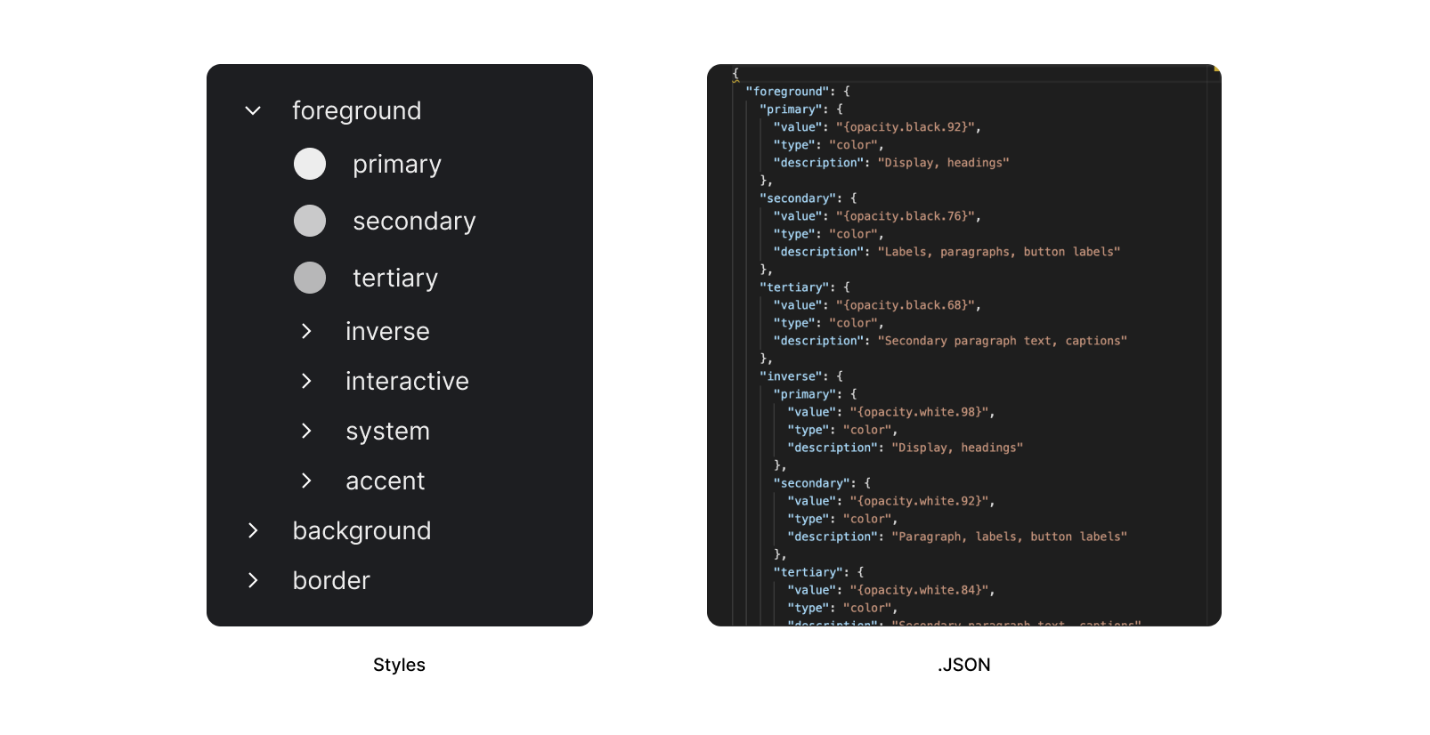
In the example above and to the left is an example of what your styles may look like. “foreground.primary” or “foreground/primary” creates a primary style within a foreground folder. This same concept would apply to Figma variables.
Top-level semantic color sets
Semantic color sets can be broken up into 3 main categories that all work together to style all UI elements.
- Foregrounds
Text, icons, and any elements that sit on top of a background. - Backgrounds
The background color of individual UI elements and whole sections or bodies of content. - Borders
The stroke or outline color of individual UI elements or lack thereof.

Styling a component
Before we dive deeper into sub-categories, let’s look at how foregrounds, backgrounds, and borders work together to style a component.
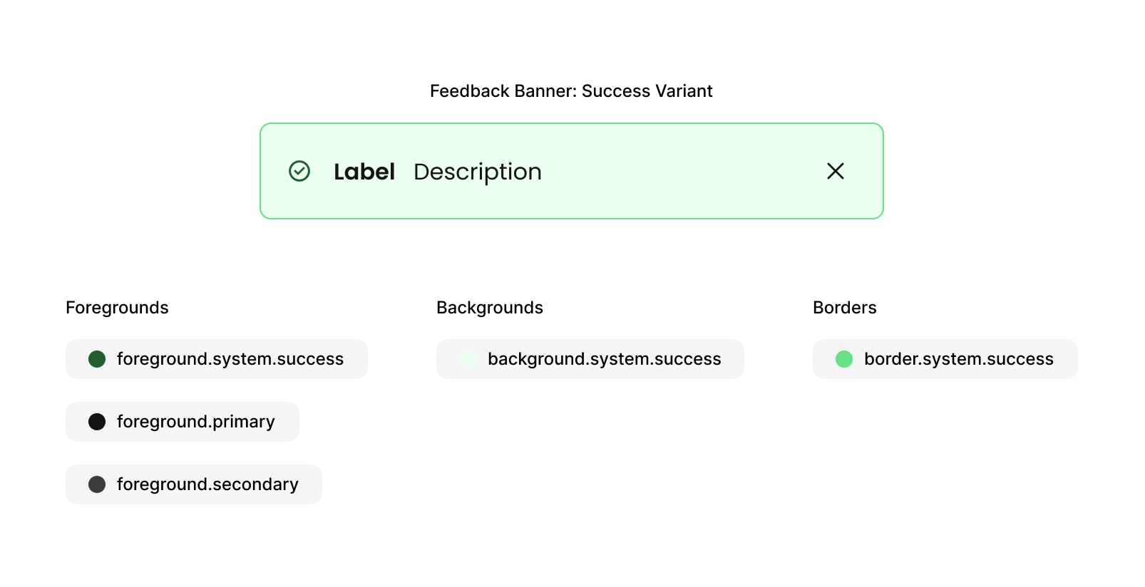
The above example, we have a success variant of a feedback banner. Each category has a “.system.success” sub-category. We are still using foreground.primary and foreground.secondary for the text copy and tertiary icon button. However, using the foreground.system.success for the text copy wouldn’t be incorrect. The tertiary icon button would be left alone due to being a nested, interactive component with its own styling.
Sub-categories
You might wonder why “foreground.system.success” and not “foreground.feedback_banner.success” Flexibility, consistency, and the ability to scale. Multiple types of feedback components will utilize these exact styles. e.g., Inline alert or completed progress ring. A designer may also need to create a custom local component to communicate success to a user. If we did component-specific naming, it would confuse them about the styles they should use.
Let’s break down these categories to help you define styles for your system. Remember, every system has differing base styles, so how these shake out in the end will vary, but the concept should still apply.
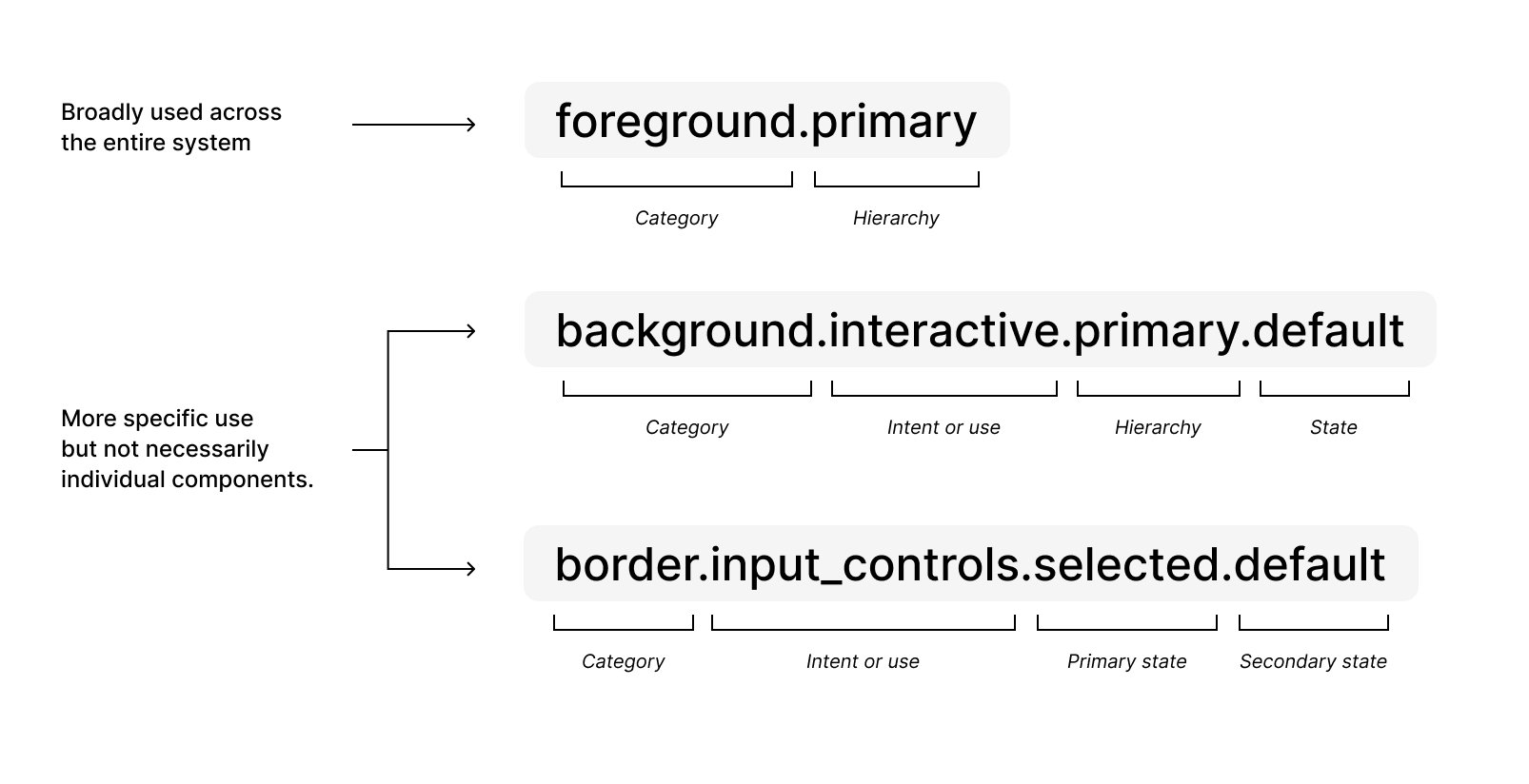
System-wide color styles
There are color styles that get used everywhere across multiple components. If it’s not otherwise specified, it will use a system-wide color style. Some interactive components, such as a secondary button, will use “foreground.primary” and not “foreground.interactive.secondary.default” foreground style because we don’t need it. We might be reflecting states only through background colors, but if your system wants to show states through an additional foreground color change for the secondary button, then you would add those specific styles.

Specific color styles—Intent or use
If a style isn’t utilized across the entire system, the second level will define intent or use. This second level typically includes interactive, input controls, system, and accent.
- Interactive
Most commonly, these are your buttons. Why don’t we just say buttons? Because we may have other custom interactions down the road that will use this same styling. These are further broken down into hierarchies—primary, secondary, tertiary, and quaternary. Each has their own states—default, hover, focus, press, active, and inverted. They will also have a disabled state, but all disabled components are styled the same so those use system-wide color styles for disabled. - Input Controls / Inputs
Both input controls and inputs get styled the same; if they are not, you can break these up. Inputs include text fields, select, date picker, search, auto-suggest, text area, obfuscated, etc. Input controls include radios, checkboxes, super radios, toggles, input steppers, sliders, etc. These will have unselected and selected states with their own default, hover, focus, and press states. System styles would be utilized for their error and disabled states. - System
System styles are used for all system components, and severity states for interactive components. This would include feedback banners, inline alerts, errors on inputs, etc. Their states are informative, success, warning, and error. Typically, the error will have a default, hover, focus, and press states because action is always required by the user in these situations. - Accent
This bucket is broad and made up of secondary colors used within the brand. It’s reserved for what I like to call “brand moments.” This gives designers creative flexibility for onboarding, value props, and landing page screens as they have a bit more personality them. These are also used to create a variety of color combinations for informative badges.
These four categories, plus our system-wide styles, cover all essential components needed for a design system.
Application
If you’re creating a design system from scratch I recommend doing exploratory work before you begin defining your semantic color styles. Create a few key views that include multiple core components to get a sense for how these colors will look, then start to define your semantic colors. After so many times, you’ll be able to visualize it in your head!
🎨 It’s hard to show an entire semantic color system in a single article so be sure to snag a copy of the Figma Community file to see an entire example of semantic color sets.
Bonus tip for illustrations!
You can also use your primitive colors to create a semantic color set for your illustration library. This won’t get used by engineering, but it’s extremely helpful when you have multiple designers working on illustrations that need to be consistent. You can define your highlights, base colors, shadows, and outlines in multiple color ways. If you use a lot of people in your illustrations, consider making skin tone color ramps.

In conclusion,
Remember, every design system has different needs, so do what works for you and your team.
- Primitive colors get attached to semantic names.
- Collaborate with your engineers on naming structures.
- All color styles will be divided into foregrounds, backgrounds, and borders.
- There will be system-wide and more specific color styles for interactive, input controls, system, and accent components.
- Don’t forget to document all the various states for the more specific color styles.
Next, I’ll dive into advanced color-theming tactics for multi-brand design systems where you can edit a single color value and have your primary interactive colors update along with their states through color mixing using the Tokens Studio plug-in. The concepts would still apply to Figma variables but color mixing is not available.
I love helping others on their design journey and want to keep the educational content I create free and accessible. If you feel inclined, you can support my journey by donating here!
By day, I am a Sr. Product Designer at Forge Studio. Where to find me:
Twitter, LinkedIn, Posts, Instagram, Website

