Member-only story
How to design a registration form
Step by step guide on how to start your form designs
Registration forms are one of the most important pieces of design you’ll ever make (right next to checkout forms) because this is how the users get into our product ecosystem. It is important to do them right!
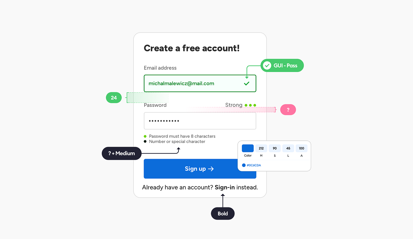
Of course, there are many ways to do registration, and in this post I’ll focus on just one — a simple form with email input and one password field.
The repeat password controversy

Many designers get confused by the lack of a “repeat password” field. Shouldn’t we include it so the users can be sure they entered their password right? After all if they do it wrong, they’ll have to reset it, which is cumbersome and takes time.
While in some specific cases having that second field can make sense, I believe that right now with browser/OS built-in password managers and suggested strong passwords one field is more than enough because the password is likely already saved in a keychain — whatever it is.
But it’s important to understand your users — if you’re making a product for less tech-savvy people, then including a password repeat field can be a good idea.
Now that we have that part out of the way we can get to…

Hierarchy strips
The first step is to think about how many groups we have. In forms like the registration, it’s usually quite simple (unless we have some terms or privacy checkboxes to take care of).
We should group relevant information together, which in this case brings us to three main groups.

The three main groups here are:
- the context (or the title) which…