Member-only story
How to design a sleek dashboard UI
A step by step guide with helpful tips.
Welcome to the second step by step UI guide. Since you really liked my first article on “How to achieve Friendly, Lightweight UI”, I decided to make another one in a similar manner. Please note, that this is not a “legit” process on how to create a product. We will focus on creating a clean, consistent UI, and we skip all the research/user experience/whatever you like to call it/steps.
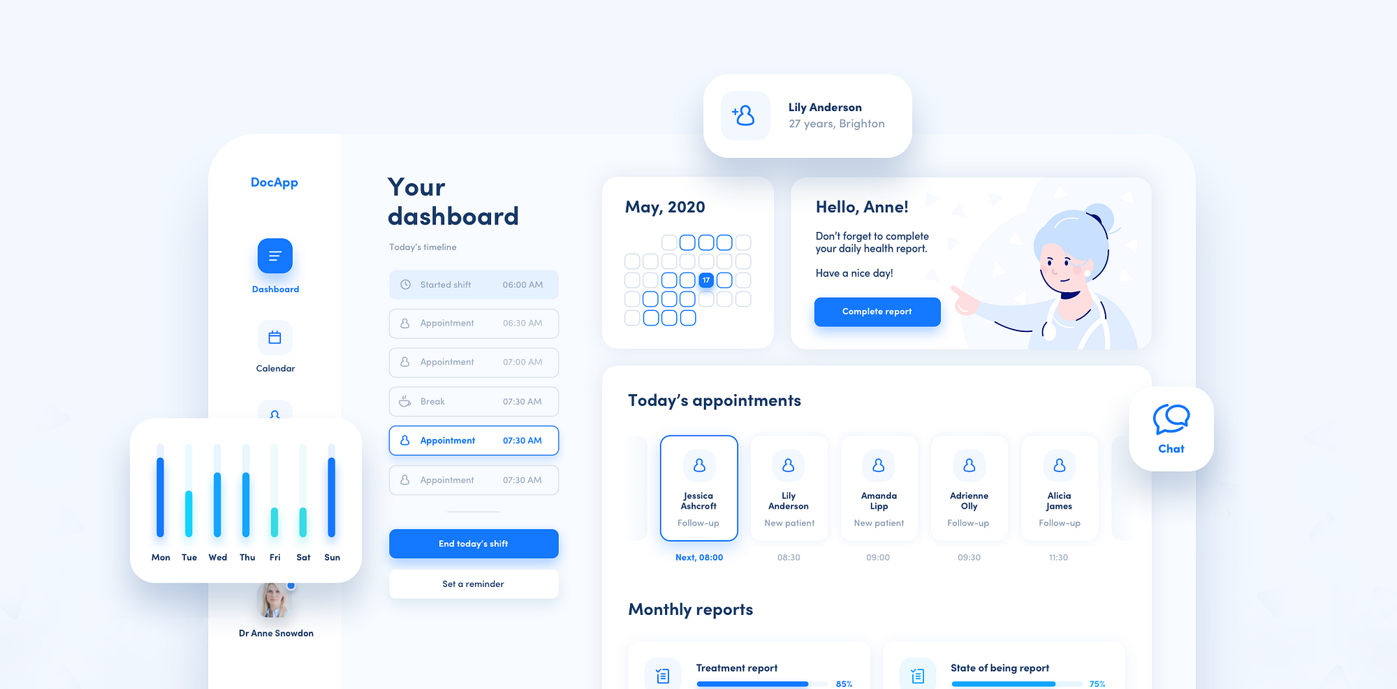
Basic idea & rough wireframe
Let’s start with an idea for a dashboard.
We are going to create a dashboard for a healthcare industry, preferably doctors, who have daily shifts, different patients and other duties (my aunt is a doctor, and actually she is not only saving lives, but as she says “there’s sh*tload of paperwork to do”) 😉. I will use Sketch for the whole process.
Usually, I start with a very low-key wireframe. I create a rectangle and some other rectangles, and I change their sizes and arrangement until I’m happy with the result. I choose some random but similar colors so I actually see where the rectangles are.
At this point, I also have in mind what kind of content I want to show and where.