Member-only story
How to design better paywalls
(That are less annoying and drive more conversions)

Freemium products often teeter on the edge of being downright annoying
No surprises there.
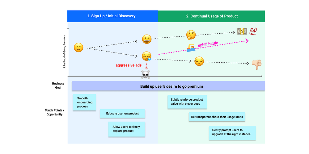
Striking a balance between business goals (to drive conversion) and user goals is often elusive and difficult. In this article, I will be sharing how to design less annoying upgrade prompts and paywalls that still convert users.
In a nutshell, Timing + Transparency + Tone = Less Annoying Paywalls
1. Timing / Relevance:
As with any successful marriage proposal, where you ask, when you ask and how you ask matters.
The right moment to propose an upsell varies from product to product (and user to user). However, there is a recognised golden window timing of opportunity:
- right before the purchase decision and
- during the consideration process
The question is of course, how do we know exactly when this window opens? The answer lies in a thorough understanding of your user and his/her user journey.

a. Target the right portion of the customer journey.
✅ Slowly build up the user’s desire to go premium at points of restricted actions
Gently remind users of the value of going premium by dropping hints that users could be getting more value and what they are missing out.

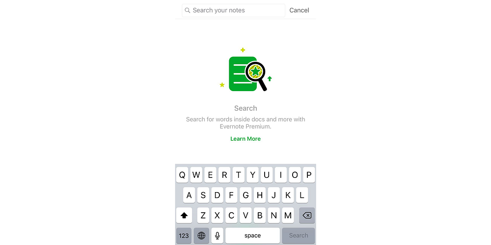
Evernote capitalises on common user behaviour of a universal search by making it premium. It tempts users to upgrade while raising awareness for its premium functions.


