How to effectively design a monochromatic user interface
You only need one hue to create a stunning UI design as long as you keep these few tips in mind.

In color theory, there are a number of different harmonies that you can work with to create various color palettes. However, when it comes to UI, it doesn’t take a slew of colors to create beautiful designs. In fact, sticking to a monochromatic scheme can help your designs look cohesive, clean, and sophisticated.
And the best part? Once you learn these few tips, it takes no time at all to create your palette.
At the end of this process you will have an easy to use a palette that consists of:
- Base color
- Lighter base variation
- Darker base variation
- Low contrast neutral
- “Black” (high contrast neutral for light mode)
- “White” (high contrast neutral for dark mode)
I also offer tips on the uses for each color.
Let’s get started!
Steps to creating a monochromatic UI palette
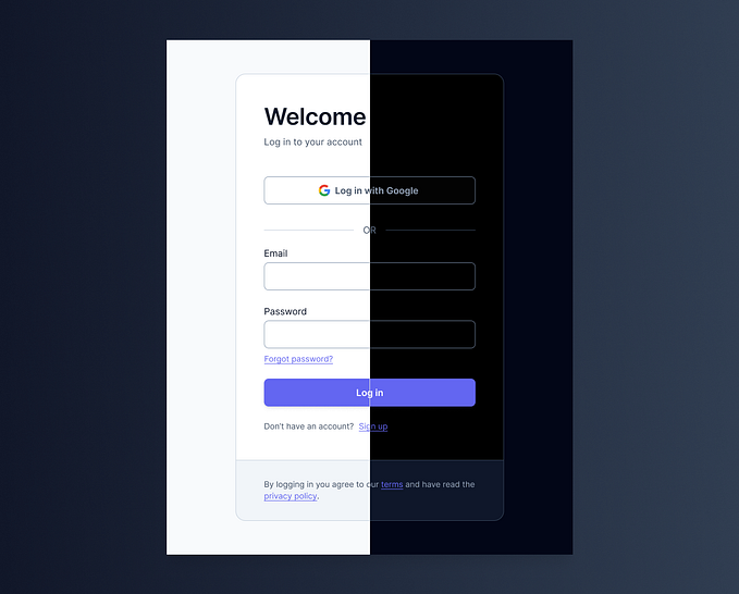
Step 0: Light and Dark Mode
Before you do anything, if you plan on creating a light and dark mode, make sure you establish what those look like.
Even if you are not creating two modes, this is essentially establishing your “black” and “white.”
Note that these do not have to be a pure black and white. Your black could be a deep navy blue or you white could be a very subtle beige. Just make sure they are consistent throughout.
Step 1: Pick a base color
This will be your dominant color. You can’t really go wrong in this step, but do keep in mind that the color should be usable on both light and dark interfaces.
If you are working for a brand, then just go with a primary brand color. If you are lucky enough to have total creative freedom, then the world is your oyster.
Feeling stuck? Blue is the most common favorite color of both males and females. It’s all over UI design (think Twitter, Facebook, and LinkedIn) and it develops a sense of calmness for the user. If you don’t know where to start, blue is a pretty safe bet.
Step 2: Create swatches of your base color
These colors are going to be all your interactive elements, like hovers or call-to-actions. Remember, don’t change the hue, just change the saturation and brightness. Make at least one lighter and one darker swatch.
If you need a darker color variation = increase saturation and decrease brightness
If you need a lighter color variation = lower saturation and increase brightness
Step 3: Create high and low contrast neutrals.
These will primarily be used for your layout elements and help differentiate different sections or groups on information.
Your low contrast neutrals can be used for sidebars, form fields, or anything that you might want to separate but don’t need to stand out. These will be lighter/darker colors of your established “black” and “white.”
Your high contrast neutrals can be used for high contrast backgrounds. To find these all you have to do is switch your light and dark modes. That is, your high contrast neutral for your light mode is the “black” that you established in step 0, and vice versa.
That’s it! You now have a sure-proof 6 color palette to create a stunning UI. Remember that these rules are not written in stone. While this can be a good base tool to get started, you may run into states that require more colors. If you need to, add as you go. Just ensure you are consistent and thoughtful with your decisions!
Sources
How I Organize Colors for a UI Design Project — Here
UI Design | How to choose colors and color palettes — Here