
How To Get A Head Start On Design System
A Guide For Design System Beginners
Recently I got some questions from my friends who were just starting to work on style guides (or design system), and most of them were like:
“Where should I start?”
“What should I do if I don’t have resources?”
“What if I’m the only designer in a small startup or we have a small design team and there’s no other designer or developer who can help me with it?”
As a designer who used to be in a small design team (now we are growing fast and I get my front-end buddy and fabulous product coworkers to work on it together), I’d love to share my experience with design system, especially the “How to get started” part.
It’s stressful to build a detailed and consistent design system, especially when you lack resources. But the good news is, you can make design decisions quickly.
The following steps can help you to get a head start on basic design system. As you are building it, remember that design system itself is a product as well. It’s a powerful tool that can help your users achieve their goals: cooperate efficiently to build consistent and high-quality products.
STEP 1 — Fully understand your product, and list all components
The first step is to fully understand your product. Review every aspect of the product and try to list all important elements on a paper, then group elements by their usages. For example, style group could be basic assets such as colors and fonts, and components group includes buttons, cards, tables, dialogs, and etc.

During this process, some inconsistencies may emerge. For example, buttons intended for the same purpose may have different colors on different pages, or the setting for on/off uses radio button on one page but uses drop-down on another. Don’t worry about them now, make sure you take notes of these so you can clean them up later.
STEP 2 — Build components in Sketch
Open your editor, Sketch, Illustrator or Photoshop, and create a separate page for each of the components (eg. each bullet point in the sample list above should have its own page). Then begin to fill in these pages, starting from basic and key elements, such as color and fonts.
To create color sheet, decide your primary and secondary colors first, then add accent color and other colors. Then generate different shades for these colors (if you are using material design as basic design language, a tool such as angular color generator is helpful to create shades.)

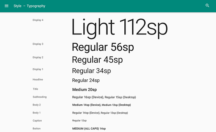
To create the fonts page, list typography styles by usages, such as primary titles, secondary titles, labels, card titles, body contents, and buttons.
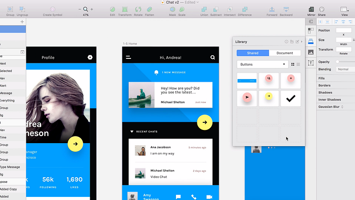
Once you have colors and fonts, you can go on to create more complex components such as buttons, cards, and dialogs.
If you are using Sketch, generating all components to symbols is very helpful because you can reuse them in the future. Naming them in an appropriate way can help you to find them easily. You can combine these symbols to create more complicated components, such as index pages and settings pages.
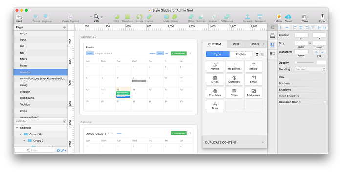
You can keep different states of each component, such as active, hover-on, press, disabled and so on in their corresponding page. Make sure these components are pixel perfect in each state. You don’t need to create different sizes of these components, as resizing can be done easily with the appropriate setup (read Sketch 39 resizing to learn about resizing in sketch).
*Pro tip: Craft is a convenient tool for you and your coworkers to build a collaborative library.
*Side bonus: you can use Inspect or Zeplin to get pixel perfect spec easily.
STEP 3 — Document design principles, rules and patterns
Glad you made it to the toughest part :)
After you have built all basic assets, it’s time to move to the document part: build principles, rules and information structure for your design system.
In this step, you should sum up rules and principles that could apply to different cases in your product.
//You can also reverse the order and build the principle part first, but for small teams that want to be agile and move fast, I recommend building the basic components first, to implement them to products and get real time feedback.
Two good examples are macOS Human Interface Guidelines and Material design guidelines. Material design guidelines include motion, style, layout, components, patterns, and also lots of examples about mobile designs. On the other hand, Apple guidelines include four different platform targets: iOS, macOS, watchOS and tvOS, each part has equivalent usage and rules.

It can take a while to organize and document these rules. You need to dig deeply and refine rules for different use cases. You also need to fully understand your users and make sure these rules can smooth work flows, decrease confusion, and lead to a good experience.
It may be a good idea to use cooperative platforms to document decisions about these principles and rules. Confluence and Frontify are two good choices that come to mind, and you can encourage your team members to contribute to it. Make sure the library is up to date and only includes the latest designs, and update your design library whenever there’re new decisions made. It will become an evolving system that can help all team members work under a consistent design framework.
To keep documentation clear and easy to understand, use images, animations or clickable demos to explain what the design looks like and how it works.
It takes a lot of time to document all the detailed rules. But Rome wasn’t built in a day, neither was design system.
ONE MORE STEP (optional) — Implement code to library
If you have a front-end buddy, or you yourself have front-end skills, it’s neat to build a live library.
Lighting design system and Angular material library are good examples for code library. Developers can find exact component by class names and deliver high-quality outcomes efficiently. Developers can copy and paste highly consistent code from the library, which is useful for avoiding UI bugs, miscommunication, and duplicate work.
You can also use github to manage your live library.

Stay tuned for another article that I am writing, which discusses in more details about design system, such as how to deal with design legacy, and how to hand over design to teammates for their use. I will also share more resources. ;)
Thanks for reading!
If you like this article, please give it a ❤️ :)


